Hello! Today I am going to be painting some sunset photos that were on my friend Kayla’s blog Journals of Joy (her blog is private). She shared many great sunset photos, and out of those I chose these two.
Aren’t these sunsets gorgeous?
I love these two photos because the colors are drastically different from each other and there are very little clouds, which makes the colors very pure (and clouds are really hard to paint in my opinion).
0 | Start by taping the edges of your paper down. I split my paper in half, but if you want your paintings bigger, use two sheets of paper.
1
2
3
4
5
6
7
(From left to right)
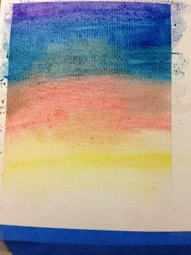
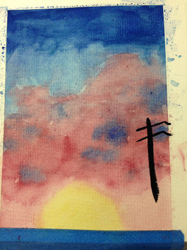
1 | Start by wetting the paper lightly. Then add some mid-toned blue in small triangular shapes on the side, near the top, but leaving an inch or so to the top. Leave everything loose.
2 | Add some blue-gray between the two triangles and blend things together a little bit.
3 | Add some periwinkle/violet in the slit that you left at the top. If you want to make your purple slit bigger, just lift some of the blue paint off.
4 | Add some scarlet-ish paint in a small rectangle shape right below the blue/gray/violet blob.
5 | Add some brown red to the side of the scarlet paint and some lemon yellow below.
6 | Blend everything together with minimal strokes.
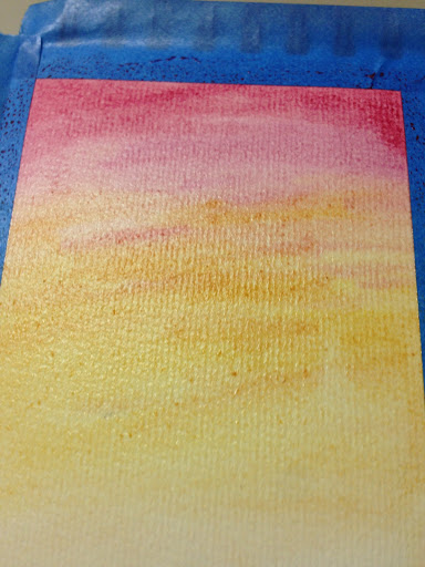
7 | Add more paint on top for more vibrancy. Let dry. In the meantime, let’s start the next sunset.
8
9
10
11
12
13
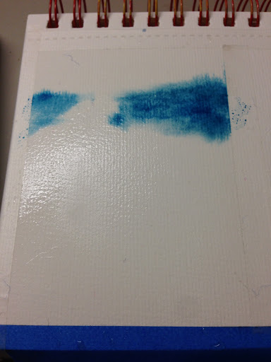
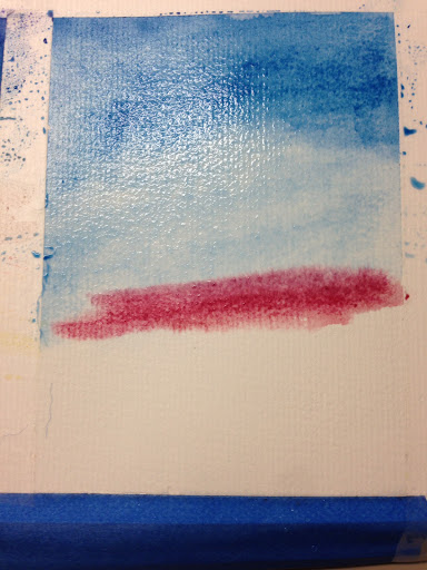
8 | Coat the next piece of paper with water. Then add blue paint from the top blended down, and then a bit of cool red/pink.
9 | Add some texture with the red.
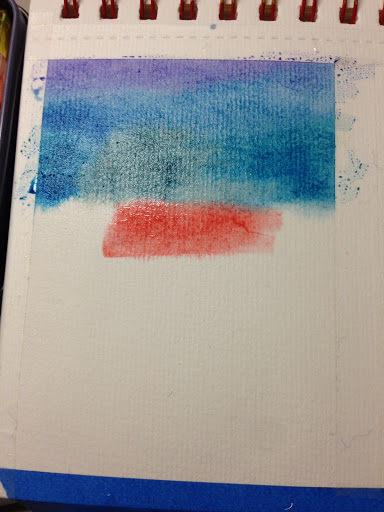
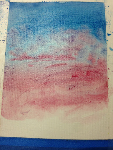
10 | Blend out the texture, creating a lavender color. Blend the red downward too.
11 | Add a setting yellow sun. Make sure it isn’t too low, we still have some trees to paint over it.
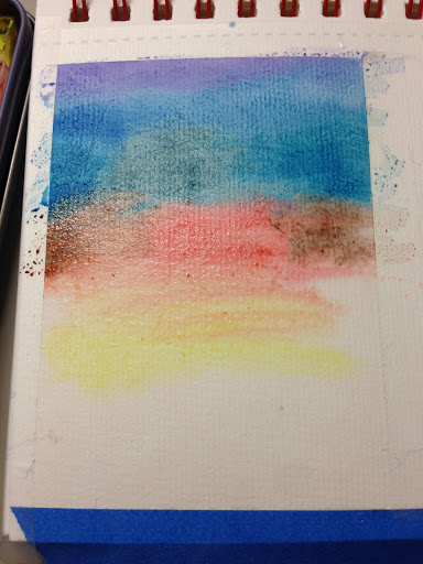
12 | Add some blue texture to the red block.
13 | Add more pigment onto the painting to brighten the sunset. You can blend it out more, but I decided to leave it very patchy. (Now that I think about it, I don’t understand why I did that.)
14
15
16
17
18
Yay!
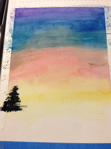
14 | Using black paint (I used gouache) create lots of trees across.
15 | Then add a house and fill in the rest of the bottom with black.
16 | Onto the second painting. Add a power line stand (?).
17 | Add trees. I made the trees in front of the setting sun lower so you can see it.
18 | Finish filling the bottom in with black.
Here are the finished sunsets. They are quite different from the photos, but I like how bright and contrasting the colors are. I hope you enjoyed this post. What sort of tutorials would you like me to do in the future? You can leave a comment or send me message in Contact. Thanks for reading!
Hi! I can’t believe it’s already June! Quarantine has passed by pretty quickly (which is good). I think quarantine is ending soon… (?) I have made up some one-word art prompts for a summery daily art challenge you could do with me. I will be posting my artwork for this challenge in new posts (I think once a week).
Watermelons
Ice cream
Wet
Sandy
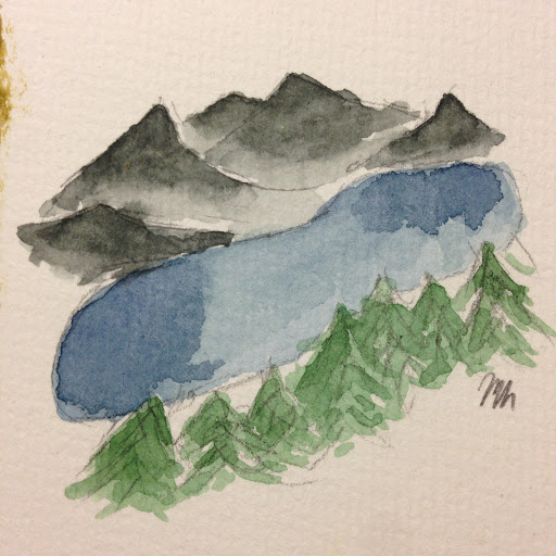
Lake
Dog
Barbecue
Hot
Swimsuit
Bonfire
Home
Sleep
Roast
Seashell
Camp
Sunny
Shower
Foamy
Tan
Trash
Sweet
Mermaid
Gooey
Short
Burn
Sunblock
Read
Peach
Refresh
Strawberry
Some tips/notes
You can omit some prompts from the list so that you make an art piece every other day or every week, it’s up to you. You can also just do it whenever you have time and find the prompt for that day.
You don’t have to make full sized pieces, I am planning to make small thumbnail size paintings.
I would love to see some of the artwork you made for this challenge! Click here to submit your art. If I get some submissions, I will make a post with all of your guys’ art work from this challenge. Thanks for reading!
Hello! Today I am going to be painting with phenol red. No, this is not another Limited Color Palette. Phenol red is a pH indicator so it changes color depending on the pH it mixes with. I am going to try using this property to create different colors and make a piece with it.
Phenol red
This is my phenol red. I used it in a biology lab, which is why I have it.
Pure phenol red (It’s very subtle but it’s still quite red…)
Dried pure phenol red (…and now it is orange-ish.)
Alkaline phenol red
Finished swatches
I first started by swatching it out. I started with pure phenol red and watched the color develop on the paper. Apparently the paper is acidic (yellow means acidic and magenta means basic) but the cover of the sketchbook says “Acid-Free.” The magenta color (phenol red with baking soda) starts out light, but it actually becomes quite pigmented as it dries.
Here’s my sketch. As normal, it’s a bouquet in a nice, round vase, but today it was slightly larger, which I think I like.
Magenta vase
Adding yellow stripe to vase
Yellow flowers
Trying but failing to make each leaf a different tone
Trying to make the yellow stripe darker and failed again
I started by painting the vase magenta, and then added a contrasting yellow stripe. Then I painted the flowers yellow too.
I wanted the leaves to be a different tone from magenta to yellow, but it didn’t work. (It was a little better later on). Then I tried to make yellow stripe darker, and it didn’t work (again). (It was better later on [again].)
Baking soda on the pot.
Baking soda in the middle of the flower
Vinegar on the yellow stripe
Blending out the vinegar
Fixed the leaf gradient
The yellow stripe dried and added some phenol red to the flower
Then I painted some magenta baking soda granules on the vase and the middle of the yellow flowers.
The not-yellow stripe wasn’t very satisfactory, I poured myself some vinegar (that sounds so weird😆) and painted it over the stripe. (It doesn’t smell good.) And it turned it bright highlighter yellow. But I blended it out and it actually dried really nice gradient.
Alkaline Bouquet
Here’s the finished piece! I think it turned out pretty good. The flowers weren’t as good as they were in the beginning, but I really like the end product. It’s a fun experience, but I don’t like that I can’t touch the paint.
I hope you enjoyed this post! Have you ever painted with chemicals? Thanks for reading!
Update
Alkaline Bouquet but it dried more and the colors changed
The colors apparently changed after a day so… 😢. You can see that the acidic yellow colors are more magenta now.
I guess the name Alkaline Bouquet is more fitting now. Which photo should I put in the gallery?
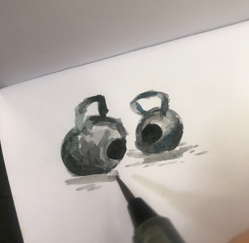
Hello! Happy Memorial Day! Today my family went out to the gym and did a workout together, I painted (😊) and my brother and I did some chalk art. I am very excited for this post, so let’s get started!
The workout that we did is called Murph. (Read about the Murph here.) I did half of it. It took 36 minutes. Then I painted some kettlebells that were sitting around.
The kettlebells I’m painting
Painting the kettlebells
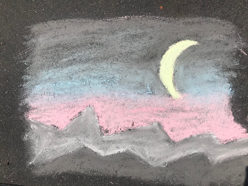
After I painted I wanted to do some chalk outside, so I made this little sunset scene. Chalk is actually pretty cool! I can blend it easily with my finger. (I later used a cloth because the skin from my finger would probably all peel off 😂.)
Then one of the ladies from the gym asked me to make a chalk American flag. My brother helped me too. (Thanks Timothy!)
Here is the finished American flag.
And some more photos from the gym below.
Dumbbells
Punching bag and rope
Tires
I will probably paint these sometime for my mom to put in the gym
I hope you enjoy(ed) this post and the rest of the Memorial Day. And thanks for 10 followers! What did you do today for Memorial Day? Thanks for reading!
Hello! Today is Whimsical Watercolor’s first birthday! Thank you so much for following me and my blog through a whole year. In celebration of it, I am going to share with you a revised edition of my very first post, Sunset City. (If you are wondering why this blog is quite empty, but it is one year old, I used to have a blog on Google Sites before I moved to WordPress.)
(From left to right)
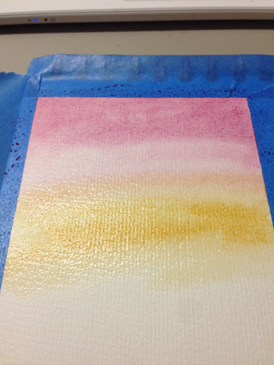
1 | Tape the edges of the paper and apply a thin, glossy layer of water.
2 | Add a cool pink color to the top of the paper, brushing side to side to add a cloud-like texture.
3 | Add a yellow tone of your choice (I started with lemon yellow), and use the same brushing technique to blend the colors together.
4 | Build up the intensity of the colors and add more texture. I used a little yellow ochre at this step.
5 | Start with a very light layer of gray paint, mixing in a lot of water. I made my gray using red brown and cerulean blue. You can make the buildings taller than I did, but I wanted to be able to see the sunset.
6-10 | Continue making layers using darker and darker tones.
Sunset City
Here is the finished painting. This revised version is definitely a lot better than I first painting; I like the more transparent layers than last time. Do you like sunsets? I hope you enjoyed this post. Thanks for reading!
You can compare this painting with the original painting 😬.
Hello! Today you can come along biking with me. I am going to paint a little scene.
Supplies
Above are all the supplies I used. (Mini sketchbook with mixed media paper, my travel watercolor set and a small waterbrush.)
There is a lovely street with jacaranda trees in it, so that is the place I decided to paint.
My brother kindly rode up and down the lane while I painted.
Jacaranda Trees
This is the finished sketch! I am not a very good plein air painter. I like to have a sturdy sketch before I start painting, so it didn’t turn out as good as it could have, but it was really fun. It took about ten minutes.
I hope you enjoyed this post! Do you like bike riding? Thanks for reading!
Hello! Welcome to the last Limited Color Palette post. I might be doing more in the future, but for now, this is going to be the last one. This time we are going to be doing three colors: a red, a blue and a yellow.
Color wheel
I really like the color choices of this palette. I get quite bright purples, very slightly muted greens and really pretty muted oranges. Bright oranges are often in your face, but muted oranges are really pretty, especially the tertiary oranges.
Sketch
Here is my sketch. I used an image of flowers I found on kirstensevig.com.
Painting it in… I really enjoy the large poppy-like flower because it looks really 3D and (you guessed it) because it is colored in with muted orange. I also quite like the gray color that that the colors can make, but I didn’t use it that much.
Wildflowers
Here is the finished piece! I used the gray color in the middle of the poppy, and to highlight my signature, but that’s pretty much it. I hope you enjoyed the last post for the Limited Color Palette series. If you have any series that you want me to do, feel free to leave a comment below. Thanks for reading!
Hello! Welcome to the second post in the Limited Color Palette series! This one was actually the first one that I painted. Enjoy!
Color wheel
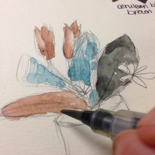
I knew that one of these posts had to be cerulean blue and brown red (I think it’s actually called red brown, but oh well) because it makes a really even gray color. I don’t actually like this pairing together that much, but the mixes are really pretty.
Sketch
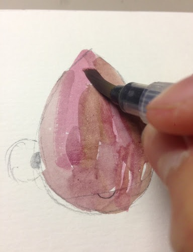
Here is my sketch of the bouquet. I like how the vase is tilted.
Gray Bouquet
Here is the finished piece! It’s kinda dark and moody, but I really like how it turned out with all the small, layered scales. Thanks for reading!
Hello! Welcome to a new series: Limited Color Palettes. Basically, I am going to choose two to three colors that work together in a way that I like (not a random choice), and then make a piece. ⚠️Spoiler alert⚠️ All the pieces are florals, which was not intentional…
I am indecisive
I was split between doing violet and yellow green or violet and viridian green. The yellow green makes a really nice umber-y brown-y earthy color, and the viridian makes a really nice indigo/payne’s gray color. I decided to go with the viridian because the blue color was really pretty.
Color wheel
Here is my color wheel of violet and viridian green. I made half of the palette lighter than the other.
This is my sketch.
Blocking in some colors.
Adding some layers…
Indigo Bouquet
Here’s the finished piece.
I hope you enjoyed this post! I will be doing more limited color palette posts in the future. Thanks for reading!
Hello! If you want to paint something simple but cute, then painting teardrop fish is for you! You can also use these to make more interesting paint swatches or thumbnail sketches.
Step 1: Sketch a teardrop, eyes and a mouth.
Sketch
It’s pretty self explanatory to draw them… I like making the eyes on the side really large. You can make the mouth happy, sad, mad. You can also add lineart to it, but I didn’t.
Step 2: Paint it in + Ideas
Painting in the fish
1 | (Top) A simple ombre.
2 | (Bottom Left) I made a little galaxy inside the fish by putting down a couple of blues and purples and then some black at the edges. Then I added some white gouache for some stars and planets.
3 | (Bottom Right) I made a little lavender scene by making some grass. Then I added some lavender watercolor and gouache to make the flowers. After I added the sky, but I should of added the sky before adding the grass and flowers.
Teardrop fish
I hope you enjoyed this little tutorial on teardrop fish. If you made some, I would love to see them and put them in the gallery. Click here to fill out the gallery form. Thanks for reading!
6 | Try a new painting style you’ve never done before.
7 | Fill up a sketchbook page with thumbnail paintings.
Thumbnail Sketches
8 | Paint something furry. (Tip: Use the wet-on-wet technique to create a background layer of fur.)
9 | Watch a show and draw an outfit a character is wearing.
10 | Paint something perishable in different stages of spoiling.
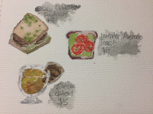
11 | Create a menu for an imagined restaurant and draw some of the items you would serve.
Cladosporium Foods If you can’t read the food labels they say (from the top) Parsley Mold Steak Sandwich $8; Lavender Avocado Toast $6; Steak Cocktail $5.
Hi! I designed a simple color wheel template on Google Drawings and I have been kinda obsessed with making color wheels.
I made a little color wheel template which you can print, cut, and then use. Even if you print it on normal printer paper (which is what I did), it’ll work perfectly well, though it won’t last that long. If you use plastic paper, it would be much stronger.
Cutting paper template with an X-acto knife
Painting the template in
Template in the top left of the document, using three colors
For the template top left (in the template document), you put your three primary colors in and then make the secondary and tertiary colors in the ring around.
Template in the top right of the document, using six colors
For the top right template, you use a warm and a cool of each primary color and then make secondary colors.
Template in the bottom left of the document, which uses two colors
For the bottom left template, you choose two colors and then make the mixes and swatch them in twice. You can make on side transparent, and one side more pigmented. This one is great for two color painting challenges.
Template in the bottom right of the document that uses three colors and includes a spot for an earth tone
And lastly for the bottom right template, it works like the first one except you make an earth tone with the three colors and put it in the center ring.
I hope you enjoy using the color templates. If you have any questions about them, feel free to use the comments. Thanks for reading!
Hehe, they are actually called thumbnail drawings, but these are really small, so I decided to call them pinkynail drawings.
Secondary color pinkynail drawings
These first ones are muted secondary color ones. I’ve been enjoying using muted primary and secondary colors lately. You can see them in detail below.
Secondary color pinkynail drawings closeup
Secondary color pinkynail drawings closeup
Lemon yellow and cerulean blue pinkynail drawings
These ones I create with cerulean blue and lemon yellow. I really like these, but I still prefer the first ones because of the color palettes. I also did more blending on these, which I like, but I think crisp edges look nice too.
Lemon yellow and cerulean blue pinkynail drawings closeup
Lemon yellow and cerulean blue pinkynail drawings closeup
Which pinkynail drawing do you like the best? Thanks for reading!
Hello! The first (more like one and half) month of quarantine is over, so I wanted to share with you my favorite paintings from this period. Even though quarantine is pretty boring and lonely, it’s been a lot of fun doing a lot more painting.
Monochrome girl
I really like this super simple painting, I don’t know why. It’s just really cute and I really enjoy the monochromatic color palette. I actually made it my profile picture!
Medusa
This one a made for an earlier post, and I used a color palette that I found on a snack package. I really like how the girl is mad (xD). But Medusa is a mad person, so…
Avocado Toast
A friend suggested that I do an avocado tutorial, so I also did an avocado toast tutorial. I really like eating avocado toast and I enjoy looking at the swirled and layered avocado spread.
Colorful Forest Cottage
This one I painted when I had a couple of days when I was really fond of painting houses and buildings. I made everything very colorful, including the plants. I really like adding non-real colors to spots of my paintings and it makes it pop quite a bit.