

Hello! My blog button is really boring, so I decided to redesign it today. I am going to keep my original logo, but I created a tagline and moved some stuff around. I am using Google Drawings.
Image has been removed.
On the left is my logo, and the right is my blog button. I really like how the logo looks, but I think that the blog button needs a lot of work.


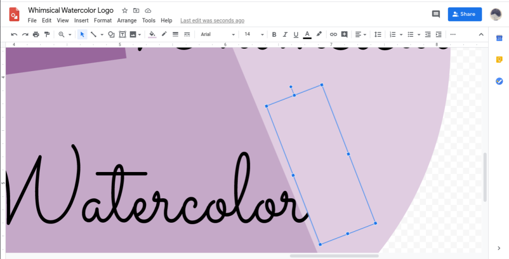
I started by editing the original button. I turned the words into Word Art. Word Art is better than text boxes, because the text size is determined by the size of the box, so you can make it skinnier or fatter. Plus, you can make the letters have gradients or outlines. The tagline is now “tips, tutorials, artwork.”
The font for the title is Sacramento, and the tagline is using the font Montserrat in regular.


I decided to make a second button design. I put the text over and under different parts of the logo. I put the tagline at the bottom in the darkest top piece. I changed the it to “tips • tutorials • artwork.”


Then I made a third design that is almost exactly the same as the second design, but I moved “Whimsical Watercolor” down a little bit.
Alright, these are the final buttons! I would love to hear your feedback on the buttons and tagline. (The bottom right is #1, top right is #2 and the left one is #3.) Thanks for reading!

I like this one the best: https://whimsicalwatercolor.files.wordpress.com/2020/06/whimsical-watercolor-logo.png?strip=info&w=720
LikeLiked by 1 person
Thanks for your feedback!
LikeLike
I think it looks better when the is not hidden under parts of the logo and the tagline is along the bottom side of the darkest purple part
LikeLiked by 1 person
*the title
LikeLiked by 1 person
Okay, thanks for your feedback!
LikeLike