A while ago I made this brand called Off-Width. It was a climbing company, and I made some climbing shoes, a shoebox for the shoes, and a harness. (You can view the old post here, or just look at the photos below.)
Today, I finally made some more products for Off-Width. I made these rather fast and I am sure later I am going to notice fifty-eight things I should have done better. But I think they are pretty cute.
This first item (actually, all the items are) is climbing chalk! This is the super-fine kind of chalk. I originally started with some curves in the corner, but I soon changed the curves into a circle in the center of the bag. I added another curve around it that does not close into a circle, and then made text around that in the same shape. The text is just a silly description of the chalk with all the adjectives I could think of: “Super-fine, friction-increasing, high performance, silky smooth magnesium carbonate chalk.” It is not really that readable, so it is not a very good design choice, but it looks fun.
Here is the mockup I used (and yes, it is the same as the super fine chalk’s mockup).
I also made some coarse chalk; the design is pretty much the same. My favorite part of these two chalk bags is probably the “tear here” note. It’s super cute and tiny. I also quite like the stripes above the “tear here” since they get thrown away when you open the chalk.
The final kind of chalk is the block kind. Instead of being a fine or coarse powder, it is one big block. I thought that putting a block of chalk in the thin pyramid-like bags that I used for the two previous chalk types would not work, so I downloaded a new mockup. It wasn’t quite what I was looking for, but it was square enough to appear to be holding a cube of chalk. Because of how the bag works (there is a flap in the back; you can see tiny corners of the flap extending from the back of the bag), there is no “tear here.” There aren’t any stripes at the top either, due to the shape of the bag. Otherwise, it is exactly the same.
I think the style of these bags does not quite match the style of the previous Off-Width products. I can’t tell what it is that makes them look a little off, but it definitely is different. This time, I played around with various playful background colors, and I quite like it, though I think the colored backgrounds make the style of these mismatched with the previous set of products.
What do you think of the chalk packaging? Thanks for reading and happy climbing 🧗♀️
I have not posted in over a month, mostly because I’ve not really made anything to post. But I recently bought some face paint and I painted some insects on myself, so I thought I might make a post about them.
This dragonfly was rather disappointing as it does not look very realistic. The details on dragonfly wings are very small, so it is quite hard to make the wings look nice. The body does not look realistic either, so all the pieces add up to be mediocre.
Here is a closer photo of the wings. I painted this on my leg just above my ankle, so it was quite an odd position to sit in as I painted it.
My butterfly is far better than my dragonfly. I actually made this monarch butterfly before the dragonfly, but I thought I would present the butterfly after so as not to underwhelm the readers when they see a poor dragonfly after a much better butterfly.
In the first photo, I had painted just the butterfly, but in the second photo, I added some metallic paint: gold to the yellow of the wings and a little bit of silver to the body.
I hope you enjoyed seeing my paintings! Thanks for reading and happy insects 🦋
I left paint water to evaporate for thirty-four days with the intent to paint with it. I had done this in the past, but I do not quite remember the results and it was amusing, so of course, I had to do it again. I had painted something for a friend with a limited color palette, so in the end, I had two jars with paint water in purple and blue. Unfortunately, I do not have a picture of the jars before I left them to evaporate, but I do not think it is too difficult to imagine paint water in a glass vessel.
I attempted to make a color wheel with the two colors; however, the wheel did not turn out well as the colors were all almost exactly the same, and my stencil was dirty–that was my fault–and therefore it left some unwanted paint on my color wheel. Additionally, I did not make my edges very neat, and I tried to fix them with outlines, but to no avail; in fact, I consider it worse.
Besides the misshapen ferns in the top left corner and right-hand side, I quite like the floral pattern I made with the evaporated paint water. I think the painting is quite fitting to the paint water because I had made similar paintings with the paint that had created this paint water.
I hope you enjoyed my experiment and painting. Thank you for reading!
Blind contour drawings are illustrations you make by only looking at your subject and not at your page. I believe you are supposed to lift up your pen only after you have finished the piece, but sometimes I break this rule. I drew quite a few blind contour drawings in my sketchbook, so I thought I might show them to you.
(Above) I made this first page with a normal pen. I like the style that a single-width line gives to the drawings; I don’t know how to describe it, but I think it is nice. My favorite is probably the bottom left one; the mouth and the rest of the facial features are in the right place but the piece is still very whimsical. My least favorite is the drawing beside my favorite; I don’t know what that turned into. The one with the giant round eyes at the top is fun too since the proportions are all off.
(Below) I decided to use a brush pen for the second page of blind contour drawings. I don’t like the style that these are in as much, but the varied width of lines makes these more interesting. My favorite has to be the bottom right one; the expression is quite silly. I also like the top left one because of the figure’s long flowy hair and neat bun. My least favorite is the middle right one; it’s quite creepy, to be honest.
(Above) Now, enjoy a closeup of this suspicious side-eye grinning expression. He has two noses, apparently, both facing different directions.
(Above) Also, enjoy this closeup! I quite like this one as well because the lines are all over the place but the features are generally in the right location.
I hope you enjoyed looking at my silly illustrations! Thank you for reading and happy blind contour drawing 🖊
I decided to design my own sheet of stamps, print it out, and add little perforations with an unthreaded sewing machine.
Maybe in the future, I will create actual designs, but I didn’t really feel like creating something nice. Mostly, I wanted to create the perforations on the stamp sheet. I added a nice little abstract design and some text. I named the stamp brand Infinite because the most popular stamp brand in the USA is called Forever, and infinite and forever for synonyms. I chose different fonts and monochromatic colorways for each stamp. The abstract shape is actually the lowercase “a” in the font Oi.
I made half of the rows a little smaller because I thought printed, the white gap would be a bit too small. I did a test print and decided the smaller pictures were better. I also thought the stamps were too small, so I reprinted the stamps.
And here is the finished stamp sheet, complete with little perforations! I used my sewing machine to create all the little holes; it was quite fun to do. Before I added the perforations, I added a single layer of Mod Podge to add a nice shiny feel and look.
The holes do not really resemble stamp perforations, especially up close, but they think they are good enough to make the stamp sheet fun.
The stamp doesn’t look nearly as cute torn-off, but the tearing-off process was quite fun.
I hope you enjoyed my stamp sheet! Thank you for reading and happy mailing letters ✉
Above are all my pieces! I painted at the National Gallery of Art, Georgetown Univerſity, the Library of Congreſs, and the National Muſeum of American Hiſtory. For ſome reaſon the ſpread did not get painted chronologically; I painted the bookcaſe on the far left firſt, the arch ſecond, the bathroom third, and the univerſity laſt.
Deſk and bookcaſe in the Federal ſtyle. Owned by John Aitken in Philadelphia from 1795-1810. It is made with mahogany, glaſs, and braſs.
The above deſk and bookcaſe is probably my leaſt favorite out of the four paintings. It does not have a ſense of depth, and the ſubject is not as viſually intereſting as the reſt of the pieces. Howbeit, I love the glaſs pattern and the bright blue color of the glaſs. Below, you can see the embelliſhments at the top of the bookcaſe are not blue, but I decided to make them blue for two reaſons: the firſt is that the blue is more intereſting, and the ſecond is that as I finiſhed painting the piece, I did not have acceſs to a photo and therefore my painting was inaccurate.
Georgetown Univerſity is in the gothic architecture ſtyle. The building has quite a bit of little details, ſo it was very fun to sketch and then paint. I did not capture even half of all the details on the univeriſity, but I think the lack of detail ſuits the ſtyle I painted it in. The whole building is kind of just gray, ſo I tried to uſe warm grays and cool grays along with brown and blue to make ſure the painting does not look too monochromatic. If you are intereſted, you can ſee my reference photo below, though I did finiſh painting the entire thing while I was there in perſon and I did not uſe my photo.
Library of Congreſs Porte-cochère
This is moſt definitely my favorite painting. Leſs importantly, I like how it cuts off at the edge and how it makes the painting aſsymetrical. But, more importantly, I like how the inadequately executed depth leads you down the tunnel into a mysterious ſomething. The porte-cochère (which is a doorway through which vehicles can go through) is very lovely; each of the trapezoids ſeems to be pointing down the tunnel and I like the way I painted them. I do not like the ovals at the top baniſter very much, for they look a little rough and miſshapen. Similar to Georgetown Univerſity, the entire arch was gray, ſo I tried to uſe different values and layering techniques to make sure it does not look flat. I made the car at the end of the tunnel red inſtead of gray ſo that it would pop rather than blend in, though I think I did not wait until the gray watercolor was dry before I painted the car.
I attached my reference photo below; I took it in the morning ſo the light in the air was very blue.
Dollhouſe at National Muſeum of American Hiſtory
There was this aſtounding dollhouſe at the National Muſeum of American Hiſtory and I juſt had to draw a room. Eventually, I ſettled on painting the bathroom; this may be an odd option for ſome, but I find bathrooms to be quite faſcinating. I did not capture the depth as well as I wanted to, but I think the painting is ſtill charming. The colors are superb in this painting, I think, though I ſuppose the colors are good in the painting becauſe they are fantastic in the actual dollhouſe. However, I added quite a bit of pink and red that did not exiſt in the actual house; I think this was a fitting choice as the colors would have been a little bit too monochromatic in my painting if I followed the dollhouſe’s colors.
Below is my reference, which I uſed to paint in with watercolor but not ſketch it.
I hope my plein air paintings were charming to look at. Which was your favorite painting? I alſo hope that the medial s was enjoyable; I fancied uſing it yet again. Thank you for reading and happy plein air painting.
I took a voyage to the Diſtrict of Columbia and decided to conſtruct a collection of photographs of intereſting typography I ſee. Almoſt all of the photographs are from muſeums in Waſhington, D.C.; I avoided taking photographs of brand logos and things like that ſince thoſe brands appear all over the world. I have included which muſeum I took the photo from below the photo, though I am not entirely ſure all the captions are correct. Alſo, I have decided to uſe the medial s in this poſt as I am obſessed with it after ſeeing it being uſed in old documents at the National Archives (moſt notably in the Conſtitution of the United States).
Library of Congreſs
The Library of Congreſs has quite pretty branding; they uſe this groteſque ſans ſerif in everything. The “S” has attractive angles inſtead of curves as the letter turns which look very pretty. This font alſo appears to have little to no contrast, but the “N”‘s ſtroke is quite a bit thinner than the reſt of the letter, which I find very odd but nice.
Library of Congreſs
There are lots of Gothic typefaces around muſeums in Waſhington, D.C. as many things there are very old. Alack, I have only two or three Gothic fonts in my collection; however, this does not bother me ſince I find they all look very ſimilar and unreadable. The font choſen here is relatively ſimple, and I aſsume a ſimpler Gothic font was uſed ſo modern-day people can actually read what the header ſays; Gothic typefaces can get pretty complicated.
Library of Congreſs
Theſe books are part of Thomas Jefferſon’s library at the Library of Congreſs. I thought the “La Philosophie De La Nature” title was quite intereſting ſince its tracking is different for each line of text.
Library of Congreſs
The ſerif font above is rather normal, but I had to take a photograph of it for the hyphen. It is thicker on the left ſide and thinner on the right; I like the way this looks a lot.
Library of Congreſs
Letters that are caſt to be three-dimenſional as oppoſed to printed to be two-dimenſional ſeem to have ſlightly uneven ſhapes. The “R” in “fire” has a little gap where the bowl and the ſtroke come together to meet the ſtem, while the “R” at the end of “extinguisher” has no gap. I think this unevenneſs is quite adorable.
Library of Congreſs
This geometric ſans ſerif is mostly not very unique, but I took a photograph of this font becauſe of the very unique “K” at the beginning of the ſign. I have never ſeen a “K” like this, and I like the way it looks; I ſtarted writing my “K”‘s like this (though I think I am going to ſtop, for it looks a tad too grand for my handwriting and it takes quite a bit longer to write).
National Gallery of Art
This typeface is very elegant. I aſsume both of the fonts are from the ſame typeface, but I do not know for ſure. I like the way the different weights are put together as it makes the text look leſs boring and more modern.
National Muſum of American Hiſtory
Again I am featuring a rather normal ſerif font; however, the “R” has a very intereſting ſtroke, ſo I had to take a photograph. The ſtroke has a little round cut into it, so the top part of the ſtroke where it meets the bowl is thinner than the reſt of it.
National Muſum of American Hiſtory
Alas, the paint was ſcratched off of the terminal of the “3,” but that does not matter much becauſe I was mainly adding this font to my collection because of the “5.” It has a beautiful wavy top and a stupendous terminal that looks sophisticated and dramatic.
National Muſum of American Hiſtory
Now, I would not call this font pretty, but it was too odd not to add to my collection. (I think its ſlight uglineſs comes from the colors it is in.) All the corners, curves, and points make the text very eye-catching.
National Poſtal Muſeum
The unevenneſs of the ſerif is very beautiful. The ſerifs are quite round, which makes the font look rather modern. Alſo, I love ligatures, and this font has one; ’tis thoſe two “t”‘s that are connected. Additionally, we muſt not overlook the fern; that leaf is delightful.
National Poſtal Muſeum
All of theſe fonts are wonderfully art deco.
National Poſtal Muſeum
This ſerif is ſo pretty. It has juſt the right amount of contraſt in it and the hyphens are very intereſting. They are tilted; I do not uſually ſee tilted hyphens.
National Poſtal Muſeum
This geometric ſans ſerif is–after a quick Google ſearch–very 1960s style.
National Poſtal Muſeum
The low bar on the “A” and the high bar on the “E” very art deco. It alſo has intereſting rounded corners. The typewriter font at the bottom is also quite nice.
National Poſtal Muſeum
This font has nice angles all over it; I eſpecially like how they are uneven and do not appear to be carefully meaſured.
National Poſtal Muſeum
Serif numbers with large terminals are always fantaſtic. I find it intereſting that the “9” deſcends inſtead of ſits on the baſeline; next to a “g” this could be confuſing.
National Poſtal Muſeum
This is one of my favorites in the collection; the font is quite eccentric and the colors are very pleaſing. I like how the lines that create the text ſhadow ſometimes meet the letter and ſometimes does not.
National Poſtal Muſeum
The curly parts of the title are really intereſting. I particularly like the “A” because its bar has a nice dip in the center and ſwirls on the ſide.
IAD Airport
The Waſhington Dulles International Airport used this very modern and technology-eſque font for much of the text there. Uſually, airports uſe rather boring typefaces, ſo I liked ſeeing this one. They alſo uſed a red-orange color, similar to the Library of Congreſs’.
I hope you enjoyed ſeeing ſome of the typefaces I collected in the Diſtrict of Columbia. This is only twenty out of my thirty-ſix photos in my collection; the poſt was getting too long and I thought it was going to be boring. I alſo hope the medial s was enjoyable; I definitely enjoyed uſing it. Thanks for reading and happy medial s!
I unintentionally bought three different kinds of watercolor paper in different price ranges, so I thought it would be fun to do an experiment and compare them. The “cheap” paper was Canson XL paper; I use this paper all the time and I like it quite a lot, although I must say I like it because it is inexpensive. At the time, it was forty-six cents per nine-by-twelve inch piece. The “medium” paper was Canson Montval paper, which is the same brand as the “cheap” paper but a different and fancier line. This one was eighty-five cents per piece. The “expensive” paper was Arches, a brand that I had always wanted to try but never did since it was so expensive. This paper comes out at the very high price of one dollar and seventy-five cents per piece.
And because we must make this an actual experiment…
Hypothesis: if the paper is of higher quality (i.e. more expensive), then the paint will be smoother on the paper.
Independent Variable: the paper quality.
Dependent Variable: the quality of the painting.
Constants: the paint type and brand used and the subject painted.
Also, I must note that the Arches watercolor paper is hot press, and the Canson watercolor papers are cold press. I happen to like hot press paper better, so this experiment is in favor of the most expensive paper.
the procedure
Firstly, I made a sketch. I drew on one of the pieces of paper, took a photo, increased its contrast, and traced it onto the two other sheets. It was a bit hard to get all three bouquets to look exactly the same, but I decided that they did not have to. In the end, however, I think they look pretty similar.
After all my sketches were complete, the fun part began. I painted all of them together, completing one aspect at a time through all three pieces. It was a bit of an interesting way to paint; it is not ideal if you want to focus very closely on details, but I think it was amusing and exciting. After I covered all three of the bouquets in a single layer of color, I went back in for the details. The finished pieces are below.
the results
(Above is the Canson XL paper.)
This paper acts perfectly fine and I haven’t any big problems with it, but I noticed it was harder to get crisp and sharp edges with this paper than with the more expensive papers.
(Above is the Canson Montval paper.)
This paper had the most texture out of the three brands of paper, but I think I could still make nice clean edges on it, which is interesting.
(Above is the Arches paper.)
This paper was the easiest to make clean edges on, and this might be the placebo effect, but some of the colors seem slightly brighter (it is not visible in the photographs). The paint on this paper actually was the least smooth; it tended it let the paint sit where I left it instead of spreading to other wet areas.
I also noticed that the higher quality papers were thinner, but the package still stated they were the same weight, so I can infer that the higher quality papers are denser.
conclusion
My hypothesis was disproved, for the paint on the higher quality papers dried less smoothly and with more variation. However, this is not a bad thing; I like the variation since it makes paintings, well, more varied. I also enjoy how crisp lines are and how colors appear on the Arches paper. The middle paper–Montval–is quite nice, though I don’t think it is worth it compared to the cheap paper–XL–since it isn’t that much better. The most expensive paper is not, in my opinion, usually worth it. I will probably use this if I make pieces that I want very nice, but I think I will stick to using the cheaper papers for most of my paintings.
I hope you like seeing my “experiment” with watercolor papers at different prices. Which painting did you like the best? Thanks for reading and happy experimenting 🧪
I made a “plein air” painting recently–and I put plein air in quotes since I completed most of the painting inside, and besides, the part I did outside was only just outside the front door–with gouache. As thou canst see from the title, I painted my neighbor’s front garden, which is why I didn’t have to go very far to make this “plein air” painting. I used an impressionistic style since I did not quite know what I was doing.
Above is my rough sketch; it doesn’t look very understandable but ’tis good enough to be able to paint it. There are hanging succulents above and rose bushes below, along with many snake plants and a few bricks. At the edges, I drew the posts and the top, the roof.
Alas I failed to take photos of my process, so we shall skip straight from the sketch to the finished painting.
Shortsightedly, I painted the foreground before the background, and everything turned out a little bit messy, but the impressionist style lended itself to the messiness, so it turned out fine. I particularly enjoy the gray background; it makes the colors look brighter. The snake plants have a pretty mix of colors; howbeit, they are not well distinguished from the rose bushes behind. My favorite plants are most likely the hanging succulents; I fancy the shades of purple and teal.
I must also include a photo in which the sun casts delightful shadows upon the painting.
I hope you liked my painting and the occasional improperly used Shakespearan term. I thank thee for reading and farewell till it be morrow.
Richard Scarry’s Best Story Book Ever contains a cute page with a bunch of flowers and garden related things on it, so I decided that I would draw some of them. This book is really, really fun to read and look at even though it is made for kids a lot younger than me. There are a medley of pages inside that have many types of the same kind of item (like the flower page below), so it is useful if you want to copy something.
I decided to draw six flowers. Well, I actually drew five; one of the drawings I chose to do was the little seedling located near the center of the left page.
I also drew the lily of the valley (located at the bottom left corner of the right page), the violet (bottom right corner of the left page), the pink (above the bunny in overalls), the thistle (top right corner of the left page), and the aster (center of right page).
And below are my finished drawings! I decided to use colored pencil since I wasn’t feeling like taking my paint and all the supplies that go with the paint out. I think the pink flower is my favorite; the petals have a smooth gradient and the edges are simply more interesting than the other petals’ edges. The violet is probably my least favorite since the leaves in front of the violet are kind of ugly. I also like the aster; it’s a little bit more complex than the others and it turned out nicely.
I hope you enjoyed my copies of the flowers from Richard Scarry’s Best Story Book Ever. Which was your favorite flower? Thank you for reading and happy gardening 🥀
I recently learned about a website designed by the typography foundry Hoefler & Co. from a television show called Abstract. The website, Discover Typography, showcases H&Co.’s typefaces in an interactive form. It’s called a “store window.” You can click on the different objects to see what fonts they are; it’s very fun and I could spend quite a bit of time looking through all the little items.
I thought it would be fun to create my own little “store window.” I decided to illustrate a bunch of things in a wallet and spread them out in a manner similar to H&Co.’s.
Below are all my illustrations without any text. I have the first variation right below and the updated one under it.
The first version
The updated version
And here is my color palette:
I originally included a pink and a cream, but I removed them later because there were too many colors. The yellow almost provides a fourth color in the palette–olive green–which I especially like.
Next, I chose my fonts. I chose one sans serif display typeface (Thunder), one slab serif (Hatch), one serif that has a very interesting display font for numerical characters (Bely), one sans serif font for smaller text (Forma DJR Micro), and one handwriting font (FF Market). I italicized the second half of the words so that I can see the italics as well while I’m choosing from the fonts to put on my illustrations.
Before I show you the finished piece, enjoy some beautiful closeups.
Here are the polaroid photo and stamps. I wanted to show off pretty numerals on the stamps, so I put 22 on the bottom one for this year, 2022, and 1776 because stamps tend to have patriotic things on them (1776 is when the United States declared independence). The stamps are super simple, but they are probably my favorite part of the design. The cutout for the stamps’ edges is quite fun too; I like interesting edges. For the polaroid, I wanted it to look like someone wrote on it, so I just wrote “The Art Museum!” because the picture looked artistic.
Thunder, Weight 100, Contrast 50
Here are the quarters! I quite like these, though they don’t look very good if you zoom in on them this far. The eagle is ugly.
Title: Bely Display. Open Above: Bely Regular.
This gum looks quite sleek and modern; it looks rather fancy too. I was going to do some sort of repeated text over the wrapper, but I already did that for the instant floss packet (which you’ll see later). They are located right next to each other, so I thought it would look monotonous if they both had repeated text.
Title: Hatch Bold. Subtitle: Hatch Light.
Here is the wallet! I don’t particularly love the wallet; its details don’t look that great together. This is actually the only piece with three dimensions in the artwork, but I actually kind of like that. It makes the wallet stand out a little bit, which is good because everything else goes inside the wallet.
California + Blue Titles: Forma DJR Micro Bold. Driver’s License + Donor: Thunder, Weight 500, Contrast 50. Signature: Market Pro Regular. Everything Else: Forma DJR Micro Regular.
And for the last closeup, the driver’s license! I didn’t include everything a driver’s license had (because a driver’s license has a lot of things), but I think it still looks very driver’s license-y. I have the girl’s signature below the photo and even a little organ donor circle! I like the “eyes” section; it says “gone” because her eyes are nonexistent. You may also notice that Penelope Edgar lives on Annabel Street (from Annabel Lee by Edgar Allen Poe) in Raventown (from The Raven by Edgar Allen Poe). I made many things Edgar Allen Poe related mostly because I gave Penelope the surname of Edgar.
The two close-ups before this driver’s license have Edgar Allen Poe related things. The wallet’s brand is Lenore (from The Raven) and the gum’s brand is Pendulum Chewing Gum (from The Pit and The Pendulum). Plus, Pendulum Chewing Gum rhymes, which is an added bonus!
Here is the finished piece! Please note that you probably aren’t seeing the finished piece because I probably changed something since I uploaded this image.
Here is a list of everything from top to bottom, left to right: The Craft Store gift card, Allen’s Deli coupon, paper scrap with Penelope’s email and phone number, small paper scrap with a phone number, the wallet, a piece of gum, the driver’s license, two quarters, an instant floss pack, The December Bookstore coupon, a polaroid photo, two stamps, and the Lee’s Burgers gift card (which I only realized later sounds like I was copying Lee’s Sandwiches).
The gift cards were pretty fun (top left corner and bottom right corner). I updated the flower on The Craft Store’s gift card two times, each revision getting simpler and simpler. Lee’s Burgers was inspired by (but changed a lot from) a Dairy Queen gift card; they have an interesting logo with some abstract pieces behind the text. It is called Lee’s Burgers because that is Annabel’s last name in Edgar Allen Poe’s Annabel Lee.
The coupons (top middle and bottom left corner) are my least favorite part and they still are not satisfactory, but I decided to leave them be. The 25% off gift card is for December Bookstore, and The Raven takes place in December, so I decided to name the store December. The buy-one-get-one-free coupon is for Allen’s Deli, which is just taken from Edgar Allen Poe’s name. The barcodes took quite a while to make, so I just copied the barcode over from the first coupon to the second.
I also have two little scraps of paper in the wallet; these pieces were quite fun to make. I like the torn edge a lot since it gives the piece more variety. Penelope’s email is edgar.penelope@bells.com because of the poem The Bells by–you guessed it–Edgar Allen Poe. Lastly, we have the little Instant Floss Pack! I really like this thing even though it’s super simple. Repeated text is always fun.
I hope you enjoyed seeing my “store window” being created! In the end, it wasn’t really a typography “store window”; instead, it was just a fun illustration. And besides, it can’t really be a store window if I’m not selling any fonts. Which was your favorite piece in the drawing? Thank you for reading and happy illustrating 💻
With a clothing order came a little piece of paper with a pretty bouquet (the back probably had cleaning instructions or something like that), and I decided to keep it! I kept it in my sketchbook and recreated it with watercolors.
Here is the photo and painting! I definitely did not draw it anywhere near realism, but I think it still looks cute. The flowers and leaves and leaves are my favorite part; I think they have some sort of depth. The bottle isn’t that nice looking–it seems kind of flat–and the threads on the screws of the bottle are weird.
I put white paint stuff (that is actually for covering mistakes) over the painting, so if you view the painting from the bottom you can see the texture difference very clearly. I think it’s a fun effect.
I took a class over the summer on character design and simple animation! So, I am going to share all the things I did in that class here.
sketching the characters
We were making characters to focus on different emotions, so I made one girl with a bunch of different emotions. This was done before class, and I actually did it wrong. I was supposed to create one character for each emotion, but instead, I did one character with different emotions.
And no, “asleep” is not an emotion. Haha.
After we received a little bit of critique and chose three characters we wanted to do, we remade our sketches. This time, I made one character for each emotion. I modeled “happy” after my original character, and then added “annoyed” as a boy and “surprised” as a girl.
We also created some animation ideas in the form of sketches which you can see in the image above, though they probably don’t really make any sense.
animation
Then, I vectorized the characters. I pasted images of my sketches into Illustrator and used the pen tool and the curve tool to create shapes. Here are the finished characters!
This is Felicity (which means happy)! I made her with short pink hair and a bright green hat. For the animation, I made her smile move, her eyes twinkle, her ears wiggle, and the flower swing. Though the flower didn’t turn out quite right and it looks weird.
This is Miriam! I wanted to make her very striking and surprising, so I made a bright purple afro and gold jewelry. I think she is my favorite character; the colors are really fun. The two other characters already have big eyes, but I made Miriam’s really big. For the animation, I made the eyes and mouth get big and the earrings swing, except I wasn’t smart and only made the earrings swing one way.
This is Enoch! I made his mouth neutral but slightly negative, and his eyes rolled. I also gave him a backward baseball cap. For this one, I made the eyes roll and the mouth gets pressed together. I also added a little flap of hair through the loop of the cap and made it move.
the backgrounds
First, I sketched the backgrounds! Because I didn’t make the characters’ bodies, my friend suggested that I should make them in a Zoom meeting. I ended up doing that and creating unique homes for each of my characters.
Here are the finished backgrounds!
For Felicity, I made a cool bookshelf with a window in the center. I added lots of gradients and I think I overdid the gradients a little bit, but overall, I really like it. The plants are cute.
Here is Miriam’s house! I made her very surprising by giving her lots of awards, including the Nobel Peace Prize.
This is definitely my favorite background. I gave him some baby shark posters because the baby shark is generally annoying. I also gave him a speaker and it is implied that baby shark is playing. To add to the nautical theme, I made a circular window on the door.
the isometric houses
Part of the class was to make isometric houses for each of our characters. This was my least favorite part, but I really enjoyed making the isometric grid and shortcuts (those grids and stuff come in handy all the time).
Here is Felicity’s house! I included the window that is in Felicity’s background.
I gave Miriam’s house an afro, like her hair.
Here is Enoch’s house. I made it many floors tall so that he has a reason to be annoyed (walking up all those stairs must be tiring). I don’t love how it looks, though.
the finished piece!
First, here is the unanimated finished piece. I made all my own little Zoom graphics, too. I love the little reaction button; the smiley is so cute.
Here is the animated piece! I made the book fall down on Felicity’s video and the Nobel Peace prize fall on Miriam’s. Then, I made Enoch say in the chat, “Your stuff fell down!” And that’s why he’s so annoyed.
I hope you enjoyed seeing my characters! Thanks for reading and thanks to the friend who taught the class!
I recently read Grounded: The Adventures of Rapunzel by Megan Morrison. It was a really fun book; I recommend reading it if you’re into fairy tales. I actually had this book for a few years, but the first time I read it, the book seemed boring. But when I finally decided to read it again, it ended up being an exceptionally exciting book. Today I am going to draw a character from the book (Glyph) and animate her a little bit.
(This post won’t include any spoilers for the book unless you count knowing Glyph’s existence and her appearances a spoiler.)
Glyph is a fairy who has a broken wing (for reasons I won’t disclose; it’s not very important to the book and it’s revealed very early in the book, but I won’t tell anyway). Here is her description:
The fairies parted in front of her, revealing a red marble dais on which a fairy wearing a pale blue sheath rested in what appeared to be a large cupped hand made of soft red clay. Her hair was the color of a cloudless sky, and so was one of her wings. The other wing hung, dull gray and broken, down to the ground beside the hand. (Morrison 59)
So, here’s what we know:
Pale blue sheath (which is a sort of dress)
Sky blue hair
One sky blue wing
One dull gray wing that hangs to the ground
I began by sketching out Glyph. I originally had her in a dress, but I changed it to a tunic with pants because I thought that would be more interesting to look at.
On the left, I have my unedited sketch. I prefer sketching without erasing at all until I am finished. If I erase my previous lines whenever I want to fix them, it takes too long and ends up not looking as good. On I right, I have my edited sketch. After I’m satisfied with my sketch, I’ll erase all the excess lines and make the ones that I like darker and bolder.
I put my sketch into Illustrator and used the pen tool to outline all the shapes.
Then I added the face and changed the head shape. The old head shape was not right.
I added color after (keeping to the blue theme that Glyph’s description clearly showed) and then textures. I used a variety of pictures from Unsplash, but the rock photo on the wing is mine. To add the photos on, I created a clipping mask and lowered the opacity down to around ten to twenty percent. Every piece beside her facial features has a texture. Her skin even has a texture; I overlaid a papery photo, though you can’t see it very well.
I honestly don’t know what to think about her; the style is kind of weird. All the textures make a very childish art style, though I suppose that is fine.
I created a background for Glyph next. It looks quite odd, but I think Glyph looks really cool on top of it (I won’t reveal that just yet because I want it to be a surprise). Again, I used lots of textures. Though Glyph isn’t always on top of a red marble dais, the description mentioned her on one, so I used rocky textures and deep, earthy reds.
Then I made a stop motion set of scenes. Usually, I use the “Video Timeline” option in Photoshop, where you drag different objects around, but this time I decided to create separate frames for the “Frame Animation” option. It ends up being choppier, of course, but I think the choppiness will lend itself nicely to the style of Glyph.
I spent quite a bit of time figuring out how long I wanted the animation to last, but I settled on 0.3 seconds for each slide. Glyph moves around a little bit in each frame because of the way I pasted in my pieces into Photoshop, but I find it kind of cute.
I made her healthy wing flutter, her head tilt, and her smile move a little.
Before I close the post, here are all the images I used for the textures, minus the one I took myself: ocean for wing, hair for hair, textile for tunic, textile for belt, leather for pants, paper for skin, sand for background, rock for background, and painting for background.
I hope you like my iteration of Glyph! Have you ever read Grounded: The Adventures of Rapunzel? If so, what did you think of the book? Thank you for reading and happy animating!
PS: I spent a lot of time figuring out how to quote and cite the book, but I’m almost as happy about the citation as the animation haha.
Works Cited
Morrison, Megan (2015). Grounded: The Adventure of Rapunzel. New York, NY: Scholastic Inc..
It’s been one week exactly since I’ve posted, and I don’t have any new art pieces to share, so I am going to show you a recent bedroom I made in Blender. I suppose you could call this my “ideal” bedroom, though I would probably make it very different if this room was real. I was trying to make this bedroom seem normal (with the exception of the climbing wall), so if I were to actually make my ideal bedroom it’d probably have some pretty odd things inside (such as a murphy bed or a secret trapdoors).
In this little room, I have a bunk bed (because my brother and I share a room), a table with a bench (I built a bench instead of two chairs because I was lazy; I would most definitely prefer having a fancy office chair), a bookshelf (again, I was lazy, so I didn’t add books), a pretty pink ceiling lamp, and a climbing wall.
The bunk bed is rather simple; it has two mattresses, two pillows, two blankets, and a ladder. The space between the bottom bunk and the top looks small, but it is pretty large. The top blanket is covering a lot of the space.
The table is very plain. The bench is a little more interesting since I put a little cushion on it. I think the cushion is quite cute.
We’ll skip the empty bookshelf and go straight to the climbing wall. I created a pretty steep overhang on one side of the wall with lots of colorful holds. You might also notice that there are two little holds next to the bed. Those are there so that you can grab onto those to get in and out of bed without using the ladder! Fun, right?
I also have this wall that has a slight overhang. I put more holds on this wall but I also added some long pieces on to make cracks (a kind of climbing where you jam your hands and feet into a crack and hold on that way). I really like the cracks and I would definitely would want cracks if I had a climbing wall in my bedroom.
I hope you liked my Very Cool Bedroom. If you’d like to try out Blender, you can download it at this website. Thank you for reading and happy sleeping 😴
I painted four gouache scenes for my art class, so I thought I might share them with you today.
After taping down my page, I put in four different backgrounds. The first is a noon sky with wispy clouds. I used a dry brushing technique that I’ve never used before, and I think it turned out okay. The second is a deep sunset, from purple to orange. The third is a night sky with just a little bit of light left in the bottom of the sky. And the last is a pastel sunset from lavender to yellow to pink and finally to blue. I based this on a sunset I saw that was very pretty, but the painting doesn’t look as good as the real one.
My brother gave me his gouache tubes from his art class that he’s not using anymore, and they are really nice. I didn’t want to just use the fancy colors since there wasn’t that much left of them, but I can get an almost equally fancy opacity and texture if I used half fancy gouache and half my not-as-fancy gouache. Now that I’ve used this gouache, I feel kind of spoiled and don’t like my gouache as much anymore haha.
I covered up two of the scenes with my very messy mixing palettes and then flung white paint onto two of them for stars. I think the paint was a bit too wet when I flung the paint on the night sky one, so the drops were big, but I did it much more delicately for the sunset stars. I tried to keep the stars for the sunset one near the top since I made the sun still very visible at the bottom.
I don’t necessarily think that stars show up at sunset time, especially at the early time in the sunset, but it was more of an accident. I didn’t have a third palette to cover up that one, so, inevitably, white stars were flung onto the sunset, so I just went with it.
After some time…
I am finished!
For the first, I put a tumble of rocks and some grass. The grass didn’t turn out looking very good, but it’s okay. The second painting is my favorite. I really like the Joshua tree I painted in, and I think it looks quite realistic (but the right amount of realism, since the sky is not completely realistic). The third painting is, uh, very ehhh. It’s probably my least favorite. I created rock face and put a rope going up the rock. The rock looks a bit weird to me. And lastly, I painted in some small, younger Joshua trees and some hills in the background.
I hope you enjoyed my four scenes! Which is your favorite? Least favorite? Thank you for reading and happy painting 🎨
I made a Google Doodle (those little pictures that show up on your new Chrome tab) for Christmas (in 2021), so I thought I might share it even though it’s February. I like to make Google Doodles because they are good starts to base a little animation on. I’ve made quite a few, actually, but most of them don’t get animated.
So, here it is. I actually kind of think it’s my worst Google Doodle I’ve made yet; it’s just very incohesive and has a weird color palette and font combination (the colors and fonts don’t necessarily look bad; they just don’t look Christmassy, I guess). But it’s cool otherwise.
It says Google in the beginning as inns. Each inn says the same thing, “There’s no room at the inn.” And then it swipes away and a manger with a glowing star above it appears. I guess it has some chronological continuity, but it doesn’t really show anything other than the inns being full and having to go to a barn.
Here’s a screenshot of the beginning! I made each letter myself and added a little house top to each letter. The L ended up looking like a C, obviously, but I couldn’t think of any other way to do it. Then, I made little text bubbles and added, “There’s no room at the inn.” I used the font JetBrains Mono.
Now, here’s the second scene. I made a little manger and put a little very big star on top.
I hope you enjoyed seeing my Google Doodle! Thank you for reading 😛
During the summer of 2021, I decided to learn how to use Blender, a 3D modeling software, because I thought it would be an exciting activity. It was quite a bit more laborious to learn how to use than other software, so I still barely know anything, but I know enough to create some entertaining things (but quite crudely).
Stereotypically, I started out with the donut tutorial. However, I got bored of the tutorial, so I stopped after finishing the frosting shape and color (which is probably why I don’t know very much).
But I still think it looks pretty good! The middle ridge on the donut is my favorite part.
Onto my favorite project yet:
This bedroom! I started out with floors and walls, and then I added different things like a bed, a bookshelf (which has no books because I’m too lazy to add some), and a table with a chair. My favorite part is the computer screen, which I learned how to make glow!
Tada! The computer glows! The light lights up too! The room is rather dark because I don’t really know how to work lights, but It’s good enough for now. Maybe later I’ll learn how the lights in Blender actually work.
Other things on the desk include two pieces of paper, a pencil on top of the pieces of paper, a mug (with nothing inside because it sounds hard to put liquid in), and a pencil holder with a pen and another pencil with green paint. Above the desk is a board and I have two papers pinned on it. I really like pinning fun stuff to corkboard, so that’s why I added this. The wall was also a bit too blank.
I also have a little reading lamp, which usually points toward the soft beanbag in the corner so you can read your nonexistent books, but right now it is pointing sort of in the bed direction.
I’m pretty proud of shaping my beanbag, and it looks comfy to me. Plus, look at that electrical plug! It’s my favorite detail.
It’s a little bit hard to articulate in this photo, but I have some rope walls here! From left to right I have a slightly overhanging wall, a slab, another slightly overhanging wall/vert(ical) wall, and a roof (which is only for lead climbing).
I also have a bouldering area, which is just as sparse, but I have some pads at the moment.
And here is the overhead view, which makes even less sense, now that I look at it. On the left are the rope climbing walls, and on the right are the bouldering walls.
My gym actually began as a boudering gym, which I have kept, but I stopped working on it and created a new one. The dimensions in the bouldering gym one are way off, so there is kind of no point in trying to fix it. But it’s really cool and colorful, so here are some pictures!
Here is a top out boulder, which means you can step over the top and stand up there! I have a downclimb on it. One of the reasons I stopped with this gym is because something weird happened where some things would just cut out into gray (like you can see the walls behind doing). I don’t know what happened, but it doesn’t happen anymore with my new one.
I also made this absolutely amazing climb (I’m exaggerating), that starts on a thin little foothold and interesting geometric hold. Then you can move your feet up and your hands to the first sloper hold and the tiny round crimps (?). Then you can use the other crimpy pinch things to get to the finish hold, which kind of looks like a chair.
I kind of just created cool holds, so I don’t know how this climb would actually work. It might be super easy, or it might be really hard. Who knows. But I’d love to climb it just for the sake of it.
I also created these delightfully practical benches, perfect for stowing away bags and sitting down to watch people climb.
I created an extremely long slab wall (because slab is the best), which is a kind of wall that tilts in slightly. I also added a slab that goes to an overhang. Slabs that lead into overhangs are always interesting.
Here’s an overhead view of the very sad employee rest room, which only has two benches.
Lastly, I have a toy that I created! It looks like your ordinary stacking toy (or whatever they are called), but it does something cooler!
I used pastel colors in an analogous palette because I think it looks very pretty but not too sophisticated to be a toy (but still very sophisticated haha).
You can put the stick on the side of the stand together with two of the disks and make a toy weight! So now, toddlers can pretend to weightlift. The last disk creates a little kettlebell, which is already created for you.
This project I created directly after the donut, so I wanted to do something simple that had multiple pieces, but that I wasn’t just copying. I thought making a stacking toy would be a good one. I didn’t really do much except edit the disks slightly and recolor them, though.
I hope you enjoyed seeing all my Blender things. If you use Blender and have any tips for me, I’d love to hear them. Thank you for reading and happy 3D modeling!
I don’t know when Chinese New Year exactly is, but it’s around now. To celebrate, I made an art piece.
Happy New Year, 2022, Ink
Since this year is year of the tiger, I drew a tiger. But I don’t like drawing animals (usually–I like drawing bugs), so I drew Hobbes instead of a tiger I might’ve created myself. Plus, I like Calvin and Hobbes (the comic) and I think Hobbes is a really cute representation of a tiger.
This piece was actually for a school assignment where we had to show motion, so I drew Hobbes running. I like how his stripes look, especially the ones on the side of his head. My dad taught me how to write 新年快樂, and it was the hardest part but I think also the most fun part. It doesn’t look as good as my dad’s handwriting, but I think my writing is kind of cute.
Today is my one hundredth post and also approximately my two hundred follower anniversary. So, thank you! I was planning on doing something a little different and special, but I had no ideas, so here is another brand I’ve created.
I made some branding for a climbing gym, and I am going to share that with you today! I named it Scandere Climbing Gym, because scandere means climbing in Latin, and Latin is cool. I have no idea how to properly pronounce it, but in my mind it is scan-deer.
Originally my idea was to make some sort of minimalistic and sleek logo that would fit a generic modern climbing gym, but that was boring, so I chose some art deco fonts and made something different. I used Anisette Std Regular and Fino Sans Regular. In Anisette, capital letters are stretched, so I made the “A” capital to add some more visual interest. I created two lines with the pen tool and then used the width tool to widen an edge.
I also created a seashell pattern (that is just an edited version of the seashell pattern for this poster) to add decoration to my stuff. I really like the new seashell pattern.
If you’re curious, here’s the width tool at work (using Illustrator):
I have a line and the width tool selected on the left-hand side.
Then, you click and hold a point in the line and drag out or in.
And now it’s finished! You can change the width of practically any point of the line and make it crazy.
Now, onto the products (that’s not really what they’re called, but I don’t have another word). I decided to make two posters (one for gym rules and one for day pass/membership prices), along with four tags for climbs (which I’ll explain in a second). But first, here is my color palette:
I made a whole rainbow of colors so that I can use them for the different colored tags for each climb, but not all the colors were actually used because I didn’t make that many tags. And, by the way, that black color is apparently called “xiketic.” What sort of name is that for a color like that?
First up: those tags.
Climbs at a gym all have grades for difficulty and a pre-set start hold. So, the start hold has a tag on it, telling you the grade. Most climbs start with matched hands (two hands on a single hold), but if it doesn’t, there is a separate tag that says something like “Two Hand Start.” Also, there is a finish hold for each climb. You must put both hands on that finish hold to complete the climb. That hold has a tag on it that says something like “Finish.” (I’m sure not all gyms follow these rules, but most gyms do.)
Fino Sans has quite lovely numbers.
Ack I didn’t notice that the bottom of “hand” matches with the top of the bottom red square. It looks bad. Oh well.
So here is a set of bouldering tags! On the left, I have the start tag, which has the grade V4 (because that’s my redpoint/highest bouldering grade I’ve climbed so far), colored squares to show the color of the holds on the climb (a climb in a gym follows a route made up of a single color of holds), my logo, and some seashells. The two hand start tag is very similar.
I really like how the tags look! They match the logo well and I love the seashell pattern (as stated earlier haha). I think most gyms’ tags don’t have the color of the holds on the tag (I know of one that does though) because then the tags wouldn’t be reusable, but I’m into making them as aesthetically pleasing as possible instead of less wasteful and take less time to use. This is a pretend climbing gym, so there’s no such thing as time or waste.
And then I created a set of rope climbing tags (finish tags and two hand starts are used for both boulders and rope climbs, but I wanted to create sets of two tags, so I paired the finish tag with the rope climbing tag and the two hand start with the bouldering tag)! I chose to go with the purple color and I made them in a very similar fashion to the previous tags. (5.12A is not my redpoint–mine is 5.11A or B or something like that–but the numbers 5, 1, and 2 look nice and give more visual variety than 5, 1, 1 so I chose those.)
If you’ve noticed that the tags are very bottom-heavy, it’s for a purpose. Tags are tucked into the holds, so I wanted to make sure there was space on the top of tags to tuck them in and not hide anything important.
Now, here are the posters!
I couldn’t get a bullet point in the poster, so I used a tilda (~) instead.
Most gyms don’t provide rental ropes for lead climbing, but I wanted mine to have one, so I made up an arbitrary price and my brother says it’s way too expensive (which I agree with).
First is the Etiquette & Rules poster! I typed up a bunch of rules (since I couldn’t find one to copy), but they’re normal-ish (except for the fact that you are allowed to teach people how to belay and that you have to be ten to belay–most of the time it’s around fourteen, which I personally think is too old, but I mostly think that because I used to not/still don’t really make the cutoff to belay at some places). I had some extra space so I put some shells on the bottom and I think it’s really cute.
For the Pricing poster, I just put a bunch of prices under multiple categories. I made the numbers bold to highlight them and made the words nice and big so that it’s easy to read. I tried to make the prices make sense… I don’t quite know how that turned out, but it doesn’t really matter. I couldn’t fit any shells on this one, so I did the squares instead. I like that one poster has the squares and one has the shells, so they don’t look exactly the same, but they still match nicely.
My brother suggested that I make the “A” part bigger (because you can also stick a B, C, or D there too, and it it important to know which letter it is) and the “5” part smaller because all rope climbing grades start with “5”. I might do that later, but for now, it looks like this.
There is a typo on the rules poster but it’s okay
And I thought it would be fun to create a simple website too:
It’s not very good, but that’s okay. I made it really fast. Here’s the stock photo I used.
I hope you liked my climbing gym! What do you think about the tags and posters? Thank you for reading and have a nice day 😄
I made a climbing brand not-so-recently, so I thought I might share it with you! I created two items and three mockups: a pair of climbing shoes and a box for it, along with a harness. I named the brand Off-Width because it is a crack climbing term that I think sounds pretty cool. (Crack climbing is when there is a crack in the wall and you stick your feet and hands into it to climb up the wall. An off-width crack is a crack that is wider than your hand, but not wide enough to stick your whole body inside, so it is very hard to climb up.)
the shoes and shoe box
The shoe box is the only thing that is actually using a mockup because I (obviously) can’t find a climbing shoe or climbing harness mockup. I really like how the logo turned out. (I also have no idea what font I used, which is sad because it’s quite cute.) For the box, I added stripes horizontally and vertically and I love how that turned out as well. It’s a little bit simple, but still pretty.
(Update: I really wanted to find what font I used, and it is Roc Grotesk Heavy. I wanted to find it because I am planning to add more items to my Off-Width collection, since I think this is one of the most exciting brands I’ve created.)
“Neon” was the first word that came to mind when I made them, so I named them the “Neons.”
The shoes took a while since I had to color them in. I started with an image of Black Diamond Momentum Shoes in the color white (which were literally the only pair of climbing shoes I could find in white) and added multiply or overlay layers (I can’t remember which) to lay on color. I used the same colors as the shoe box and added gray, yellow, teal, and red. I love how the shoe ended up, especially the asymmetry of it (you can see the flap of the shoe that’s on the opposite side of the image is teal instead of gray, which makes it assymetrical).
Laying the logo on was the hard part. I had to warp them around until they looked right and they never did. Originally, I was going to attach the logo onto the side of the toe part, but I decided against it because it would rub off quickly if this shoe were to be manufactured and used in climbing.
the harness
And here’s the harness! I used a photo of the Mosquito harness (which is black and very simple, making it easy to edit) and edited out the logos before adding mine. I decided to name the harness Inertia because the harness I own is called Momentum, and momentum and inertia are kind of similar except for the fact that inertia’s definition is “lack of movement or activity especially when movement or activity is wanted or needed” (Merriam Webster).
I had to warp the “Inertia” as well, but it didn’t turn out as good as the Off-Width logo. The Off-Width logo looks alright, but it’s slightly blurry. Making the logo disappear from the harness made it kind of fuzzy. The original “Inertia” design (below) I thought turned out pretty. It’s really just the text, but I rounded off the corner of the “E” to make it look more lively (and it matches the logo where I rounded the W).
I hope you enjoyed reading about my climbing brand Off-Width. Thanks for reading 🤓
This year I am taking an art class, so I thought it would be fun to share all the pieces I made from last semester.
The Moon and the Sun
The first project we did was a Zentangle. For the project, we were supposed to split the page in half and draw a shape on both halves but mirrored. On the left-hand side, the shape would be filled in with black, and on the right-hand side it would stay empty and there would be a Zentangle drawing all around it.
I chose to draw a circle–yes, it is a very simple shape, but I had a reason for it–so that the left side could represent the moon and the right side could represent the sun (with all the light rays coming off). I tried to do art deco patterns, but not all of them ended up being art deco like the circles, the peacock feather teardrops, and the other circles. I think the seashell patterns (the big fan one and the little one in the corner with angled lines) and the overlapping rhombus patterns turned out the best.
We also had to submit nine practice squares of Zentangle, so here are mine! I really like the checkerboard one in the lower-left corner along with the repeating squares with circles at the top center, but I copied the squares with circles from online.
Inside the Atrium
For our one-point perspective assignment, I created an iteration of an Eichler house. Eichler houses are known for (at least I’m pretty sure they are known for) their atriums, where the atrium is sort of indoors but there is a big open window at the top (no glass). You can see the window at the top. I didn’t really know what to put inside the atrium, so I just put in a dining table. That was kind of a boring choice in the end.
I made a kitchen on the right side and a living room on the left, and those rooms are separated from the atrium with a piece of glass. I tried to add a layer of watered-down white paint to make it seem kind of fuzzy, and I think it worked alright, but only alright.
I don’t like that the vanishing point and horizon line are there, but we had to keep them there for the assignment. I used some watered-down gouache to color in the house.
Outside the Atrium
We also did an isometric drawing project, and this time I used Illustrator since we were allowed to do it digitally. I decided on making the exterior of my one-point perspective house. I also added a corner window (two windows that join together at the corner), which I like a lot 😊
For another project, we made a color wheel with three complementary color scales. I used gouache and a lot of tape to keep the edges of the shapes clean. Many of the colors in the complementary color scales ended up being brown, so they didn’t look very different from each other. I think the yellow and purple looks the best, though they all look kind of bad.
We did a cross-hatching project, so I sketched out a computer mouse. Everything is kind of gray and mushed together, but I still really like the mouse and how the light reflects off of the surface.
Beetle
Finally, my final! I made a Japanese beetle with lots of colors and I used gouache and colored pencil. I really like how it turned out and I think the shell and the legs are quite pretty. I think I made the gap between the abdomen and thorax a little bit too big, but it doesn’t look too bad. My favorite features are the little bright purple flaps on the sides of the tail end.
I think I covered almost all of my pieces! Our class also did Inktober, among many other sketches. Thanks for reading and see you again soon 🙂
I found a poster when my family went to Joshua Tree that stated rules about staying in Joshua Tree. I’ve had making a poster in the back of my head for some time, so I thought that I would take a photo and redesign the poster! It ended up being very fun and I went for a style that I had never done before: art deco!
Here is the poster I saw. It’s a very, um, interesting style. It looks pretty nice, though personally, I don’t love the style. The layout of the text in the center column is also kind of hard to read easily, so I wanted to fix that as well. Also, since there is so much text, the large Joshua tree in the center makes it a little bit un-text-focused.
Before I show the finished poster, here are the two unaccepted posters:
1
2
I changed the rules slightly to make it more aesthetically pleasing and concise. I also removed the “Joshua Tree Thanks You” part because I think it’s a little bit unnecessary.
If you’re wondering, I used the font Fino Sans for the headers and Nobel for the body text. I made my own shell pattern, too, which I am very proud of. And below is my color palette. Originally, I had included orange in the palette, but I couldn’t fit the color in properly, so I just removed it altogether. I achieved the different shades of blue in the poster by creating semi-transparent squares and layering them on top of each other (I found some art deco stuff online that had layered squares like that).
Without further ado, here is the final poster!
3
If you compare this one to the two unaccepted posters, you can see that I changed the font on the side text that says, “Have fun and please use desert etiquette.” My mom said it was too hard to read, especially since I had italicized it. It was kind of sad to have to change that because the text there was so pretty, but it wasn’t readable so I had to. This poster also has a negative space gap where the translucent blue squares extend into.
I think the redesigned poster is a lot easier to read. Your eye focuses more on the text than decoration, which I think is key in a poster with a bunch of rules that nobody wants to read. Also, if you noticed, I removed the part that says, “Joshua Tree is busier than ever and we are trying our best.” I did that because it isn’t a rule and it also doesn’t really say anything at all.
I hope you like my redesigned poster! Which of the three is your favorite (or maybe you like the original poster)? Thank you for reading and happy new year 😁
I haven’t been blogging since… I don’t know. But I decided to blog again, and I today I have a post about a book I made recently! I also redesigned my blog and removed literally every single page and I like it a lot this way. My “goodbye” images are new (and I made a “hello” image too) using a new font but I am probably going to change it soon because it doesn’t match the other fonts I use here.
Today, I am going to show you a book/journal I made. It’s sort of like a travel journal. Instead of just some simple lined pages or a sketchbook, I made some very creative prompts! It is sort of modeled after a travel journal that my brother had, but for camping 😀 I designed my own pages and graphics and everything on Adobe Illustrator. Maybe I should have used InDesign (which I’m pretty sure is designed for making books and magazines), but I don’t have space on my computer to download it and I also don’t want to learn how to use it.
First, I designed my pages, which was very fun! I’m not going to share all my pages, but here are a few of my favorites.
I made a scavenger hunt page! I really love the mushrooms and the layout of the text.
Here is one half of the “sends” page (there were two so you can recordlots of climbs). You can write down the name of the climb, the grade, the date you did the climb, information about the climb, and notes.
At the beginning of the book, I made a supplies page to tell you what sort of supplies you should bring. I made all the stationary graphics myself, and I especially love the glue and tape graphic.
This page was my mom’s idea. You draw the sunrise and sunset every day, and it seemed like a fun idea!
If you would like to know, I used the font Paralucent from Adobe Fonts in many different weights. I tried to use the thin weight a lot, but it didn’t print well so I had to replace the thin with light. So if you’re making a book, try to stay away from super thin lines.
Once I was finished, my brother helped me order the pages correctly for printing. (You have to reorder the pages because you have to “leaf” them together, if that makes sense.) Except that I used very thick paper and had to make around eight “leafed” booklets to sew together. It’s quite hard to explain.
After I printed and sewed the book together, I made the cover. I ended up having to sew up two extra pages so that I could glue the cover to the book. I used E6000. After I connected the cover, I put many layers of Mod Podge on it.
Here’s the cover. I took all the leaf graphics that I put around the pages on the book and laid them together on the cover. The little two-headed leaf on the bottom of the spine was made specifically for the cover, however.
Fast forward a bunch of work, and here’s the finished book!
Here’s the hiking log page!On the left hand side (where you can see part of the word “blithsome”), I made an adjective writing page. It’s kind of a silly idea, but if you like writing, I think it’s great. The page with the sun is a page where you can draw clouds on. The page opposite to the cloud page is a page where you can make a pretend postcard. The back of the page has the back of the postcard. The last page with the rectangles is a page where you can make color palettes, which I love.
If you would like to create a book too, I created a document on how to create a book, which you can see here! I am planning to make another book in the near future, so hopefully, that will come in helpful soon. Thanks for reading and hopefully I’ll keep writing!
Hello! Today I am going to design another brand! I have a lot of fun doing this, so I have decided to do it yet again. This time, we are going to make a cereal brand, which I am calling “cheery o’s.” (It kinda sounds like a cheap copy of Cheerios.) I am going to design the logo for cheery o’s, the box (just the front and one side), and a web ad.
I was lazy, so I didn’t make a mood board, but later I needed a place to store my colors, so I made a mood board. It literally only has three things on it, so I don’t think it’s very necessary to show it.
the logo
I started with two different fonts, Soleil and Hobeaux (I just realized at Hobeaux is pronounced “ho-bo” 😂). I really like the playful look of Hobeaux (which is the choice on top), so that’s what I went with. I actually ended up using Soleil for subtitles and such, so it proved itself to be useful as well!
I fixed the kerning, made a color palette, and outlined the text to fix up the letters a bit. The changes I made are super faint; I can’t even tell the difference myself (compare these two to the first image). I really like the color palette. I ended up making the two center colors the main colors and the two colors on the edges the accent tones, which will probably be used more on the box.
I added a tagline and made three different iterations of the logo. I don’t absolutely love any of them, but I’m still going to go with one of them because I don’t have very many more ideas right now. Also, the tagline — a breakfast food for gloomy mornings — means that it’s a cereal made for sad mornings, and the cereal will make you more cheerful. I used the word gloomy because it’s more comical-sounding. I ended up going for the bottom choice, which has the background color on the word cheery.
the box
First, we shall start with the front. I pasted in my logo, and then I added a gradient for the background and a single cheery o image. This was actually a Cheerio image, but I used Photoshop to remove the background. Making images transparent is super satisfying for some odd reason.
I didn’t like the sunset-y sky, so I changed it to the dark blue color. I also duplicated and shrunk the cheery o’s to make them raindrops under a cloud. I really like how the clouds turned out, and it was super easy to make them! All you have to do is put together three or four circles, add a rectangle at the bottom, and use the Pathfinder to mend all of them together. I also added a cheerful smile (pun intended) and the net weight, which I copied from a Cheerio box.
Also, the red ochre color wasn’t doing it for me, so I changed the color of the logo and stuck exclusively to blue. I know blue is the least appetizing color, but I really like the new look. I also added the flavor, which is blueberry maple (if I make more flavors in the future, I’ll probably just change the colors to match the flavor. I’d probably also choose a different weather forecast). In the corner I put some health remarks, which were absolutely arbitrary.
Now that we’ve got the front done, we have to do the side.
It was pretty simple, so I only have one screen shot of it, but I really like the side. It might match the front a bit too much, but that is okay. I am excited to see how the gradients bleed into each other on the mockup, though.
the mockup
So, I didn’t take any work in progress photos of the mockup, but it was super quick anyways. I really like how it turned out! The colors are super pretty and the gradient looks awesome! I’m glad I measured out the mockup beforehand because last time I did this I had to extend the background a bit. I wouldn’t be able to extend this background because of the gradient. I don’t particularly appreciate how the box is not centered, but there isn’t much I can do about that.
Also, you might notice that I changed the layout of the cereal on the side. I did this because I wanted the cereal on the side and the front to be part of the same rainfall and not separate ones, so I placed them more randomly.
the ad
Okay, so now we are going to create a web advertisement for my cereal. Nobody will eat my cereal if they do not see an ad for it first! I found an ad online and chose the size of that particular ad. It was 970 x 250 pixels.
The first thing that I did was get the mockup and use the object selection tool in Photoshop to remove the background of the cereal box mockup. It ended up a bit choppy, but I didn’t care to fix it because it’s going to be very small anyway.
After that, I added a few more things… and we are finished!
the finished mockup and ad
You already saw the mockup… but I’ll show it again. Blueberry maple cereal sounds like it would taste delicious. I kinda wish I could eat it right now.
And here is the ad! Yeah, you can easily tell that the box was very rapidly edited. Other than that faulty edge, I really like the ad! I especially like that all the colors are the same. I really like that the whole this is made with one color, though maybe the box would have popped more if I had used different background hues. Also, cheery-os.com is not a real domain. I searched it up on Google Domains and it is available, but I am most definitely not buying it.
Also, I wanted to see what the ad would look like a website, so I quickly took some screenshots and such and put this together! It looks nice, though I prefer not having ads on my website haha.
Maybe one day I’ll make another flavor. That sounds super fun, so I’ll probably do that sometime in the future. But for now, we only have blueberry maple. I hope you enjoyed seeing me make another brand! What is your favorite cereal brand? What do you prefer eating for breakfast? Have a fantastic week. Bye!
Hello! Today I am going to share some fun websites that I think artists would enjoy using! Some of these are fantastic for getting inspiration for your next piece, while others are just plainly fun to use.
Color Hunt is a super pretty website to look at: there are seemingly infinite rows of beautiful four-tone color palettes. You can easily copy the color codes or save the palette by clicking on the heart. Plus, there is no need to create an account! You can also create your own color palettes and add them to the list, but the person that created Color Hunt curates all the palettes.
While Fluid Paint isn’t totally suited for drawing, it’s super satisfying to make large swipes of the brush on the canvas. The paint in Fluid Paint is very fluid and naturally blends together like real life, and the brush shapes itself naturally as well. It was coded mostly using JavaScript, but there is also GLSL, which I have no idea about.
Quick, Draw! is an AI experiment by Google where the neutral net tries to guess what you are drawing (basically pictionary with a robot). It bases its guesses off of other people who drew in Quick, Draw!, so it’s usually pretty accurate. It’s super fun to play and you can also view their database of all the drawings they have ever gotten!
Coolors, in my opinion, is the most optimal way to create color palettes. You can have a large range of colors in your palette, rearrange colors, learn all different color codes, and more! Their list of color palettes isn’t curated like Color Hunt, so I don’t personally like looking in their list of public palettes (but their palette making is more superior than Color Hunt).
This is another project from Google, but they are coloring books! They took famous pieces of art and turned them into line drawings, and then you can select the colors in the bar and click to fill the shapes. There is a radial animation that appears when you click on a shape and it is nice to watch. There are background textures that show up when you fill it with colors that reflect what the actual art looks like.
I hope you enjoyed my list of fun websites! What is your favorite out of the list? Do you like color palettes? Have a fantastic day! Bye!
Hello! As I undid my old pointe shoes and sewed my new ones, a fun idea popped into my head: painting my pointe shoes! I’ve seen this done before, so this isn’t very original, but it sounds super fun. These unfortunately won’t come with ribbons since I sewed them onto my next pair, but I think they’ll still be very pretty. I have an idea forming in my head…
i tried really hard to make it look pretty in this photo… and it didn’t happen
Here is a shot of the pointe shoe that I am going to paint! I am only painting one because making a pair seems like too much work. It is a Bloch Heritage. If you’re wondering my rating of them: ★★☆☆☆ They aren’t awesome; the box is a little bit weird and the shank is quite soft, despite the fact I got strong haha. If you like Bloch Heritages, feel free to contradict me in the comments.
Then, I made a sketch. It’s super simple: I just drew different four- or five-sided shapes around the shoe. You can probably imagine what the back of the shoe looks like.
Now it’s time for the fun part! I started with the tip of the box and painted it in. It’s actually pretty easy to paint on the box since it’s hard, but on the back of the shoe it’s very flimsy and it was harder to paint on it. I found that if you used a more watery layer of paint, and did multiple layers, it created a more smooth result.
The tip of the shoe was a bit harder to paint since I had previously put a layer of fabric and jet glue (a glue that hardens your shoes so that you can use them longer), so it didn’t absorb the paint as well. But it’s mostly okay. And anyways, you don’t see the box while you dance. *as if someone’s going to dance in these*
Skip a lot of time… and they’re finished! They aren’t necessarily very pretty, but they are fun and whimsical. I decided against painting the string cinch thingy because I wanted to leave some pink, and it seemed kinda hard to paint.
The heel is very flimsy (like I said before), so it has more raggedy lines than the box. It was quite a coincidence that I used the same four colors on the box as the heel, in different shades. I really like the shade of purple on the heel.
Here’s a picture of the whole right side. (I apologize for the blinding light in the corner; I have no idea what that is.) I left very strategically placed blank spots to let the shiny satin contrast the matte colors. The colors on this side look quite sophisticated haha. I really like navy blue with mustard yellow. Actually, I think I like many colors paired with mustard yellow.
And now, here is a photo of the shoe on my foot! The colors on this side aren’t as “sophisticated” as the other side. (I was in a very awkward position to take this photo 😂)
I hope you enjoyed seeing me paint my pointe shoes! If you have old pointe shoes lying around, this is a very fun activity to do. Do you do ballet? Have you ever painted shoes? I hope you have a wonderful week. Bye!
Hello! Today I am going to do something that I’ve been meaning to do for awhile: draw my dream. If you’ve ever had a dream (and remembered it) then crazy scenes are bound to be in them. For example, I’ve had a dream that my house was full of packing peanuts, and another time I had a dream that, for youth group, we were inside this dark and spooky house. Drawing your dream is a great way to get inspiration for your art.
I’m not very good at drawing buildings, landscapes, or cityscapes (I prefer still life), so I took awhile to sort through my dreams to find a scene that I think I would like painting. Before we get into the painting, let me tell you my dream (please note that this one wasn’t really my most exciting dream).
Me and a couple other girls were in this very skinny hallway where we going to have ballet class (so skinny that if you lifted your leg side your leg wouldn’t fit). So, I moved to a balcony that had more room, but I also couldn’t see the teacher in the balcony.
I put my water bottle down on the balcony and I asked my friend if she wanted to join me in the balcony. She came into the balcony and said, “No.” So then I moved back into the very thin hallway.
THE END
Yep, that wasn’t that exciting. When I had the dream it was exciting though.
I will be drawing the balcony scene, which has sort of an oval shaped railing, and it has luscious tropical plant overgrowth. It doesn’t go into the balcony, but it touches the railing. It also has concrete floor. I wouldn’t recommend dancing on concrete floor 😂 I’ll be adding my water bottle to the scene, but I won’t be adding myself because I don’t know how to draw humans.
First, I started by sketching. This sketch was really simple and really only took about 30 seconds. I was originally going to sketch some plants, but I decided against it because I didn’t really know what I was doing. I just planned to paint them on, which I thought would have ended badly but it didn’t.
Then, I painted in the concrete floor, which ended up being a little too dark, but I can always fix that later. I also added a thin green layer behind the plants to act as blurry background plants, but this wasn’t that helpful. Compared to the deep green plants, this was basically white.
The paper warped a lot.
The leaves, once I got the hang of them, were really fun to paint. I got to mix lots of different shades of green, which was quite enjoyable. I wanted them to be quite opaque, so I added quite a bit of white, but I also didn’t want them to pastel, so I added some black, so they were quite desaturated but I actually quite like the look. I kinda just wish they were deeper greens.
We’re more than halfway done and it’s only been fifty minutes. You can probably see the saturation and opacity of the leaves go down a little bit. There’s some sort of evolution going on in the leaves. I kinda played around a bit with the leaf shape before landing on just two types: a palm sorta leaf and a “normal” leaf.
Ahhh, it’s done 😁 I really like how it turned out. It slowed down a bit near the end, so in total, I think this took around one hour and forty minutes. Let’s get onto the rail!
It took a little bit of squinting and paper-tilting to find the sketch underneath but it wasn’t completely covered! I am pretty happy with the color of the rail, but I painted it a little unevenly. The oval shape is a bit confusing: sometimes it looks like the outside of the balcony and sometimes it looks like the inside (it’s supposed to be the inside).
Also, here are some beautiful closeups.
And here’s the final piece! You might be wondering: where’s the water bottle? Well, I ended up leaving it out because there was some sort of mysterious and apocalyptic feeling of the painting, and adding the water bottle would remove that from the painting. I painted over some of the leaves to make them sit over the railing, which gives it a nice depth. But, since the rail is white the white paint mixed in with the leaves and made the leaves over the rail a whole lot more pastel. I think it looks alright though.
Overall, I really like this painting because of leafy wall and it’s very pretty. However, the vibe that the painting shows doesn’t really reflect my dream, which was supposed to be the main goal of this painting… I think this piece is more inspired by my dream than copied after my dream because all the elements in it are changed a little lot to fit my art style.
I hope you enjoyed this post a lot! I highly recommend drawing your dreams! If you want to learn how to work without reference images, but you don’t really have the creativity in the moment to think of a scene/character, have your unconscious mind do all that for you! All you have to do is draw it. (And you won’t waste your time thinking, you can multitask [i.e. sleep] while you’re thinking)
Let me know what you think about this painting! Also, I’d love to know if you ever had any crazy dreams. I love reading people’s dreams 😆 I hope you have a wonderful day. Bye!
Hello friends! A few weeks ago I went on a camping trip to Joshua Tree, so I thought I’d share some photos and paintings that I took and made there. I got quite a few pretty (I hope) photos, but I didn’t paint as much as I would’ve liked. It was a bit very windy, so I was scared that my paper and paints would fly away. Plus, my fingers were frozen so my fine motor skills would probably not be very good haha.
Here is a photo from the drive! I love the contrast between the natural desert and the wind turbines right next to each other. I know wind turbines are always just out in the middle of nowhere, but they still look a bit futuristic I guess. I also love the tiny road leading into the misty mountains; it’s very mysterious.
When we arrived we started setting up camp. Afterwards we took a hike and then went rock climbing.
Our campsite was very close to many rocks, so that was really fun! You could just take ten steps from our campsite and start climbing. You can see the famous fuzzy (more like spiny) Joshua trees in the photo, which you aren’t allowed to touch. They are very enticing to touch 😂
I had a little bit of free time between setting up camp and going hiking, so I made this Joshua tree thumbnail painting. It’s not super realistic, but I’m pretty happy with it. I don’t have a photo of the tree that I referenced for this painting because the tree was not in our campsite (it was in someone else’s campsite and it would be rude to walk in a take a photo 😆).
And here’s a close up of a Joshua tree! I really like this photo with the bush encasing the bottom half of the tree. If you zoom in, you can see that the tree has some interesting skinny pine cone like things at the end of the fuzz/spine balls.
We had some fun climbing up onto short rocks, though you can’t really do anything on them. I also noticed some slime molds (I think) in the crack of a rock, and they looked quite colorfully pretty, so I took a photo.
I had a lot of fun climbing this rock! I did the one on the far right, which is situated above the black crash mat. It took a few tries, but eventually I got it and that was nice. *grins* The rocks in Joshua Tree are granite, and usually I climb on sandstone, so it was quite interesting to climb on. It has a lot of texture (you can see that in the slime mold photo), so it makes it easier to hold, though it is rougher on your fingers. I think my fingertips are more calloused now.
I don’t know the exact name of the climb, but it might have been something like Camp 4. This rock is in Ryan Campground.
A lot of stuff happened after climbing that afternoon including extra windy weather and eating dinner. Sleeping wasn’t very pleasant because of the wind, but I think I got an adequate amount of sleep. The next morning we took a hike and that was so fun. The rocks there look like extra big rock piles, not one big mountain, so it’s super fun to scramble in and out of the gaps between the rocks. It was also nice because it wasn’t windy inside the caves.
I unfortunately don’t have any photos from that because I didn’t want to drop my phone down the cracks of the rock, but I do have two more Joshua tree photos.
After the hike we ate breakfast and took down camp, which was windy as well. Then, we went to Hidden Valley for my favorite part of the trip! Hidden Valley was sunny and not windy (yay), and we climbed a lot. I think I only finished one climb in Hidden Valley, but I attempted to do many others. In total of the whole trip I finished two climbs (if you count some traverses that I did, I would have finished four climbs).
I unfortunately didn’t get a picture of the rock that I climbed, but I did get a photo of another rock that I didn’t climb 😂
We went a few scramble hikes around the rocks, like we did in the morning, and that was also super fun. Here is a beautiful view from a rock we hiked up to. I really like that the rocks on the side create a frame for the photo and that there is a faraway mountain in the background. Of course, there are more Joshua trees.
And here’s a cactus picture!
I sat on some rocks and in caves, so I have two photos of that. Sitting in caves is super fun. I think I sat in too many caves You can never sit in too many caves.
And finally, my second painting. I came up with the idea of this as we walked from rock to rock and seeing crash mats being carried on backs. I didn’t have time to do it then, so I did it in the car on the way home. I really like how I drew the Joshua Tree-esque rocks, all tumbled on top of one another. The legs didn’t turn out quite right, but I think they are alright. The straps on the bottom that are hanging look like weird hands, which was not intended… I also am happy with the fact that there was no reference for this painting but it was instead just inspired by our trip.
I hope you enjoyed looking at my photos and paintings! Which was your favorite photo? Have you ever been camping or been to Joshua Tree? Do you like rock climbing? What is your opinion of sitting in caves? I hope you have an awesome (not windy) week! Bye!
Hello! At the time of creating the drawings in this post I was sick, and the idea of drawing some simple origami popped into my head. I also hadn’t been active much on Society6 shop, so I created a very high quality file (so it could print nicely on the products) and started drawing. I really like the simplicity of the drawings. I didn’t add any shadows, but I instead added super crisp lines that define the shapes of the paper. Check out the collection here.
The first one that I made is a cicada! I watched a video once where a guy shows different levels of complexity for an origami cicada, so I decided that I would draw one. Lately, I’ve been quite obsessed with super bright, almost neon, blue purples, specifically RGB 98, 0, 255. (I’m also very obsessed with color codes.) I didn’t use that exact color for it; I used a similar one that is a little bit more blue and desaturated.
It looks very beautiful with the color of the wood 🙃
Next, I drew an iconic crane. Since cranes are a bit more complicated than cicadas, I spent some more time carefully choosing where I would place the lines. I didn’t want to overdo it or else the lines would be counter productive, so the ways that I put it ended up being pretty weird, but it looks nice. The obvious places would be to put them in the creases, but instead (at least for the head, which took the most trial and error) I put them on the edges around the creases. I also love avocado green, so I used that for the crane. I think the two colors look quite pretty together.
I hope you enjoyed my two new products! You can purchase them here. Do you like origami? What is your favorite origami shape? Do you like avocado green or blue-purple? I hope you have an awesome week. Bye!
Hello! Welcome back to Coding With Madeleine! Today I am going to show you how to make a fun button with an animated shadow. This button is super easy to make and it requires only CSS and no JavaScript! The shadow of the button makes it pop out of the page and when you click on it, the shadow gets smaller, just like clicking a real button.
You can’t click on the button below. That’s just an image.
Before we get started, take a look at the button here.
the html
The HTML is pretty simple. You can use virtually any text tag (like <a>, <p>, or <h1>) but I (ironically) do not recommend using a <button>.
<a href="#">click on me</a>
(Since I have no specific link right now, I just set it to “#”.)
styling the button
Before, we add the animations, let’s just style what the button would look like normally. I reccommend following my CSS for the “Looks of the Button” part, but for the “Looks of the Text,” you can change anything there.
First, I set the font size to 70px and font to DM Sans. I had to link that font from Google Fonts, so you can change this to Arial or something like that. I also set the text-decoration to none, which removes the underline. Then, I set the color of the text to black.
a{
    /*LOOKS OF THE TEXT*/
    font-size: 70px;
    font-family: DM Sans;
    text-decoration: none;
    color: black;

    /*LOOKS OF THE BUTTON*/
    padding: 10px 10px;
    border-style: solid;
    border-color: black;
    box-shadow: 30px 30px 0px 0px black;
    display: inline-block;

}
For the button, I made the border solid and black. After, I added some padding so that the border wouldn’t be too close to the text. Then, I added the box shadow to 30px 30px 0px 0px black. Play around with the box shadow sizes to fit your liking. (The third number will make the box shadow blurry.)
Lastly, I set the display to inline block because it fixes some weird things that the CSS might do.
adding the animation
Now, your button probably looks pretty good, but it doesn’t yet have the piece de resistance: the animation! Surprisingly, making animations in CSS is super easy, and only requires a single line a code. (I bolded it so you can see what it is.)
a{
    /*LOOKS OF THE TEXT*/
    font-size: 70px;
    font-family: DM Sans;
    text-decoration: none;
    color: black;

    /*LOOKS OF THE BUTTON*/
    padding: 10px 10px;
    border-style: solid;
    border-color: black;
    box-shadow: 30px 30px 0px 0px black;
    display: inline-block;

    /*THE ANIMATION*/
    transition: box-shadow 0.1s linear;
}
Transitions are super simple: the first word is what the animation is applying to. In our case, we want the box shadow to change, so I wrote box shadow. The second part is the duration of the animation, and the third is how the animation timing function. Learn more about that here. You can also add a delay (by adding x number of seconds after the animation timing function), but I find them rather annoying.
Then, we need to add the CSS that will determine what the button should look like during the animation. I simply made the shadow just get smaller.
a:active{
	box-shadow: 10px 10px 0px 0px black;
}
Notice that instead of just “a” it says “a:active.” Active means that the box shadow will get smaller when it it clicked on. You can set “active” to “hover” if you want the box shadow to get smaller when the mouse is hovering over it.
And now you’re done! Here is all the code together:
<style>
/*A FONT; NO NEED TO CARE ABOUT THIS :)*/
@import url('https://fonts.googleapis.com/css2?family=DM+Sans&display=swap');


a{
    /*LOOKS OF THE TEXT*/
    font-size: 70px;
    font-family: DM Sans;
    text-decoration: none;
    color: black;

    /*LOOKS OF THE BUTTON*/
    padding: 10px 10px;
    border-style: solid;
    border-color: black;
    box-shadow: 30px 30px 0px 0px black;
    display: inline-block;

    /*THE ANIMATION*/
    transition: box-shadow 0.1s linear;
}

a:active{
	box-shadow: 10px 10px 0px 0px black;
}
</style>

<a href="#">click on me</a>
I hope you enjoyed this tutorial! If you have any questions let me know! Also, if you have any suggestions for future coding tutorials, leave them in the comments. I hope you have a nice rest of your day. Bye!
Hello! I’m back with another seasonal color palette post! Check out the previous one here. This time, they are going to be displayed in Google Calendar. I love customizing my Google Calendar with pretty colors, so I’ve decided to share them with you. Personally, I think the Calendar looks the best with only four colors, so all these palettes only have four colors.
floral
#CEAFD5
#C2EFEB
#FFD88A
#FF9B94
This palette has spring-y pastel tones that reflect colorful flowers. Check out the palette of Coolors here.
trees
#3C623C
#A1D39C
#A58069
#453823
Since the trees grow full of leaves after winter, I’ve decided to create a green and brown color palette. View the palette on Coolors here.
easter
#D6AEC2
#F3C7B9
#A0C9E9
#C4F4C7
This palette is full of pastel Easter egg colors! They are more muted than the floral palette. Check out the palette on Coolors here.
saint patrick’s day
#9AE28D
#438F42
#2D7623
#244F26
This palette has four distinct shades of green to celebrate Saint Patrick’s Day! Check out the palette on Coolors here.
That concludes our Google Calendar color inspiration post! I hope you enjoyed these color palettes! Funnily, I included a Valentine’s Day palette even though Valentine’s Day is in February, so when I went back to edit the post, I deleted it. If you used them for anything, let me know! What are your favorite spring flowers? Bye!
Hello friends! Today I’ve got a guest post from Addie! We have decided to do a Q&A, so I will her answer questions.
Hey guys! My name is Addie and I run Shining Star, and I’m also a collaborator at Life in Pajamas. Thanks so much to Madeleine for having me on here today! (: For the guest post, I’m going to be asking Madeleine 12 questions for her to answer, so let’s get into it!
How has blogging affected your life? (If it has at all)
I don’t think blogging has affected my life that much, but I think I take more photos when I do art now 😂
How did you come to know about blogging?
My friend started a blog, and thought that it was cool, so I started one too!
Why did you choose to use WordPress?
I used to blog on Google Sites, but then when my friend (the same friend) moved to WordPress, I did too.
When did you start your blog?
I started it on May 24, 2019! Whimsical Watercolor is currently slightly over a year and a half!
What is your ideal vacation?
It sounds fun to go on a vacation by myself, though I’m not quite old enough to do that yet. I think I would like to go to Europe and eat fancy cheese or something like that. I also definitely would want to go rock climbing during my vacation too, so somewhere mountain-y.
If you could, what fictional character would you choose to be, and why?
Oh, this is hard. Lemony Snicket (from All The Wrong Questions) is on my list, but I think his life is a bit sad: his parents are gone (I don’t know where they went), he lives in a dying city that has a lot of crime, and it’s very hard for him to keep in touch with his siblings because the phone lines are tapped.
Maybe Allegra Shapiro, a thirteen-year-old musician in a book called The Mozart Season. Her life feels normal, which I know is kind of boring, but I don’t want a crazy life and live on the verge of death haha.
What is your favorite setting/theme in a book?
I love the setting of Where Did You See Her Last? by Lemony Snicket. It’s from a book series called All The Wrong Questions (like I said above haha), and he lives in Stain’d by the Sea. The city is sad, but also comical. There is a supermarket in Stain’d by the Sea called Partial Foods, which is a half empty supermarket. But it’s called Partial Foods not because of the state of the food, but because the owner’s name is Partial 😂 Also, their sports team is called Stain’d by the Sea Sea Stains. I totally recommend reading the All The Wrong Questions series. I haven’t read them all, but I hope to soon.
When did you start your Society6 store?
I started it on July 5, 2020. That reminds me, I need to publish some artwork on there. I haven’t done that in a long time.
What are some of your favorite hobbies?
I like paint and sew, as you probably know, but I also like to dance and rock climb. I only do ballet, but I do like contemporary too.
If you could live anywhere in the world you wanted to, where would you live?
I like where I live 😆
What is your dream job?
A graphic designer! I love doing it, as you probably already know (check out some fun projects I’ve done here and here). Graphic design is slightly art related (which is why I like it), but I don’t want to become a professional artist.
If you could remove one thing from the whole world for a year, what would you choose?
Probably coronavirus 😆
And that’s all for today’s guest post! XD Again, thanks so much to Madeleine for having me! Have an amazing day! (:
Thanks for that awesome Q&A Addie! I had a lot of fun answering the questions! I hope you have a fantastic week. Bye!
Hello! Today I have a wonderful guest post from my friend Naomi! She is awesome at baking and has create a couple of original recipes, so she is going to share one with us today. I’ve had her lemon mini cakes once before and they are so good! I totally recommend making these.
Hi guys! I’m super excited to be doing a guest post here! I have a great lemon cake recipe I made- and want to share with you! For any Roblox fans or players, I own a group and a YouTube channel. It would be awesome if you could join/subscribe to help me out! At 250 members (for the group) we will be hosting a gameshow for a prize of 100 robux! Here is our Roblox Group and here is our YouTube Channel.
Here is my recipe! It’s a Mini lemon sponge cake with a vanilla buttercream and raspberry reduction! Enjoy!
mini lemon layer cakes
makes 3 (6 servings)
ingredients:
Cake:
All-Purpose Flour- 2 cups
Baking Powder- 2 teaspoons
Salt- 1 teaspoon
Butter- ½ cup
White Sugar- 1 ¼ cups
Large Eggs- 3
Vanilla Extract- 1 teaspoon
Milk- 1 cup
Lemon Zest- To Taste
Lemon Juice- To Taste
Raspberry Reduction:
Raspberries- 6 oz
Water- 2 tbsp
Sugar- 1 tbsp
Vanilla Buttercream:
Powdered Sugar- 2 ½ cups
Vanilla Extract- 1 tsp
Milk- 1 tbsp + 1 tsp
directions:
Preheat oven to 350 degrees F (175 degrees C). Cut out parchment paper and place on a 12×8 inch cake pan. Mix together the flour, baking powder and salt. Set aside.
In a large bowl, cream together the butter and sugar until light and fluffy, about 5 minutes. Beat in the eggs one at a time, then stir in the vanilla. Beat in the flour mixture alternately with the milk, mixing just until incorporated. Add the lemon zest and juice (lemon zest has more flavor than juice). I recommend tasting the batter after adding the zest and juice so you can make sure the flavor is to your liking.
Pour batter into the prepared pan. Bake in the preheated oven for 15-18 minutes, or until a toothpick inserted into the center of the cake comes out clean. Allow to cool in pans on wire racks for 10 minutes. Then invert onto wire racks to cool completely.
For the raspberry reduction, in a saucepan on medium-low heat, mash 6 oz of raspberries with a potato masher. Then, with a whisk, stir in the water and sugar. Boil for 5 minutes or until it has reduced to half in size. Make sure to stir every few seconds or else it will burn. Take off the heat and place a sifter over a bowl and pour the raspberry reduction into the sift. Press the reduction down with a spoon. Take the sifter, now full with raspberry seeds and put it in your kitchen sink. Put the bowl aside to cool.
In a medium-large bowl, beat the butter until soft (for the buttercream). Add in 1 cup of powdered sugar and beat until creamy. Add in another cup of powdered sugar and beat until creamy. Add in 1 tbsp of milk and beat until thoroughly incorporated. Add in the rest of the powdered sugar and milk, and beat until fluffy and creamy. If it’s too thick, add a little bit more milk. Finally, beat in the vanilla.
Put your cooled sheet cake onto a cake board and take a 11 ¼ inch circumference circle cutter and cut 6 circles in the cake. Place a cake circle on a plate and pipe buttercream on the whole of the cake layer. Take a teaspoon full of reduction and put it over the butter cream (make sure the reduction is cooled so it won’t melt the buttercream). Add another cake circle on top of the buttercream filling and raspberry reduction. Decorate how you like and do this for the rest of the two mini cakes.
Alright I hope you enjoyed my recipe! I had lots of fun doing this guest post! Have a great Saturday!
I hope you enjoyed this recipe! Let me know how you liked this cake if you tried it! Also, don’t forget to check out her YouTube channel. If you want to plan a guest post, leave a comment! I hope you have a fantastic day. Bye!
Hello! Welcome back to my coding series, Coding With Madeleine! Today I will be showing you how to create a image gallery that has a large image and smaller images underneath it that you can click on to view them in the larger image part. (That was wordy 😆)
Again, if you don’t feel like reading it, all the code will be at the end so you can copy and paste it into your website and then customize it.
I decided to add three images to my gallery, but you can add more. Make sure that you link your images properly; don’t just use ‘image.png.’ I also added a <br> between the large image and the little images so that they would show up below the large image instead of on the same line.
I also added style=”height: 400px;” to the large image, which is optional styling that you can also do in the CSS. If you are a coder already, you probably know that I didn’t add an alt text (a caption that will show up if the actual image refuses to show up), so feel free to add one. I don’t like adding alt texts *laughs evilly*
the css
Like the previous Coding With Madeleine project, the CSS is totally optional, however I think it makes it wayyyyy better. (Mostly I’m just obsessed with CSS 😉)
My CSS only applies to the image buttons, as I used a style tag in the large image. You can create a CSS class for the large image as well, if you would like.
First, I made the height and width equal, so the buttons line up perfectly. Then, I set the border radius to 50% so that they would be circles. Border or no border radius is completely up to you, personally I think both look good. You can also do something in the middle, like setting the border radius to 20%.
The most important thing to add is object-fit: cover. This crops the image to fit the dimensions that I gave it instead of squishing and stretching the image to fit the dimensions. Lastly, I changed the cursor to pointer, which gives the user the incentive to click on the image.
Your CSS won’t work without linking the classes back to the items, so here is the new HTML. I bolded all the new parts that I added.
Now, we need to write the JavaScript that will make the large image change when you click on the small images. Make sure to change the source (src) of the image to an actual image!
function soup(){
    document.getElementById('bigimg').src="image.png";
  }
  function secondsoup(){
    document.getElementById('bigimg').src="image2.png";
  }
  function thirdsoup(){
    document.getElementById('bigimg').src="image3.png";
  }
Now, let’s connect the functions to each of the little images. Add an “onclick” to each of the images with the matching function. Make sure that the source of the image is the same in the button and function you match it with. Then, give an ID to the large image.
And you’re done! There are so many combinations you can add with the CSS and JS: maybe add some sound when you click on the little images (I did that here)! Make sure to read through your code carefully if you notice any problems.
I hope you enjoyed the second part of Coding With Madeleine! If you missed the first post, check it out here! If you have any questions or notice any bugs, let me know in the comments! Have a great week!
Hello! Today I am going to review my Himi Gouache Set. I’ve had it since April of 2020, so I decided to give it a review today. I am not an expert in gouache, but I really love using gouache since it’s opaque yet it still kinda acts like watercolor. If you’re looking for something a little weird to try out, I definitely recommend gouache! It combines properties of all different kinds of paint.
the price and first impressions
This gouache set is a little different than most. It comes in a large plastic box and small “jelly cups” hold the paint. So, I was a little worried at first that it would dry up, but I’ll get to that later.
But, this set is sooo cheap! It’s only $19.99 as of now (I don’t remember the price when I bought it but it wasn’t that much different), and you get 30 mL of each color. (Compare the price to the Winsor & Newton Designers’ Introductory Gouache Set, which has ten 14 mL colors for $53.99.) There are 18 colors, and two whites, which is really nice since white runs out much more quickly.
For those who would like to know, this set is 4 cents per mL, and the Winsor & Newton set is 39 cents per mL (which, um, is a lot of money).
it’s funny that the word “gouache” on the box is crossed out
Initially the box came broken, which was not very nice, but I got it replaced. Since the jelly cups are exposed and don’t have individual lids, the lid to the whole box is quite important to keeping the paints moist. The lid is also not the best design; I feel like it’ll break again.
I took a picture of the broken box but I don’t know where the picture went 🙁
the quality
The paint quality is really nice for the price. I haven’t tried top-of-the-line gouache before, but I can tell you that these are bright, opaque, not chalky, and they don’t flake off the page. They can reactivate very well on the page too, but you can’t lift them off the page with a wet paper towel.
The gouache dries very matte, flat, and very quickly. The paint can blend really nicely too, but it requires the perfect amount of water to paint ratio and I have a hard time finding that. If there is too much water, the paint below will start to smudge around, but if there is too little, it will have a rough texture. You can see the edges of the house how I probably didn’t add enough water.
here is a little house that i’m painting! i made one colorful one and one natural tone one. maybe i’ll put them as stickers on my shop.
what i think about the box
Let’s start with the good things about the box. I really like that you can go from color to color without having to open a tube, squeeze it out, and close the tube to get a new color. Doing that kinda disrupts your mind while you’re painting and then you might forget what that color you squeezed out was for.
It’s very easy to contaminate and get all the colors dirty since they are all open. (You can probably see the light blue in the dark blue and the purple in the brown in the image below.) You can remove the cups from the box, so I like to clean the box and the outside of the cups every once in awhile.
The box is not completely airtight, but it’s mostly okay. As I said before, the paints can crack if you leave them to dry in the jelly cups. I recommend misting them every once in awhile while the paint box is open to make sure that they’ll be soft and moist when you use them.
you can see the purple and the red ochre colors cracking
However, if you mist them with a whole lotta water, let them sit, and then stir them with the back of a small paint brush, you can revive them back into their creamy state and it’s very much usable again. You can’t do this is totally dry paints, but you can if only the surfaces are dry.
here is me stirring the paint. there are a lot of chunks…
…and now it’s all smooth again 🙂
The box also has a mixing palette in it that is the same pink as the rest of the box. Personally, I prefer white palettes, but the paint is opaque so it’s alright. However, whenever I want to add thinner washes of paint, it’s a little hard to tell the color. Also, the palette has a little cutout in the corner, which makes it very easy to lift the palette off of the box.
I don’t quite know if I would rebuy this box because of the jelly cups. It’s a little bit of a pain when the paints dry, but this set is so cheap and nice quality. Sometimes buying something cheaper is nicer to paint with, since you won’t be so worried about wasting the paint or making mistakes.
My rating is probably ★★★★☆ and not ★★★★★ because of the box, but if you prefer working with dried gouache paints, I totally recommend getting this set. If you diligently keep your paints moist, then this set also works, and it’s pretty easy and enjoyable to stir up the paints.
I hope you found this review helpful! Have you every tried this gouache set before? Do you like gouache? I hope you have a fantastic rest of your week; bye!
Hello! Today I am going to release my watercolor brush kit for Autodesk Sketchbook. I spent some time developing a few watercolor-y brushes and overall I really like them! I decided to name the brush set Superwatercolors, which is kinda weird, but oh well. You can download the set here.
Note: These brushes are only compatible with Autodesk Sketchbook.
the dynamic brushes
Watercolor Wash This brush (labelled #1 on the photo) is a round brush with noticeable texture but smooth edges. As the name implies, it’s great for large washes such as the backgrounds of your painting, but you can also make the brush smaller and use it for small details.
Rectangular Watercolor Wash Rectangular Watercolor Wash (#2) is exactly the same as Watercolor Wash except it has a rectangular shape. You can use it for large backgrounds that you want an organic square shape, however it’s not very good at details.
Smooth Watercolor This brush (#3) is a texture-less brush that has rough edges. It is great for loose paintings or filling in large-ish areas.
Rough Watercolor Rough Watercolor (#4) has the same shape as Smooth Watercolor but it has a very strong texture. I like to use it to add texture on top of smooth areas.
Crisp Edge Watercolor Crisp Edge Watercolor (#5) doesn’t have too much texture or rough edges. It’s nice for filling in exact areas and small details.
the blenders
Frayed Watercolor Blender This blender (#1), used very limitedly, can add some cool texture to your art. Usually, I use the Watercolor Blender over it to soften the frayed look a little bit.
Watercolor Blender The Watercolor Blender (#2) is great for kind of anything. It’s a very light blender, so you can easily create natural looking blends, but that means it requires more work to create more blended blends.
Textured Watercolor Blender The Textured Watercolor Blender (#3) is a very blendy blender, and it moves paint very quickly. Like the Frayed Watercolor Blender, I like to go over this blender with the Watercolor Blender.
the stamps
Circular Watercolor Stamp (#1)
Semi Circle Watercolor Stamp (#2)
Rectangular Watercolor Stamp (#3)
I hope you enjoyed this post! Again, to download the brushes, click here! If you are using the brushes, let me know how you like them! I hope you have a wonderful weekend and I’ll see you again very soon! Bye!
Hello! Today I’ve got a graphic design post: I’m going to redesign Uno cards! If you don’t know, Uno is a card game where you put cards down onto a stack (there are more rules than that). You have a hand of cards like the one below. Honestly, they aren’t that pretty, so I think they would be fun to redesign.
I am planning on making the following cards:
spoiler alert – i ended up designing one more card i just didn’t plan it out here hehe
1 in red (I think it’ll be pretty easy to visualize what the other numbers would look like if I just did one number card)
Wild (I’m excited for this one!)
Skip in blue
Draw 2 in yellow
The back
my mood board
Here is my mood board, complete with different font options, colors, classic Uno cards, and mockups. I put all my colors on a black background because I want my cards to have a black background.
spoiler alert – the mood board proved to be not as useful as i thought it would be: i ended up using different mockups, different fonts, and not all the colors
I don’t know what I want to do with the Uno logo since it doesn’t match my color palette. I’m thinking of recoloring the logo, but I don’t know if that is allowed. However, this is just my personal project, so it’s most likely okay.
things to consider
I want to make sure that my cards are playable, so I have to make sure my cards have these properties in mind:
It’s easy to identify the cards’ colors in less than a second
The card is readable whether it is right side up or upside down
The back isn’t to similar to the front of the cards
the 1 card
First, I opened an Illustrator file with six artboards (one for each card and an extra). Then I made the first one black background and added “1” with the font Parisine Plus.
After, I added some more decoration lines, and I played around with the lines’ arrangement. Overall, it’s looking good, but something is wrong…
I’ve figured out what’s wrong: the font! I change it to Sofia Pro Bold, and it looks so much better! I also deleted those short lines and added another set of borderlines. The short lines were too hard to align correctly.
the wild card
This one I’m quite excited about because I get to use every color! I first started with a black background, like the previous card. Then, I added center triangles to display the colors and some corner lines copied from the last card.
Then, I added the text “wild” in the corners. I know that the corners of the classic wild cards don’t have any text on them, but I like how this looks. I used the same font as the number on the previous card, and now I love this font a lot.
the skip card
Onto the next artboard! I create the “no go” sign first, only using a circle and a line. And then I added the black background. After, I added the borderlines that all the other cards have.
Then, I added triangles to the corners like the 1 card and the icon in the corners. It’s pretty easy to make the cards now that I have a style for the cards already. I also changed the icon in the middle to white since I noticed that the large 1 in the 1 card is white and not red.
the draw 2 card
We’re on the last card (but we still have to do the back). This card was so simple: I just copied and pasted the first card, changed the text and colors, and I was basically done. However, I did have an extra character to work with (the +), so I spent some time rearranging them.
The white is slightly hard to read on the yellow, but I think it’s okay. It’s prettier white 😆 (it’s nice that this is a personal project and I can make decisions that are probably not that great 😂)
the back of the card
Onto the back! I tried to paste in the Uno logo and use it in the back, but that didn’t work, so I decided to redesign the Uno logo to fit with my cards. I kept the real logo on my sixth artboard for inspiration.
I started by using the same font and typing out “UNO,” and then I made the kerning very small. Then, I created my outlines and stretched the bottom of the “N.” I love extending letters 😆
Then, I created the rest of the back. I wanted to give a nod toward the real logo by tilting it a little. I also took a lot of inspiration from the wild card by taking the display of colors and making it the “iconographic” part of the logo, and then I added lines to bottoms.
the reverse card
Wait, what? We’re doing another card?
So, I downloaded the mockups after I designed the cards, which was a bad decision because I looked at them, and now I want to create one more card. This was convenient for me anyway since I had one more artboard in my file, and I didn’t design a green card yet.
I started by designing the arrows. These took a while, but eventually, I ended with something that I like.
Afterward, everything was pretty straightforward: I pasted the same graphics as the other cards and changed the color. With the little icons in the corners, I spaced the two arrows apart more since the gap is barely visible in such a small size.
the mockups
We’re almost done! We have to do my least favorite part: the mockups. 😔 I have never done mockups in Photoshop before (I’ve done them in Gimp), so I don’t really know what I’m doing.
But! I watched a video, and now I kinda like mockups hehehe. Photoshop makes them super simple.
So, without further ado, here are the finished cards:
I like how the mockups turned out, even though they do look pretty fake (they were free mockups). One thing sad is that, for the most part, you can’t see the whole card, so you can view the final designs below without mockups.
I hope you enjoyed my retrofuturistic (I tried to find a term that would describe my cards well, and I landed on that one. I don’t exactly know what style my cards are, but they might be retrofuturistic…) redesign of Uno cards! Let me know what you like and don’t like about them! Do you like playing Uno? What’s your favorite card/board game? I hope you have a fantastic week. Bye!
Hello! Today I decided to start a coding series! I will be mainly working in HTML, but CSS and JavaScript will still be involved. (Most likely) all the things in this series are going to be in this page on my HTML site, so you can check that out to get a sneak peek on future tutorials!
In this series I will be sharing simple-ish things that require HTML, CSS, and JS. You’ll need a little bit of background experience in coding, but it won’t take too much. Today, I will be sharing how to create a to-do list, with changeable and checkable tasks.
If you don’t feel like reading all the instructions, you can copy and paste all the code into an HTML editor, like this one, and customize it from there. All the code, for your convenience, is at the end of the post.
Without further ado, let’s get started!
First, take a look at the to-do list, which you can view right here.
the html
First, we have to add the HTML, which makes the items show up on the page.
First, add paragraph tags <p> </p> and add contenteditable=”true” to it. You can write anything you’d like between the paragraph tags. Then, add a button in the paragraph tag but before whatever you wrote in the paragraph tags. Set the button’s content editable status to false. Put a ○ between the button tags.
Add a couple of these to your page since you probably have more than one tasks to do in a day.
the css
CSS is my favorite part of coding websites. It styles everything and makes things look good.
That is my CSS. This part doesn’t affect anything except the looks, so you can change the CSS to anything you’d like.
Notice that I set the class name to “todo” but I didn’t attach the class to anything! So, going back to the HTML code, add the class to each paragraph. I have italicized the part I added.
<!-- New code, with the class -->
<p contenteditable="true" class="todo"><button contenteditable="false">○</button>Your task</p>

<!-- Old code, without the class -->
<p contenteditable="true"><button contenteditable="false">○</button>Your task</p>
the js
Now for the exciting part! You have a pretty nice to-do list, but you don’t know if you’ve done the task for not. So, we have to add JS that changes the ○ to a ✓ when you click on it. If you want, you can change the ○ to • instead of a ✓. Just replace the ✓ in the code below with a •.
That was kind of a confusing paragraph 😂
Make sure to add script tags around your JS!
<script>
  function todo(a){
    document.getElementById(a).innerHTML="✓";
  }
</script>
Notice that I put “a” between parentheses. Most of the time, an ID would go in the second set of parentheses and the first set would be empty, but instead I have added a variable so we don’t have to create a new script for each task.
Now we have to attach the JS to the HTML. Add onclick=”todo();” to the button, and place a number in the parentheses. Then set the ID to the same number.
<!-- New code, with the JS ID and onclick -->
<p contenteditable="true" class="todo"><button contenteditable="false" onclick="todo(1);" id="1">○</button>Your task</p>

<!-- Old code, without the JS ID and onclick -->
<p contenteditable="true" class="todo"><button contenteditable="false">○</button>Your task</p>
Make sure you set a new variable number for each task! See below:
And now you’re done! Make sure to read through your code carefully to make sure there aren’t any bugs! One time I spent a long time trying to debug my code until I noticed that I spelled “function” as “fuction” 😂
I hope you liked this coding tutorial! There will be more coming in this series, so look out for them! If you have any questions, or notice any bugs in my code, let me know! Do you like to code? What do you like to use for your to-do list? Bye!
Hello! Today I am going to make art using inspiration from two different random generators. I thought of this idea the other day and I thought it would be really fun, so today I am going to do it. I considered doing many different random generators, and I even did this previously and it sorta failed because I chose to work with too many prompts.
This time, I am going to use just a random word generator and a random color generator. I am going to generate three words with the random word generator and four colors with the color generator. The words that I generate aren’t necessarily going to actually be in the artwork (it would be impossible to do that if it wasn’t a noun), they are mostly prompts. The colors generated are all going to be in the artwork and they are going to be the only colors in it.
the prompts and colors
tile
final
greet
#33e0ce
#fe269f
#41a247
#a94251
Overall, I like the colors. I get a magenta, a cyan, and a green, and then some interesting red brown cherry terra cotta color. The prompts are a bit hard to work with, but a few ideas are coming to mind that I really like.
let’s get drawing!
So, I started my piece with a sketch, as always. I ended up drawing a greeting card that has a farewell note in it. In the story of this artwork, a friend is moving away from another friend, and they have to make their final goodbyes. Also, I am going to add a tile floor, but that hasn’t been added to the sketch.
After, I painted in the card with a gray color. How did you get gray, you ask? I layered the brown red color and the green color and blended them together to get a gray color. After, I used my color picker to save that color.
On the table, I layered the magenta and cyan and I got a nice purple-y color. Personally I wouldn’t want a purple table, but I made one anyway. I used a blender to blend them together and erased around the card and the edge of the table. All these brushes are transparent, so I need to erase where I don’t want color, I can’t just layer them.
After, I made the floor gray and tried to make a tiled floor but it didn’t turn out that great. So my floor is reminiscent of a tile floor 😂 For it, I used a rectangular brush and applied a couple layers and some dark spots.
Finally, I added a shadow. I’m not very good at shadows so I think this one isn’t that good, but it’s decent compared to other shadow attempts. I also added texture to the table since it was looking pretty plain.
And the piece is done! Overall the piece is okay, but I really like the story of the drawing. Using prompts to inspire your artwork is a fun way to draw something super different than normal, which is great since it puts you out of your comfort zone and you might even find your new favorite thing to draw!
I hope you liked this post and the artwork! Do you like to use prompts for your artwork? What was your favorite color out of the four? I hope you have a fantastic week! Bye!
Hello! Today I’m going to share with you how I draw my succulents! It’s super easy and customizable. Once you get the hang of it, you can change the leaf shape color, size, and more to create a fun garden. I recommend keeping lots of succulent images on hand when you’re drawing so that you get some inspiration from what an actual succulent looks like. Plus, I will be announcing my guest post giveaway winner, so don’t forget to read to the end!
the tutorial
Step 1: Sketch out your succulent. Start with the center, drawing small petal-leaves (succulent leaves/petals aren’t quite petals or leaves, so I decided to call them petal-leaves 😂) and slowly adding bigger petal-leaves. I did a stout triangular shape, but I did longer petal-leaves in the center. Always make the little ones slightly different shape, not just smaller.
Step 2: Paint the succulent petal-leaves in individually with any color. Generally, succulents are green or blue, but feel free to change the colors up! Painting the petal-leaves in individually makes the leaves look more 3D. The color I used was a olive-y yellow-y green. You can make the baby petal-leaves in the center darker if you want, since these are usually more dense.
Step 3: Add your accent color gradient. Start by adding a little bit of color at the base of the petal-leaf, and then cleaning your brush before blending it out to the rest of the petal-leaf. I used a blue-ish purple-ish color. I think I forgot to add it to the center… oops.
Step 4 (optional): Outline your succulent in a super light gray. This gives the succulent an extra little pop. I used my Tombow Dual Brush Pen in the color N89. If you don’t have a light gray marker, then you can also use light gray watercolors, but very watery paint is sometimes a little hard to control.
Hello! In celebration of reaching 100 followers, I have done an assumptions about me post. Today I am going to answer them! Thanks to everyone who submitted assumptions!
The questions are in bold and the answers are not.
You like travelling.
I do like travelling, but I don’t love it.
You don’t like anime? 😂
I’ve never watched anime before, so I don’t know. But if you’re talking about drawing in the style of anime, then you’re right!
Your favourite colour is blue/purple!
Purple is my favorite color, but I’ve been liking salmon pink a lot lately.
You’re a great student and you like learning new things
I think my grades are pretty good and I do like learning new things! However, I only like it if I’m interested in that subject 😆
You like to read, but you’re not a total bookworm
This is totally correct!
You like abstract art better than realistic (realism) art
I don’t think this is true even though I do love abstract art, but my style of drawing from the real world is slightly abstract (I can’t do hyperrealism).
You like gardening? XD
I’m not very good at it, but I love having succulents since they are so easy to care for and I want to get some herb plants!
Your favourite colour’s blue!
I do like blue, but I think I like purple or salmon pink more.
I do prefer painting, but I can’t paint before I make a sketch behind the painting.
I hope you enjoyed reading my answers! Thank you for submitting assumptions! Also, don’t forget to enter my guest post giveaway here! It’ll be closing on the 16th. Bye and have a great new year!
I was trying to schedule this post but I accidentally published it. Oops.
Hi! There’s this thing that I’ve recently found (like in December 😆) called the Pantone Color Of The Year. Apparently, every year Pantone sorts through different colors and chooses a color for that year. For 2021, there are two. It’s the first year I’ve heard about this, so it doesn’t seem weird… but I bet it is to people who have been following along on the Color Of The Year for awhile 😂
I decided to create an artwork with only the Color Of The Year. 2021’s colors are:
17-5104 and 13-0647
which are these colors:
Spoiler alert: I used all different shades of gray, and I didn’t even check what the RGB color code of the gray was before I started the artwork. I probably should have… but oh well 😂
I just kinda started sketching with some lines and this was the outcome:
I really like how the sketch looks. Personally, I love a nice rough sketch showing through a piece. I guess it kinda makes an artwork look unfinished, but I like the unfinished look. So for that reason I don’t touch up sketches before coloring it in.
I added a big swipe of yellow with a watercolor brush, and I quite like how it looks but I wanted to do something more complicated because it’s a bit boring.
I’ve never done simply a big swipe behind, but since it looks so cool I’m definitely going to do this more often. Sometimes I like to coat sketches in even washes of watercolor, but I like the organic shape of swoosh even more!
So, here are the new flowers painted in, using the same watercolor brush. I made the leaves gray, and for some reason I quite like it. I was thinking of making the leaves yellow, though I don’t quite know why I didn’t try.
I lifted my brush often when I painted in the flowers to get a speckled and more opaque look, but for the leaves and the bow I tried to go more smoothly. I really like texture contrast, though real watercolors would look even cooler.
Here’s the final piece! I used (of course) the same watercolor brush to create a stony background wash and I really like how it makes the flowers pop. I wanted to add some more textured overlays and decorations, but I didn’t really know what to do, so I just left the flowers by themselves.
I hope you enjoyed seeing my Pantone Color Of The Year inspired piece! Do you like this year’s Color Of The Year? Have you created any artwork with them? Do you have any feedback for my artwork? I’ll be checking in on the Pantone Color Of The Year every year, so hopefully this can be a reoccurring annual series. Thanks for reading and have a nice week!
Hello hello! I’m going back to posting on schedule, which is going to be once a week on Saturdays! There has been two exciting things that happened recently! 1) It’s New Year’s! 2021 seems like such a big number and 2) we have reached 100 followers! Thank you so much to all of you who followed along on my blog! I will share my celebration plan at the end of this post.
To celebrate the New Year, here is a tutorial for a New Year’s sign!
simple new year’s celebration sign tutorial
Step 1: Write “happy” and “year” in loose wide cursive.
Step 2: Write “NEW” in block letters. I used the line tool to make sure that my lines were crisp.
Step 3: Add a background swash with a marker and watercolor brush behind the word “NEW” and trace the other words loosely in the same brush. I used a blue color.
And you’re done!
To celebrate 100 followers, I am going to do assumptions about me, so go leave your assumptions about me in the comments! I’ll be answering them on the 9th. Also, I am going to do a guest post giveaway! We will discuss what your post is going to be about if you win, but I’ll also make it clear right now that you won’t have to post about art.
Enter below (the giveaway is closing on the 15th):
Sorry, the giveaway has been closed
Again, thanks for 100 followers! Bye and have a great New Year!
Hello! I’ve decided a share a Christmassy cookie today. These cookies are way more delicious than the classic sugar cookie topped with royal icing, but they are still really pretty. They are right between fluffy and dense, giving it a brownie like texture. There is peppermint on top of each cookie, which gives it fresh peppermint flavor that complements the rich chocolate cookie. They also have brown butter in them, which I’ve recently discovered and I now do to almost every cookie that I make.
recipe notes
I based this recipe off of this chocolate cookie recipe. I made a couple tweaks to the recipe and adding different flavors to it.
I didn’t have peppermint extract on hand, so I didn’t add it, but adding a little bit will boost the minty flavor up a little and make it more Christmassy. The peppermint sticks on top actually give quite a bit of mint flavor, so don’t overdo it!
I’ve found that a mix of course and fine granules of peppermint gives the best result: the large ones look untouched and pretty on top and the fine powder gets soaked up by the cookie giving a more uniform peppermint flavor.
You might wonder why there is water in the cookie. Yes, it is weird, but the cookie dough was really dry, so I just experimented with adding some water and it turned out really good.
You can skip browning the butter if you don’t have time but it really gives the cookie that extra oomph it needs. If you have time, don’t skip this step!
Right out of the oven is the most fluffy, but as the cookie cools it sinks and gets denser and little bit more chewy.
peppermint hot chocolate brownie cookies
Ingredients
1 cup butter
1 ½ cups white sugar
2 eggs
2 teaspoons vanilla extract
2 cups flour
¾ cup unsweetened cocoa powder
1/4 teaspoon baking soda
1/8 teaspoon salt
3-4 tablespoons of coarsely ground of peppermint sticks, around 2-3 normal sticks
¾ cups of water
¼ cups chocolate chips (optional, but makes it way more delicious)
¼ teaspoon peppermint extract (optional)
Instructions
Preheat oven to 350 degrees. Place all the butter into a medium saucepan and cook it on medium until it gets to a dark brown color. Pour the butter into a large bowl and put it into either an ice bath or the freezer. Make sure it doesn’t solidify all the way.
Add the sugar to the bowl and cream them together with a whisk. Add the eggs, vanilla extract, and peppermint extract. Add the flour, cocoa, baking soda, and salt and mix a little. Add the water slowly until it gets slightly sticky.
Roll them into balls slightly smaller than ping pong balls and flatten. Sprinkle the desired amount of peppermint powder on the top and press the large bits into the cookie. Then bake them for 12 minutes, give or take. Transfer them to a cooling rack to cool down.
I hope you enjoy this Christmas cookie recipe! If you have any questions, don’t hesitate to ask! Let me know how these turn out if you try them. What’s your favorite holiday cookie recipe? Bye!
Hello! Today I am going to share my favorite art related stuffs of 2020. I don’t really remember if one of these artworks were done in late 2019, but it’s okay if they were.
artworks
A Colorful Garden, of course, has to be my favorite piece. It’s the biggest watercolor I’ve ever made, and I spent quite a long time adding teeny details on the succulents and flowers. I also put it on my shop!
This is another watercolor piece that I did of different cardboard boxes. It’s kinda mysterious, which I like.
For digital art, I have chosen my ghosts. These were really fun to make and I love how cute they look.
graphic design
I’ve only really done two projects this year: seeweed and my family’s Christmas card. I really enjoyed doing seeweed. (I also really liked doing the Christmas Card because it was more of a “real” project, but I’m not going to show it.)
I just put the original flavor below, but you can view the rest of the flavors here!
art supply
I recently got the XP-Pen StarG640 Pen Tablet, and I’ve been loving using it for digital art. I’ll hopefully do a review soon, but I haven’t got around to doing it yet.
art goals for 2021
Paint a strawberry (this is kinda random but my friend asked me if I ever painted a strawberry so now I want to)
Learn how to use InDesign/Adobe Fresco/Photoshop (I recently got Adobe Creative Cloud through my school, so I’ve been using it, but I don’t really know a lot)
Aaaand I can’t think of anything else
I hope you enjoyed this post! I will be taking a posting break from this post on until next month (aka next year), but I will still be sharing my Blobcember doodles, so make sure you check that out! What is your favorite artwork that you’ve done this year? What are your goals for 2021? Bye!
Hello! Today I decided to share a bunch of Christmas/winter color palettes that I made. I love making color palettes, so I thought it’d be fun to create some wintery ones and put them on my blog. You can use these colors palettes for anything you’d like.
Don’t forget: Blobcember has started! Submit your blobs (they don’t have to be on time) through this form to be featured in my posts.
This palette doesn’t look very Christmassy, but they are nice colors for ornaments. I also love that it is a triadic color palette. Check out the palette on Coolors to edit it more and find color codes here.
These colors represent the colors of the items in a cute winter outfit: a mustard sweater, jeans, and I added some red earrings to make it Christmassy. This one is also a triadic color palette.
Check out the palette on Coolors to edit it more and find color codes here.
Yes, that is a song title 😂 I made a palette of colors that might be found during Jesus’ birth: the night sky, the star, and hay. Check out the palette on Coolors to edit it more and find color codes here.
I hope you like these color palettes! If you used them for anything, let me know what you used them for! Bye!
Hello! Today I am going to do a drawing challenge where you attempt to draw the same thing in 10 minutes, 1 minute and 10 seconds. I’ve seen this challenge in a bunch of places before, so I decided to give it a try today. I am going to draw a succulent, like the one below.
It’s pretty small, so I will definitely be able to create a decent one in 10 minutes… but I don’t know about 1 minute or 10 seconds.
ten minutes
Here’s a photo around the five minute mark. It’s going pretty well.
And here’s the finished succulent! The spots at the tip of the succulent leaves are a little weird… I was planning on blending them out but I ran out of time. But I did get the light gray outline in! Overall I really like it! (btw, the succulent is really small.)
one minute
Here’s the “finished” succulent. It’s sad. At least I got color on it.
ten seconds (oof)
Here’s the succulent. It’s… abstract.
I’ve always wanted to use the image compare block, and today my dream has come true. Move the slider back and forth to compare ten minutes to ten seconds.
I hope you enjoyed this art challenge! If you ever did this before, let me know! I’d love to know how yours turned out. Also, thanks to Addie for awarding me blogger of the month! Check out her awesome blog here. Have a great weekend!
Hello friends! Today I am going to share a daily art challenge thingy that I created for December, called Blobcember. I missed out on Inktober and Huevember, so I decided to create my own for December.
Blobcember works by turning a single blob into something cool each day, using only a black pen or pencil. There are no prompts, so you can turn it into anything that comes to mind! There is a downloadable blob page so you can easily participate in Blobcember.
Below is an example of a blob drawing.
This is Larry the Lavender Snail. Larry is waving at you! 👋
Below are all the blobs. Right click on the image and select “Save image as…” to download the blobs. The image is 8.5 by 11 inches so you can print it on letter paper.
Below are all the blobs labeled with a date, so you can refer back to this page if you forget which blob is for which day.
I also created a website for Blobcember where are the info about Blobcember is at. I will probably share my drawings there. You can also submit your Blobcember drawings through this form, and I will feature your drawings on my posts! Make sure to go give the Blobcember website a follow!
Hello! Today I have a rather hilarious “tutorial” for you. Instead of doing a normal tutorial, I have Google Translated it into many different languages before putting it back into English. My brother showed me this using the lyrics of Let It Go, and it was very funny, so I decided to do it for a post.
The tutorial I am translating is Sunset City, which I did in this post (I recommend reading that post first).
1 When you look at the word on the piece of paper, place the cloth.
if you never looked at the word, you don’t have to place the cloth! 😂
2 Return to this orange card, increase the size of the cloud, and set it aside.
i think the cloud got bigger… (no it didn’t 😆)
3 My favorite color is Phoenix. (I’ll start with the lemon) Wash clothes.
i’m sure doing the laundry helps this artwork look better
4 Along with color and color and other colors and textures, I tried and used something else.
don’t worry, i got color, color and other colors. though i might not have gotten ‘textures’…
5 Starting with plenty of water, I use red, red and blue candles as much as I can, but I like to look west
looking west helps your candles light on fire when they are wet 😂
6-10 Continue for 10-10 hours with tools and paints.
i think by tools it means brushes…
Here is the final artwork. Isn’t it a masterpiece? 😂
I think my new favorite color has to be Phoenix 😆 I hope you enjoyed this and got a laugh out of it. If you want me to do this again, let me know! Also, tomorrow (22) is this blog’s half birthday! Whimsical Watercolor is going to be 1 1/2. 🎉🎊 (I think this is the most emojis I’ve ever used in one post 😆) Bye!
PS: My shop is having Black Friday discounts starting tomorrow of up to 50% off! View my shop here.
Hello! I don’t think I’ve shared a watercolor painting with you guys in awhile, so that’s what I’m going to do today! I think this is my largest piece yet. I usually like to work small, because it’s much easier to yet proportions of things right if they are small. But this piece is filled with different flowers and succulents, so proportions are less of a problem here.
Above is my sketch! It took a long time but it was a fun process. I think I made the center succulent a bit to big, but that’s okay.
Below I am painting in the succulent on the bottom left. Each petal is individually painted with two or three colors, so it takes awhile, but the result is much more stunning than if I just painted the whole thing together.
I tried to add a salt effect (below), but it didn’t turn out very well. Salt and watercolor don’t cooperate for me 😕
if you look closely you can see the salt texture
Above I am about half way done! I love how the center succulent turned out 😍
A Colorful Garden
And here’s the finished piece! I have decided to call it A Colorful Garden (which you probably already know). You can buy prints of it on my shop (as well as on other things like stickers and phone cases). Check out the A Colorful Garden collection here! I really like how it looks on the products so here are a couple images of them. Click on the images to view the products.
leggingscurtains
wrapping paperclock
I hope you liked seeing my process for this painting! I definitely want to make more large paintings now! Do you have any suggestions for my shop?
Fun fact: someone actually filled out my contact form and asked me to try painting something bigger and/or more complicated but I never did it oops (and it’s been a couple months) so here you go!
Thanks for reading; bye!
PS: I have a new sign off! I recently discovered Oleo Script and it is an amazing font, so that’s what I used for it.
Hello, friends! I’m super excited to announce the winners of the Fall Art Contest! Let’s jump right in, because I do not want to wait and I also don’t have anything else to say in this intro.
The second place winner is…
(I was going to create a long string of dots for suspense, but I think that would be rather annoying. I added a 500 px spacer instead.)
At Last I See Light
Kayla J!
Congrats Kayla! Your Tangled artwork is wonderful! I really like the lanterns against the deep blue sky. Here is your certificate:
Now for first place…
Plant Silhouette
Renee Khanokar!
Congrats Renee! Your artwork is awesome! The shape of the plants look super realistic. I love the sunset too. Below is your certificate:
And here is the rest of the artwork!
Pawprints Card
Abstract Pumpkin
An Acrylic Bunny
Eiffel Tower
“Why is a raven like a writing-desk?”
“A day without laughter is a day wasted.”
I sent you both an email (I sent them right after I posted this)! If you don’t receive it, please leave a comment and I will resend the email. (Don’t forget to check your spam folder too!)
Also, thank you to everyone who participated in the Fall Art Contest! It was a lot of fun to look at your artwork and host this contest.
I hope you enjoyed this post! Congrats again to Renee and Kayla! If you would like to view the voting analytics, click here. Bye!
Hello! Merry Christmas! (It’s not quite Christmas yet oh well.) Today I have a wonderful Christmas Collection for you! I have centered these designs around wrapping paper and stationary cards so that you can have matching wrapping paper and cards. Opening a pretty gift is always part of the fun of getting Christmas gifts. (They are still available on other products too.)
The first piece is “Stars.” This is a simple star pattern representing the star above Jesus’ manger. It isn’t overly Christmassy so it is a nice choice if you don’t like flamboyant Christmas decorations. Check out the wrapping paper here and the cards here!
snowflakes
This design is a delicate snowflake pattern. I created five different snowflakes for it. It’s a nice design if you want something simple but cute. Check out the wrapping paper here and the cards here!
mistletoe
The last pattern is a fun mistletoe pattern. (Sometimes I spell mistletoe as misletoe 😆.) I think this is my favorite out of the three. Check out the cards here and the wrapping paper here!
I hope you liked seeing my Christmas Collection! If you would like to buy some of these things for Christmas, here are two different coupon links you can use (hehe yeah I share these a lot). This one for $10 off a $30 purchase, and this one for $15 dollars off a $75 purchase. Thank you for reading! Bye!
Hello! Vote for your favorite artworks below, including your own artwork. I will announce the winners in a week (on 11/14). You can choose up to two artworks. You can also share this with your friends to receive votes if you would like! Please do not vote more than once.
I loved looking at all your submissions! Thank you to everyone who entered and/or voted! If you have any problems with the form, don’t hesitate to leave a comment and I will try to fix it. Bye!
Check out my scrunchie tutorial here! Once you get the hang of these, it’s really easy to whip one out in twenty to thirty minutes, so it’s great if you’re short on time.
2. sketchbooks
This takes a little bit more time, but it would be a good gift for a friend who loves to draw or doodle. Check out my tutorial here!
3. paintings
You can follow any tutorial (check out this one and this one both by me) and then frame them! IKEA sells really inexpensive frames that I like to use, and they look pretty nice too!
4. keychains
Keychains don’t take long and they are super cute! Check out my cloud keychain tutorial.
5. baked goods
Baked goods are very delicious and perfect if you need to make gifts for multiple people. Check out my snickerdoodle recipe here! If you don’t want to make snickerdoodles, check out my favorites recipes below.
A hand drawn puzzle is a fun gift for a friend who likes puzzles. If you have blank puzzles on hand (for some odd reason I do), paint or draw on them, and then package it. Maybe don’t paint a creepy eye though.
7. lettering
Framed lettering pieces are great gifts. Consider doing a Christmassy Bible verse! (Again) IKEA sells affordable frames.
these aren’t Christmassy hehe
8. beanbags
oop these are dirty 😉
These are super easy to sew (I might do a tutorial later for these) and very fun. They are great to have on hand because when you’re bored since you can do a variety of things with them. (I found this tutorial for you until I make mine.)
9. bracelets
Friendship bracelets are fun gifts and not too hard to make! Check out a tutorial for a zig zag pattern here.
Hehehe of course this has to be the tenth option. Check out the stickers here, which are fun and inexpensive gifts that everybody will love! I will be releasing a Christmas Collection very soon.
I hope you got some inspiration for Christmas gifts from this post! If you haven’t bought anything from Society6 yet (where I host my shop), then use this coupon link to receive 10 dollars off! Have a great week; bye!
Hello! It’s almost Halloween, so I have decided to design a cute family of ghosts. I was inspired by the 2018 Google Doodle for Halloween (if you haven’t played that game before it’s sooo fun). I am going to create four ghosts, and they will all be different colors. Let’s get into it!
creating my ghost style
First, I’m creating the style of my ghosts, and creating some color ranges that I could use. Below you can see my color palettes and my sketch for my ghost. I’m not that happy with my colors… but I think it’ll turn out okay.
the pink ghost
First, we are starting out with a pink ghost, which I am making a girl. You can see the steps to making it below. I really love that ghostly bow. Also, does the ghost look slightly metallic to you? I feel like it does, and I think it’s pretty cool.
Creating the body
Adding gradient shadows and highlights
Adding the face and bow
the orange ghost
The orange ghost is going to be a boy. I’m having a hard time figuring out what I want the accessory to be. I finally decided it to be a crown (see below). Again, you can see the three steps to creating this ghost. This time, I added the highlight on top and the shadow on the bottom.
Creating the body
Adding gradient shadows and highlights
Adding the face and crown
the purple ghost
I love purple, so I can’t go without a purple ghost. This one is going to be girl. I couldn’t think of anything else that could be an accessory than a bow, so I did another bow, but this time it has ends. See the process below.
Creating the body
Adding gradient shadows and highlights
Adding the face and bow
the blue ghost
We are on a final ghost! My blue ghost is going to be a boy. This time, I only added a shadow and blended out the bottom. I also added glasses. (This ghost is nerdy 😂)
Creating the body and blending it out
Adding gradient shadows
Adding the face and glasses
the final piece
I didn’t feel like creating my own spooky background, so I downloaded one off of Unsplash. I don’t know if my ghosts look their best on the branch-y background… Now for the part I’ve been waiting for! The names!
Pink: Katie
Orange: Harry
Purple: Jenny
Blue: Tom
I hope you enjoyed reading about me creating my ghosts! Which is your favorite ghost? If you celebrate Halloween, what are you dressing up as? I *might* turn these ghosts into some sort of game or animation on Scratch. If you want me to, leave a comment! Thanks for reading, have a great week!
Hello! Thank you guys so so so much for 50 followers! In celebration, I’m going to hold an art contest! I am naming the contest (generically) the Fall Art Contest. Fill out this form to enter the contest, and/or continue reading for the details.
details
The art submission time is going to be from today (October 24) to November 6 (which is 13 days).
Once the deadline passes, I am going to create a poll where all of you can vote on your favorite artwork. The name of the person who made the artwork will not show up during the voting. There is no theme or prompt, so you can make whatever you want!
If you don’t have time to create a new artwork, don’t hesitate to submit old pieces!
rules
You can use any medium, including making sculptures (no photography please). Just make sure that you can see the sculpture easily in your photo.
Each artwork cannot exceed 100 MB.
You do not have to name your artworks, but it is recommended.
You can submit up to two artworks.
prizes
The winners will receive a portrait, done by me, similar to the one below. (You get to choose the image that I base the portrait off of.) This will be emailed to you in the form of a PNG image, so you can use it as a computer/phone background or a profile picture!
Me (on the left) and my brother (on the right).
There is going to be a first place winner and second place winner but they are receiving the same prize.
Again, thank you guys again for 50 followers! I’m really excited to receive artwork for this contest. If you have any questions, feel free to leave them in the comments. Bye!
Hello! I made a cool flower graphic for you guys! All the flowers are on the same image, but the background is transparent so you can easily crop out the flowers that you want to use. WordPress download buttons never work (😒), so just right click and choose “Save image as…”
Here’s how I used it! (I’m not going to use this as my new logo.)
I hope you liked this graphic! If you used the flowers in this graphic, let me know how you used it! Which is your favorite flower/fern? (Also, I’m one follower away from 50 followers! I’m excited to reach 50 followers!) Bye!
Hello! Hehe, it’s kinda late at night (at least where I live), and I had this post ready all day but I never posted it. I just remembered 😀
I have created an awesome font design for my shop! I think it’s my favorite piece yet. I definitely want a shower curtain covered in fonts now. Check out the Fonts collection here.
I hope you enjoyed this new product as much as I did! What is your favorite font? What is your least favorite font? Have a great weekend!
Hello! Today I’m going to do a handlettering for beginners tutorial. For this tutorial, I will not be using brush pens, but colored pencils, which, with a bit of practice, can make awesome handlettering. I sometimes prefer pencils since they are easier to control.
handlettering vs calligraphy
Handlettering is simply the art of writing. It does not have to be cursive, but most famously it is cursive. Calligraphy is specifically writing with a fountain or dip pen. I believe usually it’s cursive or gothic calligraphy (the kind of writing that the New York Times uses for their logo), but don’t quote me on that. I’ve tried it before, but it’s really hard. (I bet calligraphers are mad at people calling handlettering calligraphy 😂)
the basics
Handlettering is basically cursive, except for the fact that the upstrokes are thin, and the downstrokes are fat. You can practice this with faux calligraphy, which is a cheating way of doing handlettering but very fun. Below you can see the steps to faux calligraphy.
Write something in cursive
Create small gaps on the downstrokes of the letters
Fill in the gaps
now for “real” handlettering
Handlettering is all about pressure. On the upstrokes, lightly make a stroke, and on the downs, press down harder. Try practicing waves (shown below).
If you have a pressure sensitive drawing tablet, you can also practice with that, but in my opinion it is easier to control the pressure if it’s more tactile. I would also recommend doing this with a traditional pencil, instead of a pen or mechanical pencil.
waves and a hello
extra stuff
Lift up your pencil/pen often. Cursive is often characterized with “you can’t lift your pen,” but handlettering is much easier if you lift up your pen often.
Try doing faux calligraphy with different fonts (see below).
sans serif faux calligraphy
I hope you enjoyed my guide to handlettering! If you have any questions or tips for me, I’d love to hear them. I also am also sorta running out of ideas, so it’d be awesome if you had any ideas for future posts. Thanks! Good-bye!
Hello! Today I am going to show you how you can sew a cute cloud keychain with felt. Hopefully, the instructions are detailed enough.
what you’ll need
Felt (I used light blue, though light gray and white would work as well)
Sharp needle
Black embroidery thread (or just doubled-up threads)
Sewing machine and supplies (bobbins, thread, scissors, etc.)
Pen/thin marker
A little bit of stuffing
Step 1: Cut two identical clouds out of felt. Make sure to not make these too small, since you want to be able to stuff these. Then cut a slit at the top of each cloud, at the same spot.
Note: I did the buttonhole by hand, since it was a little easier to control where my buttonhole would be. If you would like to use your machine’s buttonhole function, don’t cut a slit and instead follow your machine’s instructions for buttonholes.
Step 2: Draw on a smiley face near the bottom of the cloud. Make sure it isn’t too low that the stitches on the bottom of the cloud would cross it. Sew around each slit with looping stitches. Then use tiny stitches and sew your smiley face. Go across twice over the mouth to ensure that there are no blank spots.
Note: You can put happy faces on both sides if you’d like.
Step 3: Place the cloud pieces together and sew around the edge, leaving part of the bottom open. Since this is felt, I didn’t sew the pieces inside out, but if you are not using felt, sew the pieces inside out and then flip them around.
Step 4: Stuff your cloud. I didn’t put that much fluff since I didn’t want it too big, but feel free to create a more stuffed cloud. After stuffing, sew the bottom closed. Then add a keychain ring through your buttonhole.
And you’re done! I hope you enjoyed this simple sewing tutorial! If you have any questions, feel free to ask me in the comments. If you made this, share with me how it turned out! Have a great weekend!
Hello! I apologize for not posting yesterday, I kinda was out of ideas for what to do. I know baking is not a thing that I post about here, but I enjoy baking a lot and I have created an awesome snickerdoodle cookie recipe! I have never created a recipe before, but these turned out really good!
I love snickerdoodles since I love cinnamon (a lot), but most snickerdoodles have a cake-like texture that I don’t like. Also, some recipes have nutmeg (added to the cinnamon sugar) and cream of tartar (for tanginess, but why do you want sour cookies?), which I don’t like very much.
a couple notes
I based these snickerdoodles off of The Best Chewy Chocolate Chip Cookie recipe by Tasty. I added more flour, less sugar, removed all the chocolate, added cinnamon, rolled them in cinnamon sugar, and made them a bit smaller.
Don’t overbake these, or else they will become a bit cakey.
You can lower the sugar if you’d like (lower the granulated sugar, not the brown sugar), especially if you like to extra-coat the outsides with cinnamon sugar.
Cinnamon sugar (¼ cup sugar to 1 ½ tablespoon cinnamon)
Instructions
In a large bowl, whisk together the butter, sugars, and salt until everything is smoothly combined. Add in the egg and vanilla and whisk until the mixture becomes slightly lighter in color. Add the flour, cinnamon and baking soda. Combine them with a spatula.
Chill the dough for a minimum of 30 minutes and a maximum of overnight.
Preheat the oven to 350°F. Roll out the cookies into balls a bit smaller than ping pong balls, and then roll them in cinnamon sugar. Flatten them a bit if you’d like. Place them on a parchment paper lined cookie sheet and bake them for 12-14 minutes.
Let them cool before eating, or not.
I hope you liked this recipe! Let me know how they turn out if you try this recipe. Do you like cinnamon? What’s your favorite cookie recipe? Share it with me in the comments! Have a great rest of your week!
We’re back with a new horrifying collection of eyes! 😂 This time around they’re a bit more realistic. Plus, I also have an eye that I painted on a set of blank puzzle pieces!
This eye is probably my favorite. I like the shape and the eye color, but the white dot on the eye doesn’t look so good. You might reconize this eye because this and next two eyes were also in this post.
Not much difference from the eye before, except for the eye color and skin color. The eye is brown and the skin is slightly more yellow.
This eye is okay. The eye shape got a bit off, but the skin is really nice in this one. The color is has some fun highlights (which are very subtle and hard to see). The layering of the watercolor also looks pretty cool.
This eye got a lot of layers. I don’t really know what I was doing with the eye shape or anything, but I really like it. The texture when you rub your finger over it is nice. Plus, I really like the sense of depth on it.
This eye was very quick and didn’t get a lot of attention, but I still decided to include it. (There’s this one eye that’s reeaallyy ugly and I’m not showing hehe.) Fun fact: this is the first right eye that I’m doing! I always do left eyes.
A now for the puzzle eye! You can kinda see that it has my “old style” of eyes, since I painted this a couple months ago. I have many more blank puzzles, so maybe I’ll paint some more!
I hope you enjoyed my second collection of eyes! You can also check all of these out in a gallery collection. Which eye was your favorite? Bye!
Hello! Today I decided to show you my very unprofessional project of creating a seaweed brand. I recently have been using Adobe Illustrator and Photoshop (my brother has a school account), and it’s quite fun but I have no idea what I’m doing 😂
I designed the packaging really quickly (and I didn’t take screenshots in the middle 🙁), but the mockup is taking sooo long.
So here are the flavor profiles:
I’m doing seaweed because at the beach one time there was a LOT of seaweed. (the stringy kind, not the leafy kind.) It was quite hard to swim. The seaweed ended up looking very appetizing, so I grabbed a bucketful and roasted it over the campfire. It tasted pretty good.
I’m trying to work out the mockup for the third time. This time I’m using Gimp instead of Photoshop because I know how to use Gimp better. I put the lime and sriracha ones on the Multiply mode, but I found that Hard Light worked better for the original. If you’re trying to make a mockup with Gimp, just try out all the layer modes until you find something that looks good (but Multiply will almost always be the best choice).
haha, finally got them to work! yayayayay
Here are the end pieces. You can buy my roasted seaweed for $5.99 a bag at this link! 😂😂 No, you can’t. Sadly.
I hope you liked reading this very short post about my pretend brand! What do you think about my design? Have you ever roasted seaweed at the beach? Thanks for reading, bye!
Hello! Today I am going to share some coloring pages that I made! I’ve always wanted to create coloring pages, so I’m quite excited for this. To download the coloring pages, you can use the download button, and if that doesn’t work, you can just right click on the image and select “Save image as…” All of these are 8.5 by 11 inches, so you can easily print them out.
This is the first design I made. It’s pretty simple, but still fun. It mixes many different kinds of shapes, which is pretty cool, but I don’t know if I like it a lot… I don’t have a name for it (or any other ones 😂).
This one is of abstract polygons too, but instead, there are no patterns. If you use primary colors, it could be a fun take on Mondrian’s grid paintings.
This piece is my second favorite. I really like the curves that create a round pattern. It’s also very simple, but there are many different separated areas, so it has a colorful potential. I colored this one in, so check it out at the end of the post.
This is my favorite piece. I love the angles that create the pattern. It kinda looks like a bunch of knives.
Yeah, I didn’t finish it, but I think I just colored half the page it would look pretty cool.
You can also create a coloring book by printing these out and then sewing them together.
I hope you enjoyed seeing these coloring pages. If you colored them, let me know how they turned out! I’m currently working on a new sewing tutorial, which will take a while, so look out for that. (Guess what the sewing tutorial is for!) Have a great weekend!
Hi there! I’m doing a part two of my CSS Zen Garden series. If you haven’t seen the first part, go check that out here! Also, I took pictures when it was a work in progress instead just when it was done. To review, here are the rules:
I can change the CSS.
I can change the logo and favicon.
I can add <div> tags to separate things into classes.
I can add <br> tags to create empty space.
I can change the title and subtitle (which is where I’m going to display the name of the design).
I can add text alignment tags such as <center>.
I can rearrange sections of text
I started by creating a board, like I did in my first design. I used the font Bungee Hairline for my header fonts, and I’m absolutely obsessed with it. For my body text, I used the font Poppins, which is my favorite font for designing anything. It’s just the best font for body text or headers. My whole blog is in Poppins 😂
My color palette is a bright yellow, smoke, and dark gray color. I love a nice bright yellow with a dark gray. I am planning to make the background color to be dark gray (like the board) and the text smoke (like the board). I also like the look of the highlighted text, so I hope to add that too. Those stacked rocks are my logo.
I really like this photo because I inserted the mouse myself 😂 (screenshots don’t take a picture of your mouse)
I first started by adding the fonts, background color, menubar and back-to-top button CSS. For some reason when I make the font size very big, it adds a lot of white space on the top and the bottom of the text. I’ve tried added negative padding… It doesn’t work. (Future me: I just read an article about padding and it said “Note: Negative values are not allowed.” 😂)
But I really love the menubar. I added a border around each item in the menubar and I made it turn yellow when you hover over it. My menubar CSS is below.
After I styled the links. I made them yellow with no underline. For some reason I’m quite against underlined links. They still look good… I just don’t like them. Below is my CSS for links, and after is my CSS for link headers. I felt like keeping it simple so I didn’t add any hover CSS.
I wanted to have the two sided page again, but I felt like I needed something more unique. I thought for awhile and decided on a page with a sidebar, where I was going to put the rules in. I thought it would take a long time to add the CSS, but it was actually pretty quick! Here is my CSS. I also changed the header fonts to Bungee Hairline, as you can see in the last image.
Now, onto the last part: styling the images! I didn’t do this for the first design, but in my defense there isn’t much you can do with them. I went along with my round theme and added some rounded corners to my images. All you have to do is to add border radius, just like I did when I added the rounded borders around the menubar links.
.image{
        border-radius: 20%;
        width: 500px;
    }
I added the finishing touches, including a logo, favicon, and some little tweaks. Adding the logo actually took a long time. But I’m very happy with the result. Again, I would advise to view my website on the computer. I still didn’t add any responsive CSS. If you aren’t on the computer, go ahead and view the snapshots of the webpage. (Make sure to try out highlighting things! It looks pretty awesome.)
The bottom of the page, which is slightly inaccurate because the sidebar does not have a white background
I hope you enjoyed my second CSS Zen Garden design! Which was your favorite design? Have a great rest of your week!
PS: My last post I apparently was going rock climbing on Sunday, not Saturday, so I could have posted then. And anyways I could have just scheduled the post… Oh well. 😂
Hello! I’m unfortunately not going to post tomorrow (Saturday), because we are going rock climbing at 7 A.M. (yep that early). I’m really excited to go rock climbing, though! For this post, I’m going to share some new Society6 artworks.
pastel abstract blend
This artwork is simple but beautiful. It’s available on face masks, too, so you can have a colorful pastel mask!
layered abstract color
This colorful piece is not blended and has slightly more vivid colors in it. It looks a lot like a bright paint palette, so it looks great as a backpack or a phone case.
I’m a bit short on time, so I didn’t put them all into collections, but that will happen shortly! Check out all of these products at society6.com/madeleinetaylor. See you soon!
Hey there! I got a sewing machine a week ago, and I’m going to review it today. I’m not a sewing machine expert, so don’t expect anything too in-depth. I have the Singer M1500. I got it for $119.99. It also comes with four bobbins (two of them preloaded with white thread), a seam ripper, multiple presser feet, and a couple other things I forgot.
I have a small sewing corner in my room. I need to get a new table. Right now, I’m working on fixing the lining on my mom’s jacket.
Below is the front of the sewing machine. There is a stitch dial, reverse lever, hand wheel, free arm, and, of course, the needle. The reverse lever is not a switch, so you have to hold the lever in place when you are sewing reverse. The handwheel is a bit stiff, but you get used to it.
Below is the top of the sewing machine. At the top right, there are two thread sticks(?). I like that there are two thread sticks because that means I can easily switch between different colors (but right now, I have two white threads on 😂). And there is a bobbin winder, which is super easy to use.
The machine comes with ten basic stitches. (See below) There are three straight (narrow, medium, wide), four zig-zags (narrow, medium, wide, multi-step), scallop stitch, and blind hem (which I have no idea how to use 😂). Plus, there is a four-step buttonhole, which is surprisingly simple to sew.
Stitch wheel
Stitches
This machine has a front-load bobbin, instead of a top-load bobbin. Top-load bobbins are less difficult to use, and front load bobbins get caught sometimes. I don’t know why, it just happens sometimes, and then it just all of the sudden stops getting caught. It happens with my grandmother’s machine too…
Pros
Simple to use
Adequate selection of stitches
Bobbin winder
Free arm
Cons
Front- load bobbin
Gets caught sometimes
I hope you like my review of the Singer M1500 sewing machine! I’ll be doing more sewing tutorials soon! Do you like sewing? If you have a sewing machine, what sewing machine do you have? Bye, and have a great rest of your week!
Hello! Today I felt like sharing a coding project. I am going to see how much I can do with CSS to a simple web page. CSS stands for Cascading Style Sheets, and is used to add design the website. I have created a simple page on my site with a menubar, about, some photos of my art and some other little things. To view the page with absolutely no CSS, click here. (Looks pretty ugly, huh?)
I got the idea from a website called CSS Zen Garden, where you download their HTML (HTML is used for the website content) and add CSS, but it was really complicated since their HTML code was complicated. I cReAtIveLy named mine “CSS Zen Garden.” (I hope you can tell I’m being sarcastic 😂)
Also, I have 30 followers! Thank you guys so much! ✨🎉🎊
the rules
I can change the CSS.
I can change the logo and favicon.
I can add <div> tags to separate things into classes. (see what classes and divs are at the end of the list.)
I can add <br> tags to create empty space.
I can change the title and subtitle (which is where I’m going to display the name of the design).
I can add text alignment tags such as <center>.
I can rearrange sections of text
BELOW IS A CSS CLASS.
.example{
    font-family: cursive;
{

BELOW IS A <DIV>, SPECIFYING THE CLASS THAT IS ABOVE.
<div class="example">
    <p>awesome example text</p>
<div>
I also designed two really quick logos that I can insert into my website.
BELOW ARE MY FONTS
<link href="https://fonts.googleapis.com/css2?family=Playfair+Display&display=swap" rel="stylesheet">
<link href="https://fonts.googleapis.com/css2?family=Barlow&display=swap" rel="stylesheet">

BELOW IS THE CSS SPECIFYING WHICH FONT TO USE WHERE
<style>
    .title{
        font-family: Playfair Display;
}
    body{
        font-family: Barlow;
}
</style>
To embed Google Fonts on your website, all you have to do is select any font style, and then click “Embed.” Then you can copy and paste the code in the box on top into your HTML page. After add the fonts in your CSS like above.
The fonts aren’t working… Hmm, no yeah, it was my fault.
Me, every time I code 😂
Below is the text selection CSS (highlighting), my favorite part of CSS!
BELOW I AM CHANGING THE HIGHLIGHT COLOR
::selection {
    color: black;
    background: #b9e1dc;
  }
I used a lot (A LOT) of <br> tags (which adds white space). If you go the page and press inspect, you’ll see the endless lines of <br> tags haha. (My brother just told me to use padding instead of rows of <br> tags, but I’m too lazy to fix it 😂.)
Also, I made it so that when you hover over different sections they turn the aqua color. I have no idea why I did it, but it was really fun and I think it fits the theme.
HOW I DID MY AQUA HOVER THINGYS
.example:hover{
    background-color: #b9e1dc;
}
At this point I thought I was done, but I felt like I needed a new title font, so I went exploring on Google Fonts again. I decided to go for Abril Fatface, which is like Playfair Display except more extreme in all its traits.
WAIT! I didn’t add the logo or favicon! Let’s add it now. *me coding* It’s up now! *sigh of relief* Also, I added a separator line, which might have broken the rules…
THE CODE FOR A SEPARATOR LINE
<hr style="border:2px solid #756c83;"/>
Check out Pastel Blocks at madeleinetaylor.github.io/pastelblocks.html! Overall I really like the theme, especially the menubar and the title. The images were given no care… I’ll probably style them more in the next theme. Also, test out the “Back to top” button!
The header and menubar
The images at the bottom. I don’t know why when you hover over the images area only the heading gets highlighted.
Oh and also if you’re viewing the website on your phone… I’m sorry. I didn’t add any responsive CSS (responsive CSS that changes the layout of the page when the window is different sizes) so it’ll look pretty weird. (And anyways if I did, it probably wouldn’t work very well and still look weird 😂)
Also, I did a small logo re-model (I know, I do them a lot, but I think this might be the last time) and I think it looks a lot better. I also made a new button that matches the logo, but don’t worry about updating them.
Wow, this post is already quite long. I think I’ll end it here, and I’ll probably do a part two because I really enjoyed this and I’d really like to have another page. I’d love to know what you think about my website! Do you like to code? Bye and thanks for reading!
Hello! Today I am going to show you how to sew a scrunchie. I LOVE wearing scrunchies. They are really fun, and they hold your hair out of your hair loosely so you don’t get a headache. It takes only about half an hour to make one. (I apologize for the bad lighting on some of the images.)
You will need:
Fabric
Ruler/tape measure
Fabric scissors
Elastic (I use a hair tie. It’s the perfect size, and I don’t have elastic on hand anyways.)
Sewing machine and materials (thread, bobbins, etc.)
Pins
Chalk or other materials for marking fabric
Hand sewing needle
Thread for hand sewing needle
Let’s get started!
Use your chalk and ruler to measure your fabric. You can do 4 by 20 in, 3 by 20 in, or 2 by 20 in. I prefer 4 by 20 since it creates a big, puffy scrunchie. Choosing smaller sizes will make a thinner scrunchie, which is better if you like to use them to tie up ponytails.
I cut my fabric 4 by 20 in, but it ended up a bit small, I think because my fabric is thin. (yep the measuring tape got a cut)
Fold your fabric lengthwise inside out. Pin the edge.
Make sure the side you want seen is on inside.
Starting an inch or two from the top, sew all the way down, leaving an inch or two at the bottom. Sew at the edge of the presser foot.
I started sewing from the first pin, leaving a couple inches at the top.
Turn it right side out. It’s okay if the stitches on the edges loosen a bit. Then move the seam to the middle, and pin the flat edges together. Put the pins pretty close together so that the fabric doesn’t slip.
Hopefully this step makes sense.. The photo isn’t that great😬
Sew the pinned edge at the edge of the presser foot. Then, flip the edges in so that it makes a ring.
Maybe the last photo makes more sense with this one?
Push the seam downward to make the loop
Cut/measure your elastic. Then put a small safety pin on on side and pin it to the opening of your scrunchie. Put a large safety pin on the other side of the elastic and feed it through the ring. Sew the elastic sides together by hand.
Sewing the elastic together by hand
Fold the edges of the opening inward and pin it. Then sew that edge close. Your scrunchie is done!
Push the sides back up like you did when you make the loop in step 5
I’m really proud of this photo. The lighting is really niceee
Above’s my finished scrunchie! I hope you liked this sewing tutorial. I might do more sewing tutorials, I don’t really know. Do you like wearing scrunchies? If you guys have any questions, please leave them in the comments. Bye!
Hi friends! Today I have a new product, actually many products, on my shop, plus a coupon code (it’s a link.) for you for ten dollars off! It might be a bit late to release this back-to-school product, but I didn’t think about creating one until now.
These little pieces are labels, which you can stick onto different folders and notebooks so all your school supplies are matching. I made an abstract botanical design which I then arranged behind the school subject text. I tried to choose the most common school subjects, hopefully I have yours!
All of these labels (there’s more than two) are conveniently in a collection for you!
Hi there! On Sunday I wanted to write a post that I could post on Wednesday (today) so that I wouldn’t have to write it during the week, but I had no ideas. As I was running through my room to get my mask (btw it was really hard to get my mask out of my pocket for some reason 😂), I glanced at some tiny pieces of art on my bed stand and thought, I could make some ATCs!
If you don’t know what ATCs (ATC is an abbreviation for Artist Trading Card) are, they are small pieces of art that you can trade for other ATCS.
I had never made ATCs before, and I always wanted too, so I thought this would be a great post idea.
ATCs are 2.5 by 3.5 inches (6.35 by 8.89 centimeters).
I started by measuring out some cut lines on my piece of paper. Because of my funny shaped piece of paper, I only got five ATCs out of it, but I’m not planning to make too many.
Of course I had to make a mini Sunset City. I first made the background, which is yellow and pink. Then I layered on the buildings. And it’s done! (That was fast 😂.)
I’m obsessed with seashells, so I painted those too. I started with gray silhouette to make sure I have proper spacing, and then I added color and those little scallop shell lines. Let’s see how many details we can pack onto these!
Then, I made an eye, of course. I don’t know if anyone wants an ATC with a big eye on it…
I hoped you liked seeing me make some ATCs! If you’ve ever made ATCs, I’d love to know what you put on them. I’m planning to give these to some friends. Oh, I almost forgot: I’m almost done with a back-to-school product for my shop! Hopefully it’ll come out a day or two. Bye!
Hello! I was pretty busy this week, so this post isn’t gonna be too detailed or long, but I hope you enjoy. Today I am going to share with you tips for painting with gouache. I’m not an expert in gouache, but there are a couple things that I’ve picked up that might help you.
Use a palette knife to mix your paints
Most people use their brush to mix their colors since gouache is water soluble, so theoretically you should be able to clean it easily with just water. On the contrary, I’ve found that gouache can get stuck in the bristles really easily.
If you are making more watery mixes, then you should use your brush to mix them (the palette knife won’t be able to mix water!). If you don’t have a palette knife, I’ve found that a jam knife (those flat, un-sharp knives) works just fine.
Use real brushes, not waterbrushes
As said before, gouache can get stuck up in your bristles, so cleaning your brush after each color will take a long time and you’ll probably have to re-fill your brush multiple times. Also, if you want thicker layers of gouache, the always-wet waterbrush will water down your paint significantly.
Work from thin to thick
If you put thin, watery layers of gouache on top of thicker, dryer layers, the wet layer on top will reactivate the gouache below and expose paper. If this happens, you can easily just put thicker gouache over it once it is dry.
Alrighty, those are my three tips. I hope you find them useful for gouache painting! Have a great weekend!
Hello! Today am going to share some recent art. School has just started, so I’m a bit busier, but I still have quite a lot of time on hand because of quarantine (sometimes posts might be late). I’ve been really into digital art lately, but I’ve also been enjoying my new sketchbook. I haven’t really been doing any big projects.
graphic design
I realllly like doing graphic design (specifically designing logos). On the right is a logo that I made for my brother (which will someday be put up onto my brother’s website). The logo is made up of three abstract rock climbing holds. I made a triadic color palette, which is a palette of three colors that are evenly spaced apart on the color wheel.
The logo on the left is a butterfly I made for my HTML website. I used to have a deep purple logo that, in my opinion, was really really ugly, but I never cared much to redesign it since I was more focused on coding. I found a cool gradient tool in Autodesk Sketchbook which I used for the butterfly. Again, I have a triadic color palette (can you tell I love triadic color palettes?) of lavender, mint and orange.
a new, more realistic collection of eyes
I got back into painting watercolor eyes, but this time I decided I would try to challenge myself a bit and make them more realistic. I went to the mall a couple weeks ago and I got one of those “Beauty Recommendations” papers where there is a picture of a face and you can put makeup on it and write what makeup you put on it. (Pre coronavirus they would have makeup artists that would do your makeup, so maybe this is new.) Anyways, there is a beautiful illustration of an eye on it that I copied for these eyes.
They look pretty creepy together
characters and dolls
Lately I’ve been really into designed my own OC (original character). I’ve always wanted to do it, but it was really intimidating because I can never draw the same face twice. It’s still very much in progress, but you can check out her little draft portraits below. I named her Ariadne, and I’m working on a logo for her because why not?
I’m also currently working on a fall collection for my Digital Paper Doll! It’s gonna be a lot smaller, but I’m really excited for it. Check out these sneak peaks! On the left we have a mask. Nowadays, everybody needs one, so I thought it be a fun thing to do. I also made a bright pink sweater, which I wanted to do for awhile; I don’t know why. (Those pants are from the Summer Collection.)
I hope you enjoyed my collection of recents! Do you have any ideas for my Digital Paper Doll’s fall collection? I’d love to design them. Bye and thanks for reading!
I finished fixing the photos. Thanks for your patience!
Hi friends! I don’t know why I keep forgetting when I’m supposed to post. But I still remembered 😁 Today I’m going to show you to make a sketchbook. I love making sketchbooks because 1) I save money 2) it’s more customizable and 3) the sketchbook lays flat.. It’s super easy, but a little bit tedious. I adapted the sewing technique from Layers of Learning (I made a book for Medieval History once. I don’t even know if the sewing technique is the same…).
You will need:
Paper (I’m using watercolor paper)
A pen or pencil (a light color would be ideal. I used an erasable pen.)
A ruler
A paper cutter (you can use scissors but this way more efficient.)
Needle and thread
Large needle
Foam sheets or thin cardboard for a cover
Scissors
Sewing machine (optional; you will still need needle and thread)
Start by drawing lines on your paper where you want cuts/folds. I like small sketchbooks, so I split my 9 by 12 paper into fourths.
Then, cut your paper. If you only want to get two pages from your piece of paper, then DO NOT CUT your paper. Note: for the sewing to work, you need to have two pages on each piece of paper. Make sure you cut on the same edge for each piece of paper.
Here are my pages. I wanted to have a wide sketchbook, so I cut the paper along the long edge.
Next, fold each piece of paper in half. Make sure to line up edges; it’s fine if you don’t fold right on your drawn line.
Then, sew along the fold/line. I used a machine since it’s quicker (I am borrowing my grandmothers), but you can sew it by hand. I sewed each piece of paper separately, but if you are using drawing paper or printer paper then you can sew up to four sheets together.
Then sew back and forth, by hand, through all the stitches together to connect the papers together.
I wrapped a cloth around the end of the paper and fixed it with a large binder clip.
Next, cut a piece of cardboard or foam out as a cover. Make sure to take into account how thick the spine is.
We’re almost done! Draw dots on the spine where you want the stitches to be.
Then poke all the dots you drew earlier with a large needle.
Finally, thread a large needle with thick thread or quadrupled thread. Sew together the loops on the spine to the cover through the holes. I made X’s on the top and bottom because I put two too many rows of holes, but I didn’t want them to be empty.
Aaaaand you’re done! Here is my sketchbook. I’m planning to buy some stickers from my shop and Sunshine Stickers to decorate my sketchbook. You can also paint/draw on the cover with non-water soluble paint/pens/markers.
I hope you enjoyed this tutorial! If you have any questions on the instructions, leave them in the comments. I’d love to know how your sketchbook turned out if you made one. Also, I recently updated the stickers on my shop, so they are all kiss cut now instead of a square. Plus, I added a new gallery collection of some succulents that I drew with watercolor pencils. Have a great day!
Hello! I’m back with another Limited Color Palette! I really like this series and I hope you do too. For the first time, I’m going to be creating this Limited Color Palette piece in digital art. This was a bit confusing at the start, since I wouldn’t be able to mix colors (spoiler alert: I was able to mix colors), but I was really excited because that means my palette could have virtually any color instead the limited number of paint colors that I have.
I decided to use this pastel color palette I found on Color Hunt. In Color Hunt, you can create color palettes, view color palettes, and save them with the little heart button. It’s actually quite fun to look at color palettes.
You can easily copy over the hex color code from the website, so I did that to get all the colors into my drawing. Then I hid that page so it doesn’t interfere with my artwork. Whenever I need to use a color again, I can use the eye dropper to copy the color.
I originally was drawing a pot of flowers since I felt like I haven’t done one in awhile, but I didn’t like it, so I decided to draw a succulent from the top view. A couple weeks ago I was quite obsessed with drawing succulents, so I decided to draw one.
I revealed the color palette page to get the colors. It actually looks pretty cool like that. Maybe I should end it here… 😂
First, I laid down yellow, green and turquoise in each leaf. Then I blended it together. I really the result. It took quite a long time, but I was cozily curled up on the couch, so it was fine 😂
I then attempted to create some mixed colors, by layering transparent versions of the colors in the main palette. The colors ended up quite earthy, but I think they are quite pretty. I kinda wanted a dark brown color for the dirt, but I understandably got a creamy coffee color instead.
I don’t know if the creamy coffee color looks that great with the succulent…
Turquoise
Light Blue
Gray Blue
Here are three different backgrounds that I added to the succulent. Which background do you like the best? I think I like the gray blue background the best. Have you have heard of Color Hunt? Have a great rest of your week!
Hello! Today I woke up really late (is 8:30 late?) and I thought, It’s Saturday. I don’t have a post 😂 Well, thankfully I wrote this post two days ago. I hope you enjoy!
Hehe totally forgot to insert this image. Most of you prolly won’t see it but I should still put it in.
First impressions: This paper is 300 gsm (grams per square meter), but it feels a bit thinner than the Arteza paper which is also 300 gsm. It is advertised as cold press paper, but it actually isn’t that textured. It isn’t a bad thing to me since I prefer smoother papers, but I guess have false advertising? It still has a little bit of texture, so it could be categorized as cold press.
I decided to paint a seashell, since they are small and simple, but they use a lot of blending and layering which some kinds of watercolor paper can’t handle very well.
The paper can take layering much better than the Arteza paper to my surprise. The paper felt a bit thinner in the beginning. I added more water and that made the paper buckle a bit (which the Arteza paper does too), but it didn’t pill as much as the Arteza paper. Maybe the paper is more dense, which is why it is thinner.
I also experimented a little bit more with the paint. I tried to reactivate dried paint, and it doesn’t work as well as on the Arteza paper (it ghosts). You can get it work if you scrub at it pretty hard, though. The paper can handle that, so I guess it isn’t a problem. Blending paint works great.
PROS
Doesn’t pill
Let’s you scrub at it
Blends well
CONS
Ghosts a little bit
Buckles a little bit
In conclusion, I would recommend this paper for sketchbooks (I made my own sketchbook out of this paper, post coming out sometime soon), and making pieces, but it wouldn’t be great for making large pieces with lots of layering, rubbing and water and things like that. I want to try professional grade watercolor paper sometime, but it’s sooo expensive.
I got carried away painting seashells 😁
I think that the Canson has less sizing (sizing is the thing in watercolor paper that keeps the paint from having fuzzy edges or going into the back) than the Arteza paper, but I actually like this paper better. The results are more interestingly unexpected, and you can create lots of texture. (Less sizing also causes ghosting.)
I hope you enjoyed this review and found it helpful! If you have any questions about the paper, let me know in the comments. Which was your favorite seashell? Have you ever tried Canson XL watercolor paper? Have a great rest of your day!
Hello! I was a bit out of ideas for this post, but I’ve been meaning to do another Limited Color Palette. Plus, I haven’t done a watercolor painting in a post since *pauses to count my posts* July 11. What? It’s been almost a month.
I knew exactly what colors I wanted to do: vermillion (a warm red) and cerulean (a cool blue). You might be wondering why I’m doing this pair since the in-between colors are indifferent from when I did red brown and cerulean. In that post, I was more focusing on the in-between colors, but this time, I wanted to focus on the un-mixed colors.
I found out that these colors go really well together when I was making one of the swimsuits for my Digital Paper Doll. Also, I only did half of the color palette ’cause I was feeling lazy.
I really didn’t know what I wanted to sketch. I just decided to jump at it and see what happens. Well. It ended up being a cute (I think it’s cute. But also weird.), bald monster staring at a flower. A weird monster and a flower is not rare to see me sketch if I’m out of ideas, though.
I started by coating the sketch in water so that it wouldn’t melt away. Then I added a red-ish color to face. Maybe I should of let the water layer dry first, but I was a bit impatient, so I just went for it. It ended up fine.
I made the flower bright red. At this point I wanted the flower to be the center of the painting, so I used brighter colors for the flower and more muted tones for the monster. This color pairing doesn’t really make brown colors, but it makes gray colors, so it was a bit hard for the monster to look “normal” (as if monsters could look normal).
I love mixing hard edges and soft edges together. It’s very satisfying to make big swipes of watery paint over the page. If you continue to layer these while they are still wet, some will bleed into other wet spots, and some won’t. But I also overdid it a bit so it ended up being all blended. I sorta fixed it later.
Also, I made the eye bright blue, so it was kinda the center of the painting too. I tried to make it look like the flower owns the monster… I don’t know if that is obvious.
Alrighty, here’s the finished painting. I decided to call it The Flower and His Monster. If I think about it, the title kinda sounds like a cheap copy of The Horse and His Boy (by CS Lewis) 😬 Oh well. I really like how the flower turned out. I also added a bubblegum pink background, but it looks kind brownish in the photo.
I hope you liked this interesting Limited Color Palette. What do you think of the color palette? Do you have any color palette suggestions? (Plus, don’t forget to comment your clothing ideas for my Digital Paper Doll!)
Oh, I almost forgot: I changed my logo and theme colors. What do you think of them? I thought the purple was a bit boring, so I decided to go with a bright pink, yellow and teal color palette. I chose to do a flower design instead of something more geometric because it feels more handmade which I think fits my blog better. For those who swapped blog buttons with me, would you mind updating it? Thank you so much! Bye!
Hello! Today I am going to take you along with me as I add an artwork to Society6. I actually had looked around for a little while to find someone who made a post like this, and I didn’t find anything. Hopefully this is helpful if you are planning on starting a Society6 shop!
First, click on the “Add New Artwork” button near the top right corner. Then you can upload artwork and add a title. You can add multiple if you’d like. (This is used if you want a design with a pattern around it for the art print, and the same design without the pattern for a sticker. This way, all the tags, descriptions, etc. are copied over to a slightly different design. I actually did this later, just not at the moment.)
Then you gotta agree to the Artist Agreement and tell Society6 if it contains mature content or not. I think Society6 hides the products with mature content unless you change the settings or something; I don’t really know.
Then, you can change the title, choose a category, add tags, and write a lovely description. (Don’t worry, I changed mine from “Blah blah blah” to something else later.)
Next, you can activate and deactivate different products. You can look at the generated preview to figure out if you want to activate it or not. If some products aren’t activatable, it means that your file doesn’t have a high enough quality. (I reworded that sentence four times and it still doesn’t sound that great 😂)
I cannot edit this Framed Art Print
I can edit this Framed Mini Art Print
After, you have to edit each and every item that you activated. You can copy the edits over to other designs, but it only chooses a couple items that you can copy the edits over to, and they usually aren’t the ones that I want. A couple of the art prints aren’t editable, because they just stick the whole entire piece into a white border.
Then, agree to the Artist Agreement one more time, and you can publish your artwork! It takes about thirty minutes for the artwork to be published.
Did you notice the artwork changed halfway through the post? If you did, you get a virtual high five from me 🖐! If you’re wonder why, it’s because I misspelled shepherd as sheperd. So I had to go and fix the artwork, and do everything over again 😭.
What do you think of the design? If you have any questions, I’d love to answer them in the comments. Plus, don’t forget to comment some clothing ideas for my digital paper doll. I am planning to write a post where I design your clothing ideas. Have a good weekend!
Hello! I wasn’t planning on posting this today, but I felt like it, so I did. I’ve got a new product for my shop! Hehe, I also am sharing another Society6 post tomorrow (more in depth than this one), and the product is already published, so you can check that out too 😊
Friends
I created this abstract portrait piece with digital art. I based it off of a photo of two of my friends. (For those who go to the same church as me, can you guess who they are?) I got inspiration for this style from Christina and Camera’s post on digital art.
Hello! Aren’t long titles awesome? Anyways, I have a video for you guys, of me dragging on her clothes. I hope you enjoy my video!
Also, here’s the summer collection printable. It’s not the best paper doll, but I think it’s pretty cool. If you print it, I’d love to see how it turned out! (Just right click the image and click save image as.) For the nametag, you can take a piece of weak double sided tape and stick it on.
I hope enjoyed this post/video/printable! If you have any clothing ideas for her, please comment them! If I get enough (at least five), I will do a post where I make all of your clothing ideas! Bye!
PS: I changed my theme! How do you like it? There were a lot more choices with this theme (including choosing theme colors and a sidebar). I don’t like the side gutters since it makes the page skinnier, but that was kinda the only bad thing about this theme so I deciding to go with it. I think the theme matches my blog better too.
PPS: Thanks for a total of 100 (actually 107 right now) likes on my blog!
Hello! I know my posting schedule has been all over the place. I said two posts ago that I was going to take a break, and then the post after that I said I would be posting less often. I finally have it down: twice a week on Saturdays and Wednesdays.
Today I am going to share with you my digital paper doll (those words are very paradoxical😂). I am really excited to do this post because I’ve been having a lot of fun with this digital paper doll.
I am using Autodesk Sketchbook (as always) for my paper doll. You don’t have to use Autodesk Sketchbook, but make sure that you have unlimited layers and a mover (transform) tool. Making a digital paper doll has its pros since it’s easy to make many different pieces that are always editable, and you don’t use printer ink.
The doll
Sadly, I didn’t draw my own doll, ’cause it would be too hard. I googled an image of a girl I could use. Below is the image. I cropped Ken out of it and erased all around her so that that the cream color is gone. I also colored over the green striped outfit and made my own underclothes.
Paper doll
I cropped Ken out of it and erased all around her so that around her is transparent. I also colored over the green striped outfit and made my own underclothes. I changed her body shape a bit too. It took awhile, but the end result was really nice and it took less time than drawing it from scratch.
Now, we can finally start designing clothes! Here’s my doll:
There is no wrong way to design a piece of clothing, but the way I do it is to think of what I want to draw (obviously), and then google a picture of it and choose one to inspire my piece of clothing on. Once I’ve got the shape down, I color it in and then add details and shading.
All my clothes (so far)
Below’s my “closet” so far. I have a couple shirts and bottoms, quite a bit of dresses, and too many swimsuits. Swimsuits are so fun because you can mix and match to make so many different sets. I’ll be making an in depth post on all my clothes soon. I guess we are starting a series.
My favorite piece is… that Hello My Name Is nametag. It’s just sooo cute. She’s a Barbie paper doll, so I wrote Barbie on it. The name is on a second layer, so I can change her name if I’d like to.
I hope you enjoyed this post! I think on Saturday I will continue to post about my paper doll. I’ve been adding lots of clothes, and it’s super fun. I’m currently working on a printable version for you guys! By Saturday I think it will done. If you have any pieces of clothing you’d like me to make, please leave a comment! I’d love to draw them. Bye!
Hello! Today I am going to paint with tea. My mom bought some tea that she said tastes bad, so she let me paint with it. The two kinds of tea I am using are English Breakfast and Earl Grey. They are both just black tea.
Tea
6 minutes
10 minutes
First I started by brewing the tea. I brewed the tea in a very small amount of water, though I wish I did even less water. At ten minutes the tea didn’t look very different from six minutes so I decided to stop brewing.
In the meantime, I sketched a (you guessed it) vase of flowers. This time, I made a sausage-y pattern on the pot. I was kinda out of ideas for the flowers, so there is a lot of tiny flowers and hatching.
Layering on the vase
Painting in the flowers
Painting in the weird ball shape flowers
I dumped out the tea grounds so that I could use it to add texture
Adding tea grounds
Adding more color
I started by painting the vase in with tea. The color was pretty light. Then I painted in the flowers. I cut open a tea bag so that I could add texture to the painting, but later I just rubbed it off because it didn’t look good. I added a lot of layers to make sure that it looks pigmented.
Tea Flavored Wildflowers
Above is the finished piece. The scanner made the color a bit more peachy. I overall really like this piece, though the sausage pattern doesn’t really fit in with the painting. If you want to do something fun and different, you should definitely try painting with tea. I have a couple tips:
Brew your tea in as little water as possible (you can always water it down more later),
and don’t poke the tea bags because the grounds fall out and make the tea unpleasant to paint with.
I hope you enjoyed this tea painting! Have you ever painted with tea? I changed the blog page look a bit, so go check it out! It has a grid layout and featured images. Still, I have a blog page called Binge Read My Posts, where the full posts are in a list form. Also, thanks to you guys for 20 followers! Bye!
Hello! Today I am going to show you my process of drawing flowers in a vase without a reference photo. If you have read my Limited Color Palette posts, then you know that I made most of them flowers in vases, which is why I like them so much now. Instead of watercolor, I am going to use brush pens to color it in. This post I actually wrote a month ago, but I’ve been quite busy (mostly with going to the beach😂), so I just decided to post this. (I have quite a lot of backup posts😂.) Well, this intro is getting long. Let’s jump right in!
Start by drawing a simple vase. I usually don’t ever make my vases elaborate (which is something that actually sounds really fun now that I write it), but if you want to, save the details for later.
Then add one to three “spotlight” flowers to the vase. I did these round flowers with a large center. Most of the time my flowers are pretty stout, but feel free to make yours as tall as you like.
Now it’s time to add details! You can add small flowers, ferns, branches and leaves, as well as designs and details to the vase.
Then refine the sketch by erasing unwanted pencil marks, etc. (I actually made the vase shorter at this step.)
Now onto coloring! If you don’t want to color your sketch, you can leave it like so. Start by coloring in the vase and the large flowers.
Then add details to the vase and large flowers, and then color in the rest of the greenery.
And then you’re done! These pieces usually only take about fifteen minutes, so it’s a great little piece to draw if you are low on time. However, you can also make the bouquet much larger, and spend a lot of time on the details.
I hope you found this tutorial fun! If you have any ideas for tutorials in the future, please leave a comment. I’d love to do them! I won’t be doing as many posts for the next two weeks maybe… I don’t know. Bye!
Hello! Today I am going to share with you a small lettering piece – actually two lettering pieces! – that I made of Matthew 5:13 and 14. I just included the first sentence from each verse. I’m actually alternate camp right now! (I scheduled the post.) It’s from Friday-Sunday, but we have to come back home after each day.
13You are the salt of the earth. But if the salt loses its saltiness, how can it be made salty again? It is no longer good for anything, except to be thrown out and trampled underfoot.
14You are the light of the world. A town built on a hill cannot be hidden.
Matthew 5:13-14
First, I made a sketch with watercolor pencils so that the sketch would dissolve when I painted over it. (It’s kinda hard to see.) I didn’t want any pencil lines that would interfere with the lettering and make it hard to read. After I painted a pink salt shaker and bright yellow light bulb.
Here are the finished pieces. I really like the tiny reference. Usually I make them much larger, but I think looks pretty cool small. Maybe I should have added periods…
I hope you enjoyed this post. I put them separately on my Society6 shop, so go check it out! If you have any Bible verses you want me to letter I’d love to do them. Bye!
Hello! Eeeek! I’m really excited for this post! Today I am going to share with you guys my Society6 shop. Society6 is a print-on-demand website where you upload art and then they print it on different items such as stickers and phone cases when someone buys something.
I wanted to have a business because my friend made her business Sunshine Stickers, but I didn’t want to buy inventory because I might not be able to sell all my inventory and make a profit. With Society6, you don’t have to invest any money. However, you don’t make a big profit, but for now, I am fine making only a couple dollars.
You can follow me on Society6 if you want, but you have to make an account and all so it’s a bit inconvenient. I’ll be writing a post whenever I have a new design anyways.
Now, onto my designs! I have three designs:
The first is one of my seashells that I made. I think it’s one of my favorite shells that I’ve painted because it has a slight depth to it. The two other designs are my first two floral wreaths. All of these designs I made with my pastel gouache set. You can get these designs on different forms of art prints, cards, stickers and more.
Check out these products at society6.com/madeleinetaylor. I am planning to make more posts about Society6. If you have any design ideas, I’d love to do them. Bye!
Hello! Happy 4th of July! (This post isn’t 4th of July related because I really couldn’t think of anything that would be related.) I’m doing another Limited Color Palette post today, but this time with gouache. The colors I’m using are teal and permanent yellow deep. (The gouache didn’t come labeled so those are my color names that I matched with my watercolors.)
The color wheel took quite a long time since I have to mix white to make the lighter tones instead of just add water. The color wheel templates don’t work as well with the thickness of gouache, but I think it’s okay. Those pastel greens are so pretty!
I chose this pair because when I was rearranging my gouache cups these two colors ended up next to each other and I really liked how they looked together. I’ve always like avocado greens with this kind of yellow, but I think teals look really cool too (not better though).
I’ve always done florals for these Limited Color Palette posts, but I figured out that I reeaally don’t like doing florals with gouache, but I do love doing insects. So I decided to paint a butterfly.
I created these pastel gradient wings with yellow and a blue greenish tone. Adding white and watering down the paint makes it opaque but also easy to manage, but it also makes it more pastel. Usually that’s okay, but if you need dark tones, then you have to spend the time spreading the paint.
Here’s the finished piece! I originally scanned the image, but the colors were really off. I tried to edit the photo, but I basically just painted over the whole painting and it didn’t look good, so I just left it at a photo.
Anyways, about the butterfly. I added a very light background of blue (whenever I add a lot of white paint to the teal it turns blue) which I think contrasts the mostly green butterfly. The white spots on each side are really thick (I really like feeling them hehe).
I hope you enjoyed this Limited Color Palette post. If you have any color palette suggestions, please leave them in the comments. I’d love to do them! Also, I’m going back to my schedule of posting, but I’m changing it. I’m going to do two posts a week (one on Saturday and one Wednesday), and a bonus post each week that comes on no particular day. Bye!
Hello! Welcome to the last week of June Art Challenge! Well, sorta the last week and a half. This week I decided to use some good ol’ watercolors to make these pieces. If you have some JAC artwork for my JAC friends post, please fill out this form.
For Sweet, I made a cute little lollipop. That day I was quite obsessed with the colors bordeaux (a red purple that looks like the wine bordeaux), vermilion (a warm red), and permanent yellow deep (a warm yellow) together. Then I added to swirl to make sure that it is a lollipop and not a frisbee on a stick.
For Mermaid, I made a beach towel with mermaid-y designs and colors. I don’t even know why I chose this to be a prompt, but I really like how the word sounds 😂 so I just decided to put it in.
For Gooey, I wanted to make a gooey cheese sandwich, but that was too hard to paint, so I just made the cheese look like it was gooey and flying out of the sandwich.
For Short, I made a pair of shorts! I originally intended the prompt to be Shorts, but I wanted it to be more vague, so I made it Short. The color wasn’t the best, but I really like the interesting layering. Wearing shorts is one of my favorite parts of Summer😊.
For Sunburn, I painted an abstract version of this salmon pink oil that my mom used when she got a sunburn.
I think Sunblock is my favorite piece out of all of these. I really like the complementary colors on the bottle. Usually I don’t like complementary colors, but I think this pair turned out really good. I made the orange by mixing together orange with a bit of yellow, and the blue is just prussian blue.
For Read, I made this sad looking book. I kinda messed up when I painted it which is why the bottom edge of the book is all black and gross looking. But I really like the color of book and the layering.
Peach didn’t turn out so good, but that’s okay. I like the colors. (Well, they are pretty much the same as the lollipop.) I don’t know why I made Peach a prompt because peaches are fall fruits, but I thought I needed more fruits in the list and peach seemed Summer-y in my mind.
Nothing is more refreshing than a glass of water on a hot day. Specifically with ice, but I didn’t draw ice.
Finally, the last prompt: Strawberry! Maybe I could have chosen something more celebratory for the last prompt, but strawberries are delicious. My strawberry didn’t turn out very good. Maybe I should have painted strawberry tops.
I hope you enjoyed the last week of JAC! If you want to display your JAC artwork in my Friends’ JAC artwork posts, please fill out this form. Which piece was your favorite? Do you like wearing shorts? (Also, I have a quick poll below.) Have a nice July!
PS: Finally got those green lines around the images to go away! Apparently they show up when I text the images to myself.
Hello! Today I decided to show you a recent collection of creepy eyes. I don’t know how I got the idea to draw these, but I’m now super obsessed with drawing these. Eyes are so fun to paint since there are many different combinations for colors and styles.
This was the first one I painted. I copied another painting of eye that I thought was cool, but I didn’t include the little pink inner corner thingy (ahh what is it called?). I think the eyelashes kinda messed it up, so I didn’t add any to the other eyes.
Then I made this more abstract eye with rainbow skin. I really like how the eyeball turned out, but the skin looks like it has some sort of disease. I added some sort of speckled texture.
I wanted to create one with gouache, so I painted this really colorful one. I swished my brush a lot back and forth to create the texture. I really like how this eyeball turned out as well. The skin is ehhh, but using colors was really fun.
This time, I used a very large flat brush for the whole painting except for the eyebrow and the little pink inner corner thingy. The eye turned out kinda angry, but I love the texture of the skin and eye. I definitely will be using a flat brush later on. However, when using the flat brush it is hard to create details, so it is hard to see the edges of the eyelid that make the eyeball look more 3D.
Again, I made the skin colorful, but I stuck to green and blues and created a forest scene at the bottom. I like how 3D the eyeball looked this time, but the colors are pretty creepy.
Okay, last eye! This one is much more abstract, but I think this one might be my favorite. I spent a lot of time on the edge of the eyelids to make it look more realistic, which I think is what makes this piece look good. I did use a flat brush, but it was a pretty small one, so I could kinda still do the same things with it. Also I didn’t add a pupil, which might look creepy, but I think it looks pretty cool.
Welp, those are my *pausing to count the photos* six eyes. You can also check them out in a gallery collection, which I will be making sometime soon… Which eye was your favorite? Do you like painting eyes? Thanks for reading!
Hello everybody! You might be wondering why I am posting right now. Sadly, camp was cancelled 😭, so I decided to just post right now. I’m still going to take a “low-key” break, so I’ll probably post once a week or just spontaneously.
Anyways, today’s post is about Sunshine Stickers! Some of you might know what Sunshine Stickers is since I put the button in my Friends page. My friend owns Sunshine Stickers, where, obviously, she sells stickers.
The envelope came decorated with a sun on the front. I love that she takes the time to make every part of the experience fun, including looking at an unopened envelope. (Different orders are be decorated differently.) (I blurred out my address.)
She includes a little thank you note, which is a nice little touch.
I put the sticker on my waterbottle with a couple other stickers.
The sticker is 3 by 3 inches, and it’s very nice quality! I actually had to peel it off my waterbottle and re-stick it, and the sticker was perfectly fine. It sticks better to my waterbottle than my other stickers (which I had to peel off later ’cause they weren’t sticking).
Shipping wise, the sticker came early. Each sticker is 3 dollars, and free shipping!
I hope you enjoyed this short post! You definitely should go take a look at Sunshine Stickers; my experience was awesome. I think my next post will be the rest of JAC artwork, so look out for that. Thanks for reading!
Hello friends! My friend Kayla at Journals of Joy (her blog is private) nominated me for the Sunshine Blogger Award. Thanks Kayla! I’m really excited to answer the questions.
Sunshine Blogger Award Logo
Here are the rules:
Thank the blogger who nominated you and link back to their blog.
Answer the 11 questions given to you.
Nominate 11 other bloggers and write them 11 new questions.
List the rules and display the sunshine blogger award logo in your blog post.
I don’t read any other blog except hers, so I am going to nominate you guys! You can answer my questions in the comments. (Though I could nominate Kayla… 😂) Below are all the questions from Kayla.
What’s your favorite restaurant (including fast food)?
I don’t think I have one favorite restaurant, but there is this place called Vox Kitchen and they have really good Asian fusion food.
Are you a morning or a night person?
I’m definitely a morning person but staying up late and sleeping in every once in awhile is really fun.
What were you just doing before you read this blog post?
Hehe, writing a blog post.
What’s your favorite book of the Bible?
Matthew. I like reading about Jesus perform miracles.
Do you prefer door knobs or door handles? (like, knobs are the round ones, and the handles are the long curvy-ish ones)
I prefer door knobs. You can’t jab your hand at the edge and hurt yourself with round knobs 😂.
Describe your favorite shirt/top
I made a top at a sewing class and it has pink, white and copper spots on a navy blue background. It has a cross back kinda thing.
What’s your favorite car brand? (it’s an interesting question, I know… kind of an inside joke lol)
Hehe, I don’t really care. I guess I would have to say Honda because that was the first car brand I knew.
Do you think dancing is a sport? Why or why not?
I think dance is not a sport, but instead an athletic art.
What’s something that you look forward to in the next year?
Probably no coronavirus (or at least lockdown.)
Who’s your favorite author?
I really liked reading the Chronicles of Narnia, so I guess C.S. Lewis.
Which of those ten questions was your favorite to answer?
Mmmm… I don’t know.
Ack, now I have to write my own questions. This is going to take awhile.
What is your favorite stuffed animal?
When did you last eat tomatoes? (Yeah, I don’t know why I chose this question…)
What’s your favorite way to eat eggs?
What’s your favorite cereal brand?
What’s the last thing you cooked/baked?
Do you prefer creamy or crunchy peanut butter?
What’s your favorite chocolate dessert?
What’s your favorite pair of socks?
What’s your favorite bug or insect?
Do you like dark chocolate or milk chocolate better?
Do you prefer cacti or succulents?
Most of you probably won’t see this because it is late, but I am going to nominate Lrose5 at Creative Girl’s Everything Blog!
Alright, those are my questions! I would love to see your answers in the comments (you don’t have to answer every question if you don’t want). Thanks for reading!
(Oops, I forgot to say that this is my last post until after camp. I’m really excited for camp 😊! I don’t exactly know when I will post again, but it will be around July 4. Good-bye for now!)
Hello! Welcome to third week of the June Art Challenge! June is passing by quickly; I think it’s passing by even quicker now that I do a daily art piece. Anyways, let’s get into the artwork. This week, I used my new pastel gouache set.
Seashell
I was really excited for this prompt because I love painting seashells. I used to paint them with watercolor, but painting them with gouache (or any opaque paint) is a lot easier. I really wanted to make this seashell really colorful, which I’ve never done before, but I think it looks really cute.
Camp
This painting might be a little weird for the prompt Camp. At my youth group camp our team was called the Lifegaurds (yeah we misspelled it on our flag. i don’t know if we fixed it or not 😂), so that’s why I painted this.
Sunny
I wanted to go with a colorful painting like I did on Sunday, so I created a fun color wheel sun. I started with a yellow base, so that the “sunny look” would show through the colors.
Shower
This piece was really simple (welp, all my other pieces are really simple too). I don’t really know what I was thinking when I wrote this prompt. I think this painting is still pretty cute.
Foamy
I also don’t know what I was thinking when I wrote this post, but the only thing that came to mind was the ocean when the wave goes back in and a couple bubbles are left in the water (if that makes sense). It doesn’t look very good though😔.
Trash
For Trash I decided to do strawberry tops, which I really like painting. They didn’t quite turn out like strawberry tops, so I decided to call them radish tops.
Tan
For this painting I just painted little rectangles with tan paint. Yeah, this wasn’t the most elaborate. Oh well. (The colors are really bad in the scan.)
I am going to be going to my youth group camp soon, so tomorrow’s post will be last post until July 4 or something like that. I’m not going to post as often after camp so I can take (as my friend says) “a low-key break.”
Ahhh this outro is getting really long. Anyways, if you would like your JAC artwork to be displayed tomorrow, please fill out this form. (I don’t know why there are green lines around some of images 😬.) Thanks for reading!
Hello! Today I am going to show you some floral wreaths I painted. Plus, I turned them into cards, which you can print out.
Here are the two wreaths I made. Wreaths are really fun to make. They are a bit tedious, but if you like to draw tiny flowers, this project will be really fun. I used my new gouache palette to color in the wreaths.
I might do a more in depth tutorial later, but in short, I basically draw a circle, and then add flowers, ferns, leaves, stems and other random vines in the inside and the outside of the circle.
I made two cards (one for each wreath) which you can see here. The document is 8.5 by 11 inches so that it can print on printer paper, but there are light gray borders so you can cut it to average greeting card sizes to fit different envelopes. (Make sure to not cut the fold line!)
I hope you enjoyed this post and the cards. If you have a post idea, feel free to leave it in the comments. A big thanks to truegrace89 for this idea; I have been quite obsessed lately making floral wreaths. Thanks for reading!
Also, just a quick update, I am introducing gallery collections! Gallery collections are just a collection of similar artwork. You can view the collections by finding a preview of them in the gallery and then clicking on the preview image, or by rolling over the drop down to see all the collections in a list.
Hello! Today I am going to put together a little travel gouache palette. I really like using gouache sometimes as watercolor technique, so that’s why I wanted to create this palette.
I searched for awhile to find a tin and eventually used this cute little round tin. It’s kinda rusty inside (that was my fault), but I’m fine with it.
The first color I made awhile back and it’s a salmon-ish pink color.
Blue
Blue
Yellow
Yellow
Turquoise/Blue
Turquoise/Blue
Orange
The first color I made is a warm blue color. I mixed ultramarine, cerulean and white together. Then I made a warm yellow color with lemon yellow, permanent yellow deep and white. I wanted some sort of teal color, so I just mixed the teal color with white but it actually turned out more blue. And a muted orange of course.
Here’s the finished palette and some little paintings I made.
Painting with the gouache watered down is really interesting. Since it’s opaque, you layer colors differently, and they also look more matte. They reactivate on the paper a lot better too.
I’ve wanted to name these colors, but I haven’t thought of any good names. If you have any ideas, please let me know! Thanks for reading.
Hello everybody! Today I am going to show you this week’s JAC artwork from friends. This week we only have two😢. Enjoy!
June 7: Barbeque
Donna – Digital Art
Timothy – CAD
View Timothy’s barbeque sauce bottle here. (Please ignore the typo🙃.)
I hope you enjoyed this week of friends’ JAC artwork! I will most likely post a bonus post today or tomorrow since I didn’t yesterday. Thanks for reading!
Hello! Welcome to the second week of JAC. This week I did digital art on Autodesk Sketchbook. Enjoy!
Barbeque
This sketch is pretty unrealistic, so I think it’s my least favorite out of this week, but I still like it.
Hot
I think this is my second favorite from this week. I drew a glass of ice water for Hot because I like to drink it when it’s hot. But there is only one ice cube because all the others melted (and because drawing multiple was hard😆). I really like the flowers in the background.
Swimsuit
This one is definitely my favorite. I didn’t plan on doing full pieces like this, but this only took about half an hour. The beach was supposed to be “abstract,” but it didn’t turn out so well.
Bonfire
I don’t particularly like this one because I don’t know how to draw fire, but I really like the stick. This one is probably my second least favorite.
Home
I think this piece is my third favorite. I like how simple the house is, and that it’s coral. And of course, the flowers are here again.
Sleep
This piece is probably my fourth favorite. It was a lot of fun designing the reversible blanket.
Roast
Again, it’s a roasted marshmallow. I wasn’t particularly creative with this piece, but I think that the marshmallow looks really good.
I hope you enjoyed week 2 of JAC. If you would like your JAC artwork to be displayed tomorrow, please fill out this form. I think I might do a bonus post today, but I don’t really know. Thanks for reading!
Hello! My blog button is really boring, so I decided to redesign it today. I am going to keep my original logo, but I created a tagline and moved some stuff around. I am using Google Drawings.
Image has been removed.
On the left is my logo, and the right is my blog button. I really like how the logo looks, but I think that the blog button needs a lot of work.
I started by editing the original button. I turned the words into Word Art. Word Art is better than text boxes, because the text size is determined by the size of the box, so you can make it skinnier or fatter. Plus, you can make the letters have gradients or outlines. The tagline is now “tips, tutorials, artwork.”
The font for the title is Sacramento, and the tagline is using the font Montserrat in regular.
I decided to make a second button design. I put the text over and under different parts of the logo. I put the tagline at the bottom in the darkest top piece. I changed the it to “tips • tutorials • artwork.”
Then I made a third design that is almost exactly the same as the second design, but I moved “Whimsical Watercolor” down a little bit.
Alright, these are the final buttons! I would love to hear your feedback on the buttons and tagline. (The bottom right is #1, top right is #2 and the left one is #3.) Thanks for reading!


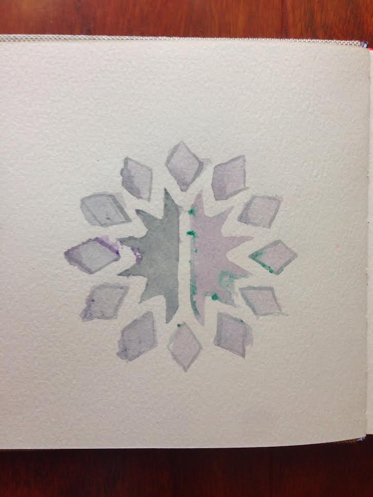


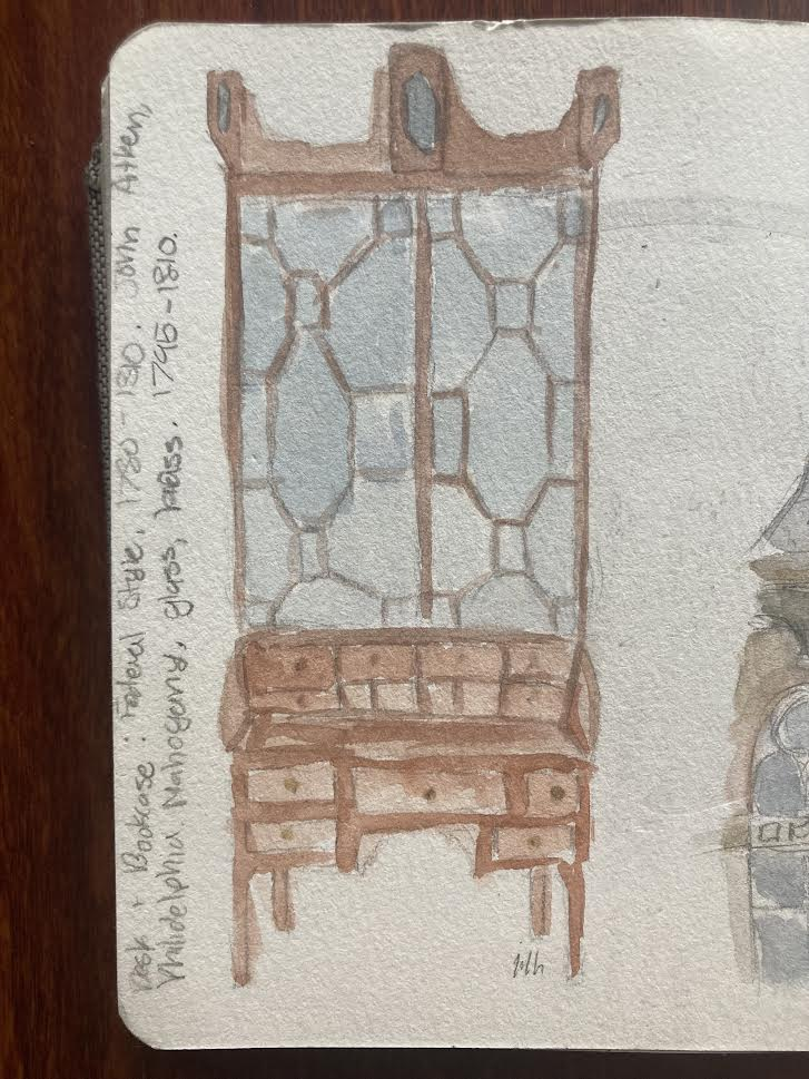


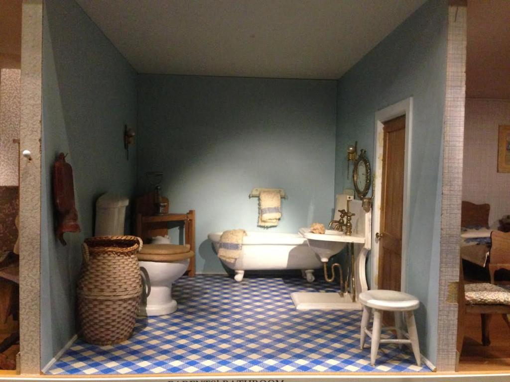


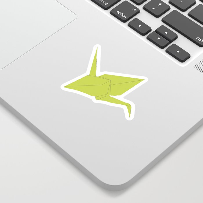


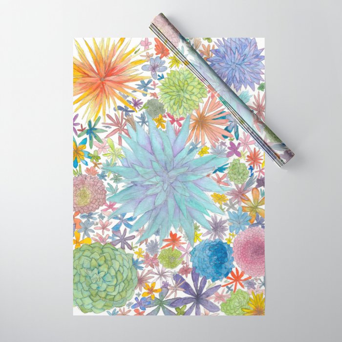


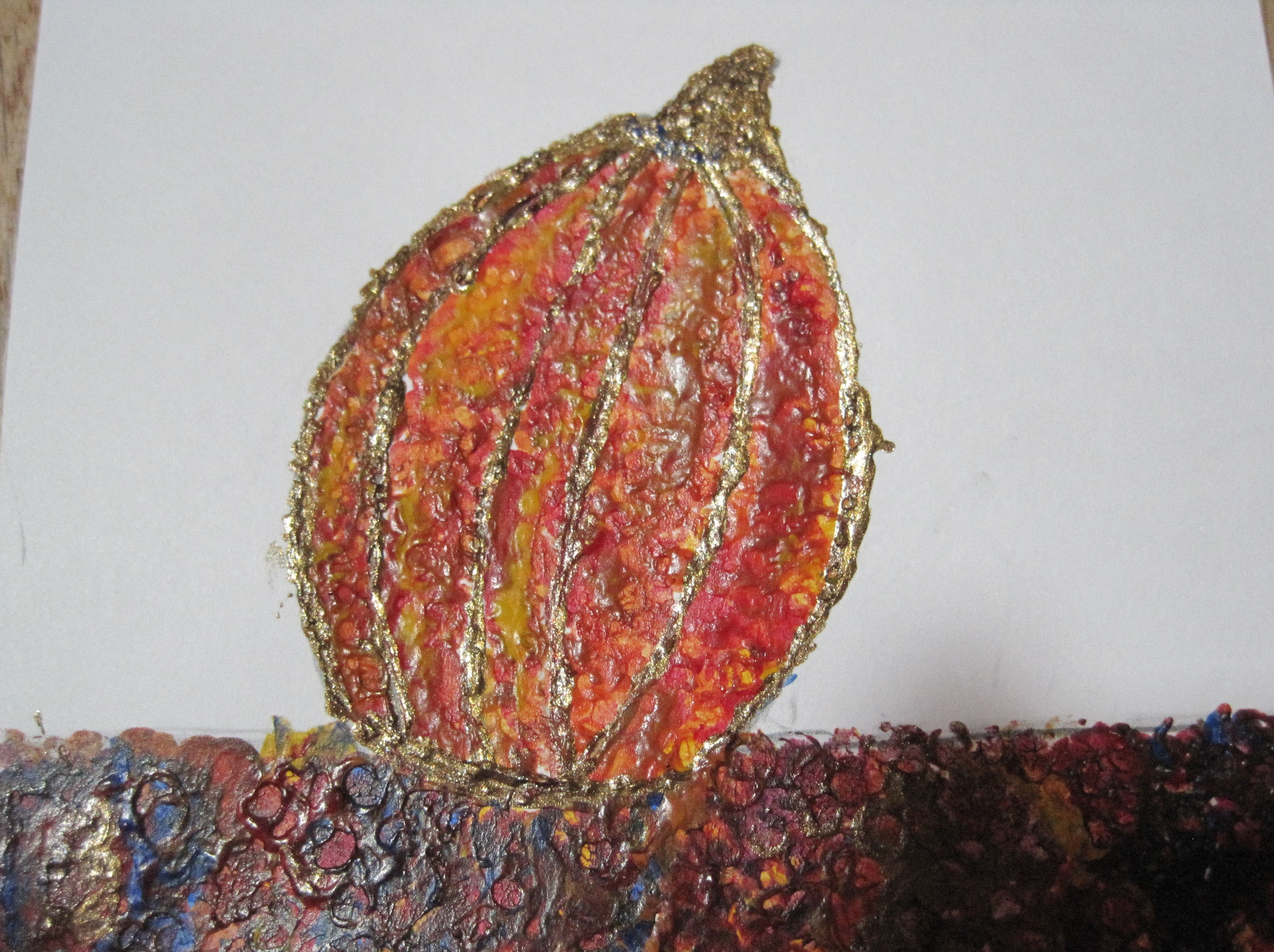


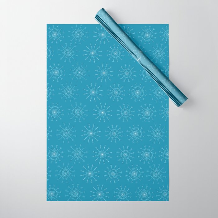


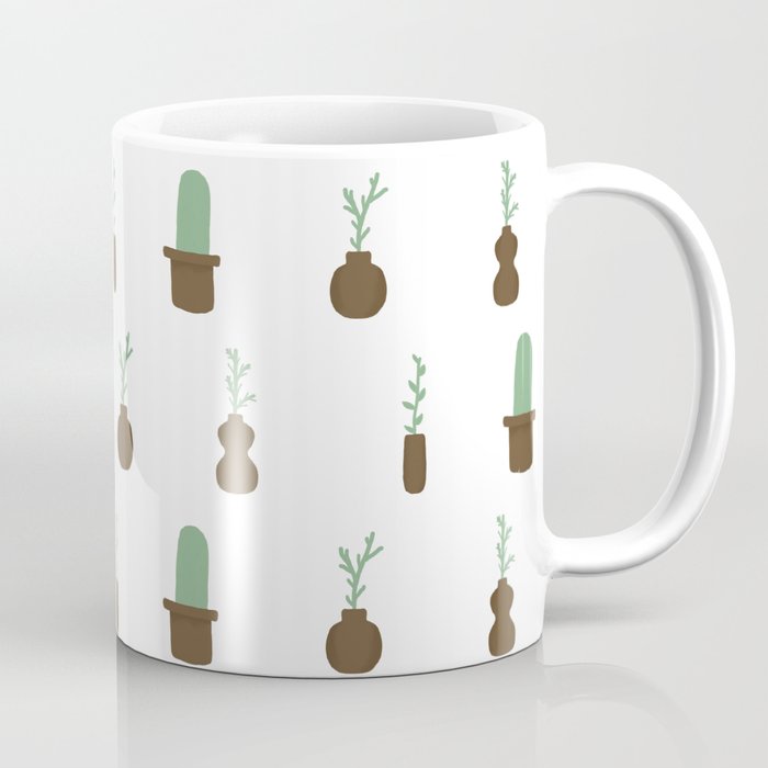


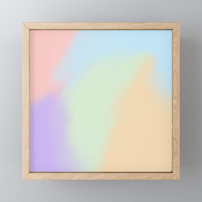


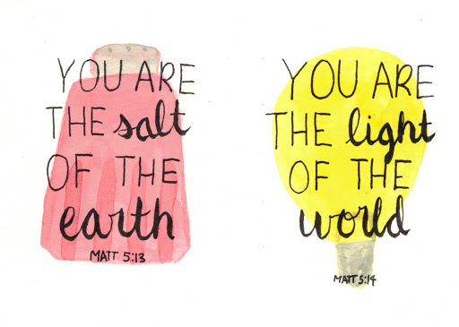


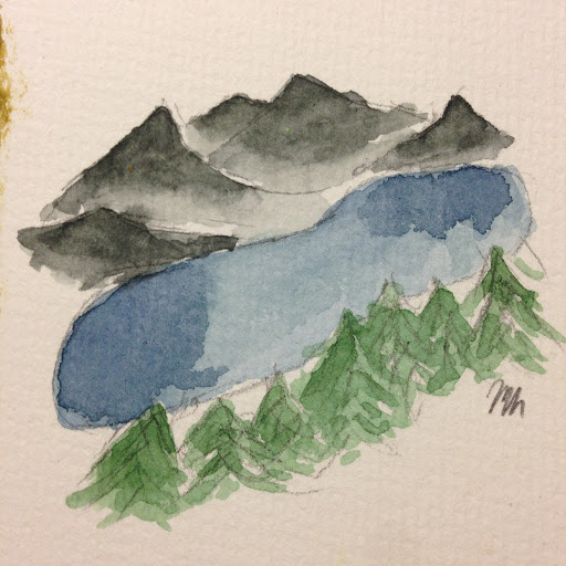


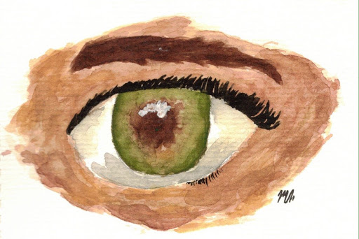


